Holidays are approaching. And since everyone’s busy trying to finish their pending tasks, I’ll make this one quick.
As crucial as financial reports are for a solid business plan, they can make your plan look intimidating.
Visual charts and graphs not only help you present your financials neatly, but also keep your plan light. Plus, investors love them
So, what visual charts should you include in your financial plan?
This is the list 👇
1. Revenue growth trajectory
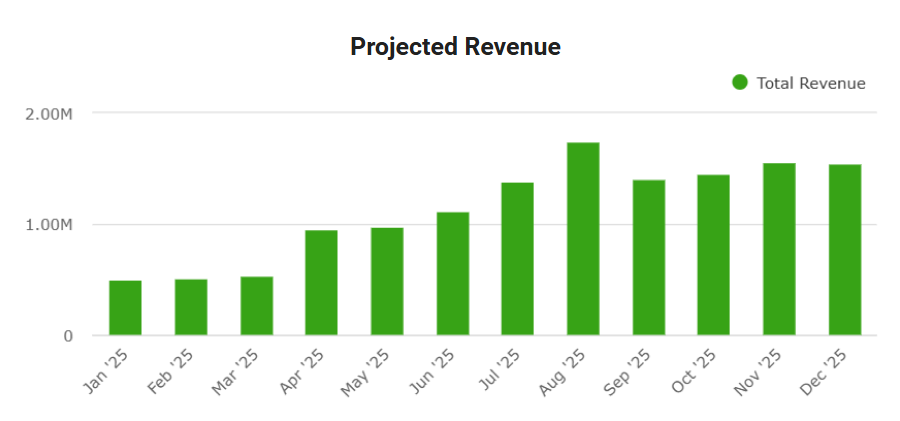
Show monthly or quarterly revenue over the next 12–36 months. A line that goes up is expected. How fast it goes up is what matters.
Steady, explainable growth looks far more credible than a dramatic hockey stick. Investors look at this chart to see whether you understand how revenue grows, not just that it does.
Tip: keep your assumptions close by. Customer count, average deal size, pricing, and retention should clearly explain the curve.
2. Cash flow projections
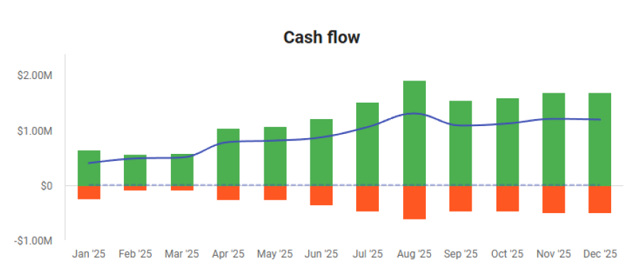
This chart tracks cash coming in, cash going out, and the remaining balance each month. It’s different from a profit and loss statement.
What it tells investors: You know how long your cash lasts.
Your balance should never hit zero unless you’re clearly showing when funding arrives. This chart often gets more attention than revenue itself.
3. Break-even analysis
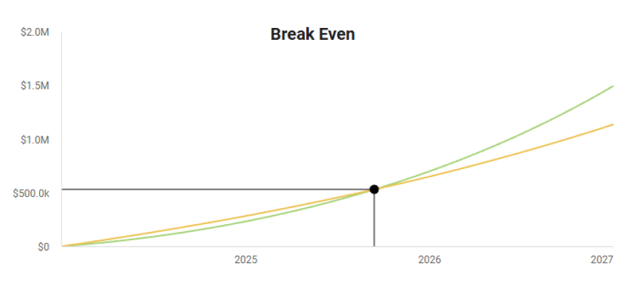
This chart shows when revenue covers total costs. You’ll usually see two lines: revenue and expenses. Where they cross is the break-even point.
Investors use this to understand how long they’re funding losses. Reaching break-even in 12–18 months with a clear plan is reasonable. Several years out raises questions.
If you can show scenarios where break-even happens earlier or later, it signals that you’ve thought through risk and execution.
4. Profit & loss trend
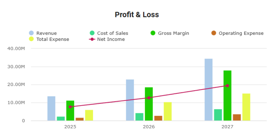
This shows how revenue, costs, and profit evolve over time.
Investors don’t expect early profits in many businesses, but they do expect to see losses narrowing and margins improving. This chart tells the story of financial discipline.
5. Profit breakdown
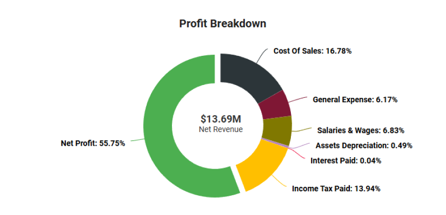
A simple visual showing where profit (or losses) come from.
This helps investors understand which parts of the business drive results and which ones need improvement.
6. Spending allocation (pie or stacked bar)
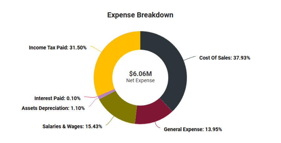
This shows how money is distributed across major expense categories.
It quickly answers questions like:
- Are you spending too much on marketing?
- Is payroll realistic?
- Are overheads under control?
One glance can replace a full page of explanation.
7. Income & Expenses
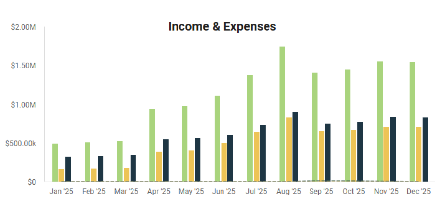
A side-by-side or stacked view of revenue and expenses over time.
This helps investors see whether the business is moving toward sustainability or drifting further away from it.
8. Unit economics
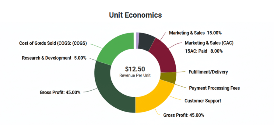
This breaks down revenue and costs at the unit level: per customer, per order, or per transaction.
If unit economics don’t work, scale won’t fix the business. This chart shows whether growth actually improves profitability.
The bottom line
That’s all for today. Visual charts and graphs are great to make your financials light and digestible for your readers.
It’s not that they’ll make your weak numbers look strong, but they make your strong thinking easier to see and understand.
Hope you find today’s read insightful. Check out Upmetrics’ financial forecasting tool for accurate and realistic financial plans (w/ awesome visual charts).
Have a great holiday season 🎄
Until the next time, happy business planning,

Vinay Kevadia
Vinay Kevadiya is the founder and CEO of Upmetrics, the #1 business planning software. His ultimate goal with Upmetrics is to revolutionize how entrepreneurs create, manage, and execute their business plans. He enjoys sharing his insights on business planning and other relevant topics through his articles and blog posts. Read more