


You’ve probably heard you can’t raise without traction, without revenue, without a finished product. And most founders at the pre-seed stage have none of that yet, so the usual advice is to wait until you do.
But Figma is proof that’s not quite true.
Back in 2013, Dylan Field and Evan Wallace (Figma co-founders) raised a $3.8M seed round with nothing shipped and no single user. They didn’t get there by faking traction or tiptoeing around the gap.
They just proved the one thing investors doubted: that you could design in a browser tab at all, not just in a desktop app.
So in this breakdown, I’ll show you what’s on each slide, what they got right, and the specific things you can borrow for your own deck.
About Figma (then vs. now)
Figma began the way a lot of startups do: with a bad idea, then a better one.
Field and Wallace met at Brown University, where Wallace was Field’s teaching assistant. In 2012, Field won a Thiel Fellowship, a $100,000 grant that pays to drop out and build something. His first idea was a drone company, and it went nowhere.
But Wallace had a better one. He’d been experimenting with WebGL, a new way to run graphics inside a browser, and had a demo proving it could do far more than anyone expected. That changed Field’s mind, so he dropped out and got to work.
I must say: they had the technology before the product. For most of a year, WebGL was a hammer looking for a nail, until in 2013 they aimed it at design and started building what became Figma.
That same year, Index Ventures led a $3.8 million seed round, backing the demo before there was even a real product. Then they went quiet for nearly four years. And that patience paid off.
- Figma launched as a free, browser-based design tool in 2016.
- By 2022, Adobe agreed to buy it for ~$20 billion, but walked away in 2023 under regulatory pressure (paid a $1 billion breakup fee).
- Two years later, Figma went public on its own at a $19.3 billion valuation.
Today, Figma is a public company doing over $1 billion a year in revenue, used by 13 million people a month. Two-thirds of them are not even designers but developers, marketers, and product managers working in the same files.
Figma raised around $750 million as a private company before that IPO. And now, it’s pushing hard into AI, with tools like Figma Make that turn prompts into working designs. Not bad for something that started as a demo looking for a problem to solve.
Now, let’s go through the Figma seed deck, slide by slide.
Detailed Figma pitch deck breakdown
Figma’s 2013 deck is 30 slides, and it doesn’t look like a normal pitch. More than half of it is demos, graphics running live in a browser. I’ve grouped together so we can move quickly. Here’s what each part does, and why it worked.
Slide 1: Founders

The deck opens on the team, not a problem or a product. Two founders on a sailboat, credentials beside them: Dylan Field (Thiel Fellow, Brown, Flipboard, LinkedIn) and Evan Wallace (Brown CS, Pixar, Microsoft Office).
For a company with no product, I think this is the right call. The whole pitch is “trust us to build something hard,” so they open by showing why they’re the two who can.
Takeaway: When you’re raising before you have a product, your team is the bet. Lead with the credibility that makes everything after it believable.
Slide 2: The influence: “Inventing on Principle”

Next, a still from Bret Victor’s 2012 talk “Inventing on Principle,” where he argues creators should see their work react instantly, with no gap between change and result.
This one surprised me. In a single image, they’re telling investors where their thinking comes from, and it’s a smart move: it frames Figma not as a hunch but as something built on a real design philosophy. It makes the founders look like people who’ve studied the problem, not just spotted a trend.
Takeaway: Pointing to a real influence can signal you understand your space more deeply than competitors chasing the same idea.
Slide 3: The problem
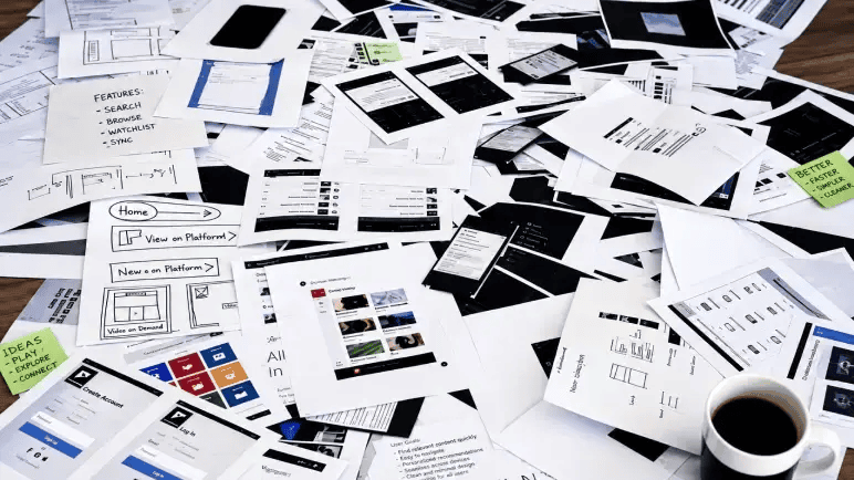
Then the problem, shown instead of told: a messy pile of printed wireframes, sketches, and a coffee cup. No bullets, no stats. Just how design actually worked in 2013, scattered across paper and files, impossible to collaborate on cleanly.
What I like is that they trusted one image to carry it. It lands instantly on anyone who’s done design work.
Takeaway: When your audience already lives the problem, one honest image lands harder than a slide full of statistics.
Slide 4: The breakthrough: graphics in the browser

This is the slide I think makes the rest of the deck possible: a 3D sphere dropping into a pool of water, ripples and all, running live in a browser. It’s the WebGL demo that proved the browser could handle serious, GPU-level graphics.
Everything after this depends on believing browser-based design is even possible, so I love that they prove it up front, with something visual and a little jaw-dropping, before asking anyone to imagine what gets built on top.
Takeaway: If your idea rests on one “is this even possible” question, answer it early, with a demo, not a promise.
Ditch your old-school pitch deck creation methods
Make compelling pitch decks in minutes with AI
Plans starting from $14/month

Slides 5-8: The vision (accessible, connected, educational)
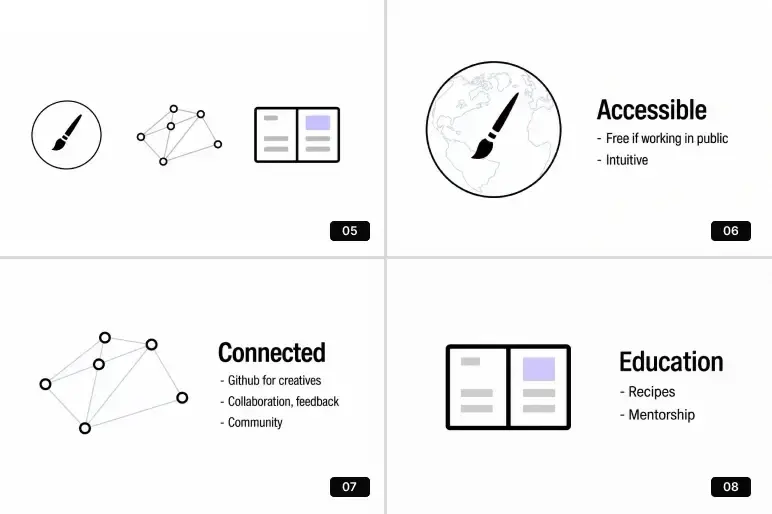
Now the vision, one idea per slide.
Accessible: free if you work in public, and intuitive enough to skip years of Adobe training.
Connected: “GitHub for creatives”, collaboration, feedback, community, instead of the lonely single-file workflow designers were stuck with.
Educational: recipes and mentorship built in.
What I like here is that they lead with the world they want to build, not a feature list. “GitHub for creatives” is the line I keep coming back to; it packs versioning, collaboration, and community into three words.
Takeaway: Show investors the world you’re building before you show them features. A sharp “X for Y” analogy can carry more than a paragraph when it truly fits.
Slides 9-24: The technical proof: the demo run
Now comes the core of the pitch. For sixteen straight slides, Field and Wallace just run demos, real graphics tools working live in a browser.
It sounds a bit repetitive, but it isn’t. The demos climb through five capabilities, each one harder than the last, and each one a job that in 2013 was supposed to be impossible outside heavy desktop software.
Poisson blending (Slides 9-11)
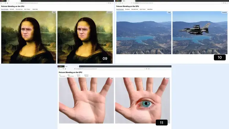
The technique that drops one image into another with no visible seams, matching color and lighting so the result looks real.
They show the Mona Lisa’s face swapped, a fighter jet dropped into a mountain landscape, and an eye blended onto an open palm, all running live, first on the CPU, then faster on the GPU (the chip built for graphics).
In 2013, this was Photoshop-level compositing, and they were doing it in a browser tab.
Background removal and GraphCut (Slides 12-16)
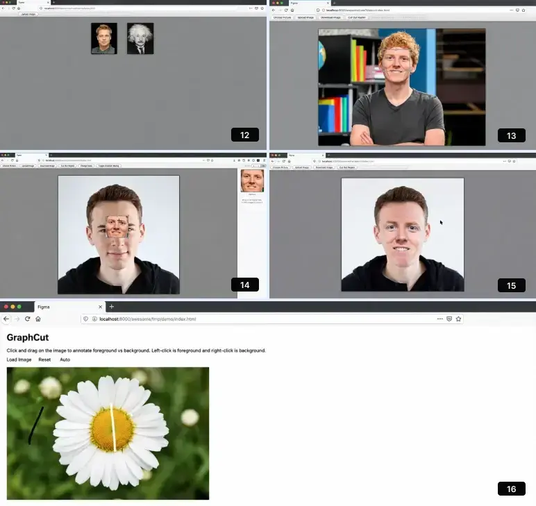
Next, a workflow: upload an image, mark foreground and background, and cut the subject out. Also, clean up the edges for you in a few clicks.
They run it on a portrait and a daisy, with buttons like “cut out region” and “download image” right there in the browser. This is the everyday designer chore, done on the web.
Image matting (Slides 17-18)

These slides show a harder version of the same idea. Instead of a clean-edged object, they pull a scruffy dog off its background without losing the fur, then do the same with a photo of a woman holding a camera.
I’d expect matting fine detail like hair or loose strands usually needs a skilled hand in Photoshop, so doing it in-browser made the point loudly.
Color tools (Slides 19-21)
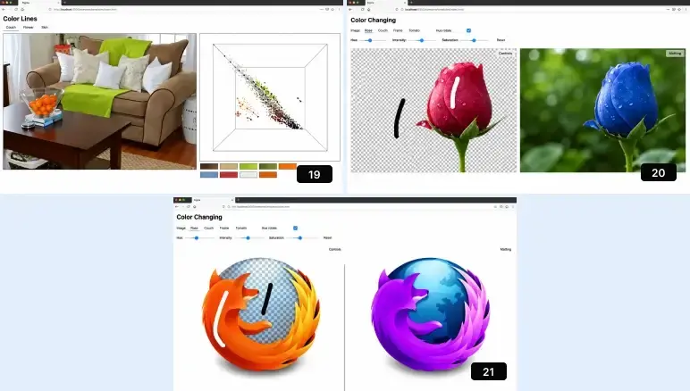
Live recoloring, changing the color of something in a photo while keeping its shading and texture intact.
They shift the color of a couch and its pillows, a tulip, and even the Firefox logo, adjusting hue and saturation in real time. This is where the story moves from “cut things out” to “edit things freely.”
Photo editing (Slides 22-24)
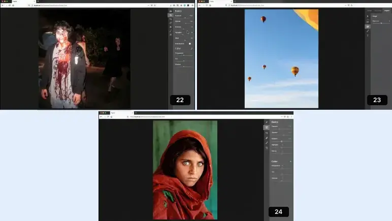
The run closes on a full editing panel, exposure, highlights, and retouching controls brightening and fixing a dark night photo. Then cleaner edits on hot air balloons and a portrait.
This is the closest the demos come to looking like a finished product, the moment the browser starts feeling like a real tool.
Overall, the point of the sequence isn’t to show off features. It’s to kill the single biggest doubt in every investor’s head: can this even be built?
By climbing from simple blending to full editing, Field and Wallace didn’t prove one trick worked; they proved the whole range of serious graphics could live in a browser.
If I’m being honest, though, it runs long. The point is made convincingly about halfway through, and the deck keeps going well past that. In a live pitch, that’s a real risk: you can lose the room to repetition even when every slide is impressive.
Takeaway: When your biggest risk is whether the thing can be built, spend your slides proving it, and sequence that proof so each step clears a harder bar. A working demo beats ten slides of promises.
Slides 25-26: The roadmap: beta, then launch

After the demos, two clean roadmap slides.
- Fall 2013: Closed Beta.
- Spring 2014: Launch, shown on both a tablet and a desktop.
I like how little they try to do here: just two dates and a signal that Figma would be cross-platform from day one, which felt ambitious for a time when browser-based design was still treated as a toy.
Takeaway: A roadmap doesn’t need to be complicated. Showing what’s coming next, and roughly when, is enough to prove you have a plan.
Slides 27-28: Market and competition: the pyramid
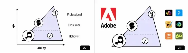
These two slides do the market work. The first is a pyramid plotting users by Ability (horizontal) against spend (vertical): Hobbyist at the base, Prosumer in the middle, Professional at the top. It’s a clean way to show Figma intends to serve the whole range, not just one segment.
The second reuses that pyramid to place the competition: Adobe anchored at the top, and a scatter of smaller app icons representing the fragmented tools filling the middle and bottom. The message is that the market is real, dominated at the top, and messy everywhere else, which is exactly the opening Figma wanted to consolidate.
The honest gap I see here is that there’s no dollar figure anywhere, no market size, no sense of how big the opportunity is. Figma got away with it because its investors already knew the creative software market was huge and Adobe-owned.
Takeaway: A simple pyramid can do more than a market-size number, but only if the room already grasps the market. If they don’t, show them the size too.
Slide 29: The milestone and team plan
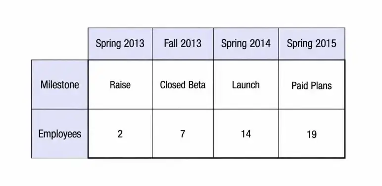
This is the slide that quietly makes the pitch investable, and the one people forget Figma’s deck even had. A table maps four checkpoints against headcount.
So the deck does address money and scaling, just not as forecasts. It shows when they’ll charge and how the team grows to get there. For a pre-revenue company, that’s often more convincing than an invented revenue curve.
Takeaway: Show a believable path, not fantasy numbers. Milestones and hires can be more credible than a five-year projection.
Slide 30: The close
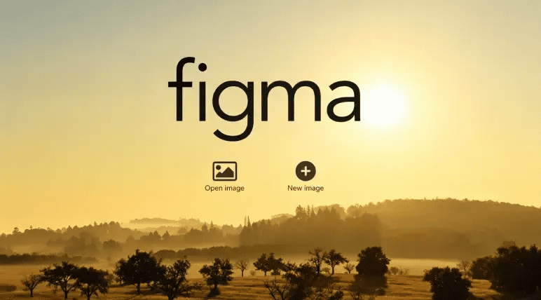
The final slide is the Figma logo over a sunrise, with “Open Image” and “New Image” buttons, a quiet hint that a working prototype was already there to try. It leaves the room with the feeling of a new day for creative work.
Takeaway: End on the vision, not the logistics. The last slide is what investors carry out of the room.
What did I like the most about this deck?
What stood out wasn’t polish. It was conviction and focus. Here’s what I keep coming back to:
- More than half the deck is just demos, proving the product works before asking anyone to believe it.
- They opened with what Figma was for, its vision and values, instead of jumping straight to features.
- Starting with Bret Victor’s talk showed the idea came from real design thinking, not a passing hunch.
- There are enough business slides. Market segmentation, a competitor slide, a roadmap, and a milestone table, all kept short and simple.
- There’s no hype anywhere, just two founders who clearly understood the problem and had cracked the hardest part.
The lesson I’d take from it: Figma didn’t win because it had the perfect plan. It won by proving its idea worked, then showing just enough vision to make investors believe.
Conclusion
The real lesson from Figma’s deck isn’t “raise without traction” or “just show demos.” It’s that Figma figured out the one thing investors doubted most, and built the entire pitch around proving it. Everything else stayed simple: a clear vision, a quick look at the market, and an honest plan for what came next.
That’s the part you can borrow.
You probably won’t have a browser-breaking demo like theirs. But every idea has one big question mark hanging over it. Find yours, and build your deck around answering it.
If you need help with your own deck, Upmetrics’ AI pitch deck creator gives you a proven slide-by-slide structure to build from. That way, you cover everything that matters, not formatting slides.
Create a Clear Pitch Deck for Your Business
Create a well-structured presentation to communicate your business clearly.

Frequently Asked Questions
Should I copy Figma's deck structure for my own pitch?
Can I raise a seed round without a finished product?
What should I put on a pitch deck if I have no traction yet?
Should I demo my product during the pitch or just use slides?
More pitch decks, broken down
See all 26




Vinay Kevadia
Vinay Kevadiya is the founder and CEO of Upmetrics, the #1 business planning software. His ultimate goal with Upmetrics is to revolutionize how entrepreneurs create, manage, and execute their business plans. He enjoys sharing his insights on business planning and other relevant topics through his articles and blog posts. Read more