Dropbox is everywhere now!
Share a folder, sync your work, back up photos in seconds, it just works.
But it wasn’t always this seamless. Back then, there was no polished product, no big team. Just a demo and a long-term vision.
That little demo went viral on Hacker News, pulling in 75,000 signups in a single day.
And it turned into Dropbox.
Today, I’m breaking down the original pitch deck that helped them raise $1.2 million in seed funding (slide by slide) to see what worked, what stood out, and what other early-stage founders can learn from it.
But first, let’s take a look at Dropbox’s first pitch deck.
About Dropbox (then vs. now)
Back in 2007, Dropbox wasn’t a big company or a popular app. It was just an idea (and a simple fix for a common problem).
Founder Drew Houston kept forgetting his USB drive and wanted an easier way to keep his files in sync across devices. He built the first version for himself. Soon, he teamed up with Arash Ferdowsi to make file syncing seamless for everyone.
At the time, cloud storage wasn’t mainstream. People emailed files to themselves or carried heavy flash drives. Existing tools were clunky, unreliable, or built for IT departments, not for everyday users.
Dropbox’s big insight was that this problem wasn’t niche. It was a universal problem everyone faced.
When this early pitch deck was made, they had a working prototype. But there was no public launch, no revenue, and no big user base. Most of their early buzz came from a short demo video (posted on Hacker News).
Still, the vision was strong enough to raise $1.2 million (from Sequoia Capital).
Today, Dropbox is a public company with over 700 million users. It earns $2.55 billion annually (with 18.22 million paying users). The company isn’t stopping here; it’s also investing in AI/ML technologies to improve its services.
(Sometimes, all it takes is one real pain point to spark a billion-dollar solution.)
Detailed Dropbox pitch deck analysis (slide-by-slide)
Alright, let’s break down the original Dropbox pitch deck, slide by slide.
I’ll walk you through what each slide covers, what stood out, and what founders today can learn from how they told their story via this pitch.
1) Title
This slide is as simple as it can be, just the Dropbox logo, tagline (“Moving the world’s files”), and a URL. No pitch, no visual effects, no attempt to explain anything upfront.
And honestly, it works. It’s confident without trying hard. The name, tagline, and link give just enough to make people want to explore further.
Takeaway: A clean logo and strong tagline can set the tone better than cluttered, long messages.
2) Problem Statement
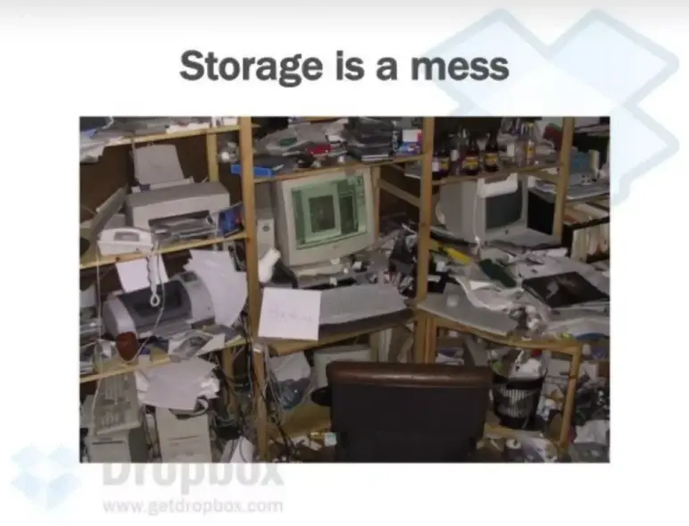
One line, “Storage is a mess”, paired with a photo of an outrageously cluttered desk. It’s simple, direct, and immediately relatable.
Instead of overexplaining the problem with bullet points or market stats, they just show it. The visual hits instantly: Everyone knows the frustration of disorganized files, missing versions, or juggling storage devices.
Takeaway: Use visuals that hit home. Don’t just tell investors there’s a problem, make them feel it. A single strong image can say more than a dozen bullet points.
Ditch your old-school pitch deck creation methods
Make compelling pitch decks in minutes with AI
Plans starting from $14/month

3) Pain Points
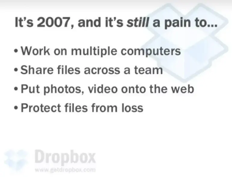
“It’s 2007, and it’s still a pain to…” sets the tone right away. Then they list four common problems: syncing across devices, team sharing, uploading media, and file safety.
I think everyone might have faced this problem in some way or another. So, it’s clear, relatable, and shows it’s a widespread issue.
Takeaway: If the pain is obvious, don’t over-explain it. Use plain language and a relatable tone to show that the problem is still unsolved.
4) Existing Solutions
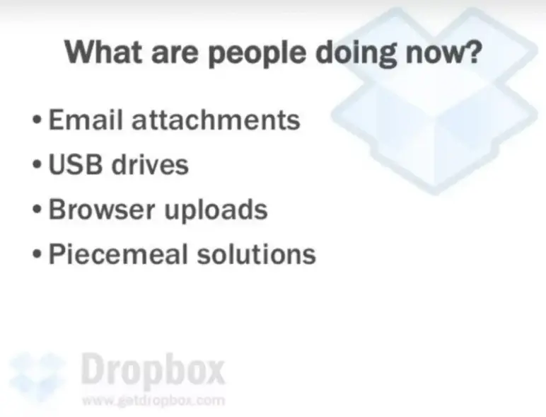
This slide answers the “Existing solutions” with four painfully familiar answers: email attachments, USB drives, browser uploads, and piecemeal solutions.
Here, I need to add that everyone knows these were annoying workarounds in 2007. And this sets the stage perfectly for Dropbox to say: there’s a better way.
Takeaway: Sometimes listing the status quo is all you need to show the gap. Let outdated solutions make your case stronger.
5) Ideal World (vision of solution)
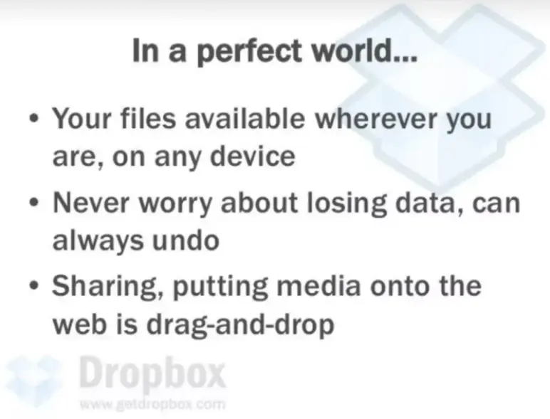
This slide lays out a simple vision: universal access, peace of mind, and drag-and-drop ease. It’s framed as “In a perfect world…” which lowers resistance, it doesn’t promise the product yet, just sets up what should exist.
The tone used is casual, but the message is big. It paints a clear, desirable picture that’s easy to go along with.
Takeaway: Show what the world looked like before the solution, so your product feels like the natural answer.
6) Dropbox Solution
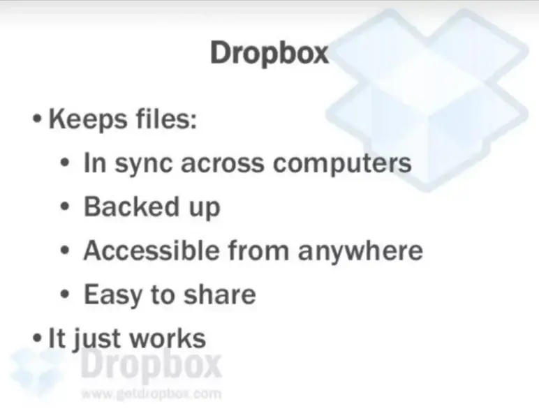
In this slide, it says what exactly Dropbox is. And they keep it tight: syncs files, backs them up, makes them accessible and shareable. Then they land it with a perfect closer—“It just works”.
No buzzwords. No diagrams. Just the value, in simple and effective language.
Takeaway: When your product solves a known pain, you don’t need to oversell it. Say what it does, clearly, and if it’s simple to use, mention that too.
7) Product Demo
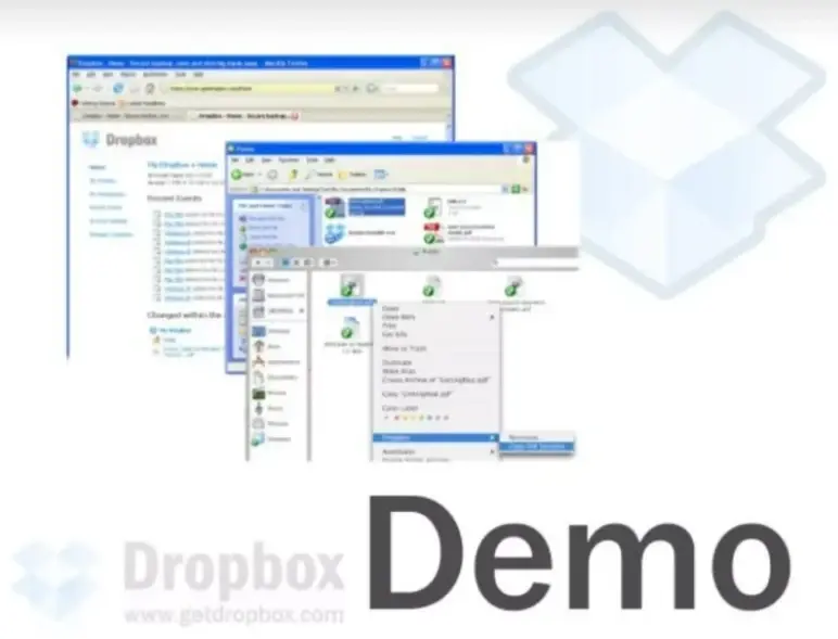
This slide simply says “Demo” and shows screenshots of the Dropbox interface, Windows Explorer integration, browser view, and file syncing in action.
It signals confidence. Instead of explaining how the product works, they’re ready to show it. No clutter, no long setup, just “here it is.”
Takeaway: If your product is simple and solves a clear pain, let a demo do the rest of the work. Show, don’t over-explain.
Ditch your old-school pitch deck creation methods
Make compelling pitch decks in minutes with AI
Plans starting from $14/month
8) Why Now?
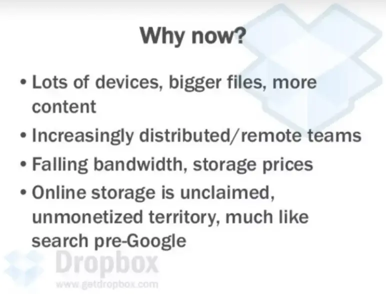
This slide spells out why Dropbox made sense at that exact moment. More devices, heavier files, remote teams, cheaper bandwidth—it’s all there.
The boldest line is the last one: calling online storage “unclaimed territory,” like search before Google. Big statement, but it worked. I appreciate how it doesn’t waste time justifying the product; it shows the market shift clearly.
Takeaway: Clearly highlight market shifts to show why your product makes sense now.
9) Why Dropbox is Better
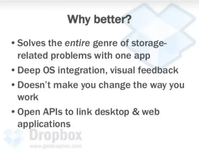
In this slide, Dropbox doesn’t just list features; it explains why it’s better. One app that solves the whole problem. Works with your OS. Doesn’t ask you to change habits. Offers open APIs.
I noted that each point hits on ease, flexibility, and greater depth, all these things early users and developers care about.
Takeaway: To stand out, show how you fit naturally into users’ lives, not how you force them to change.
10) Competitive Landscape
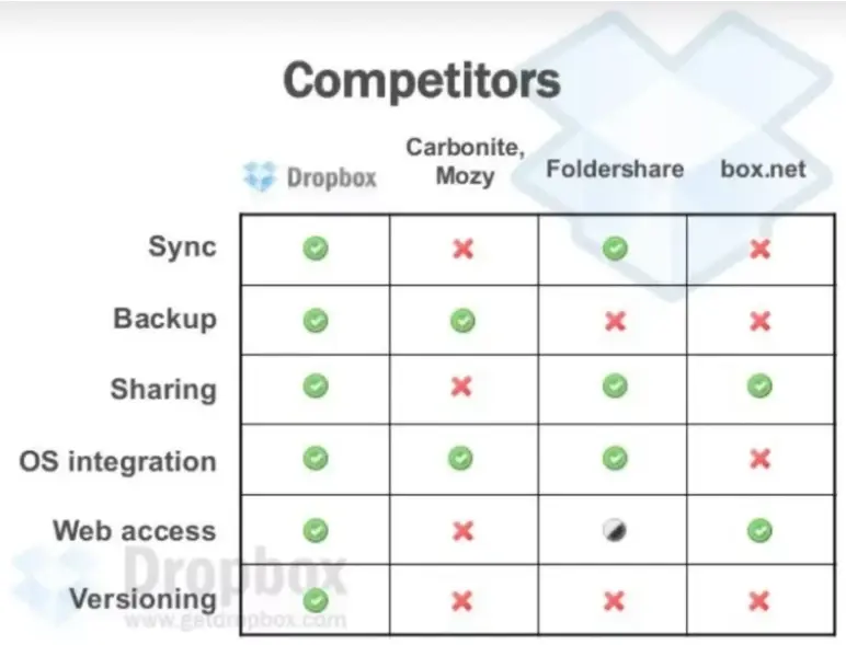
This slide shows, at a glance, how Dropbox compares to the competition. You don’t need to know each competitor in detail; the red marks speak for themselves.
The green checks across Dropbox’s row instantly create a sense of completeness and credibility. It clearly communicates: Dropbox does it all, syncing, sharing, and OS integration without needing extra explanation.
Takeaway: A visual comparison can make your product’s advantages speak for themselves.
11) Competitors’ Mistakes
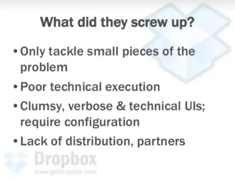
This slide calls out exactly where other tools fell short: limited scope, bad tech, clunky UX, and no growth plan. It’s blunt, but that’s what makes it effective.
Dropbox doesn’t just say “we’re better”; it shows why others failed.
I think the direct tone makes the point clear and credible. No fluff, just a list of reasons why others didn’t win. Investors appreciate honesty and deep research.
Takeaway: If you’re replacing something, be clear about what they got wrong and how you’ll do better.
12) Technical Advantages
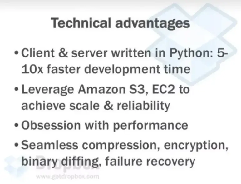
In this 12th slide, Dropbox founders give a list of why Dropbox was ahead on the tech side: fast Python dev cycle, cloud-based scaling, and deep performance focus.
I like how they made “obsession with performance” a selling point. It’s not just features, it’s a mindset. They knew what they were doing. It’s the sort of slide that catches the attention of both engineers and investors.
Takeaway: Tech slides don’t need to impress with buzzwords, just show that you know what matters and how you’re building for scale.
Ditch your old-school pitch deck creation methods
Make compelling pitch decks in minutes with AI
Plans starting from $14/month
13) Team
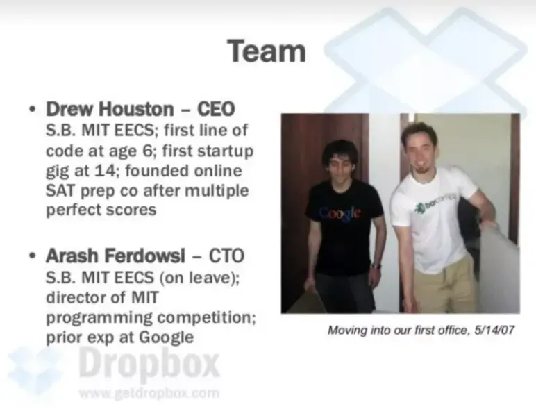
This team slide introduces the two founders: Drew and Arash, both MIT grads with strong coding exposure. It’s quick, personal, and backed by real experience.
And one more thing that I need to add here is MIT, early coding, Google experience, it’s the kind of background that makes investors feel safe betting on execution.
Takeaway: Keep your team slide tight, but make it personal. Investors bet on people, not just slides.
14) Business Model
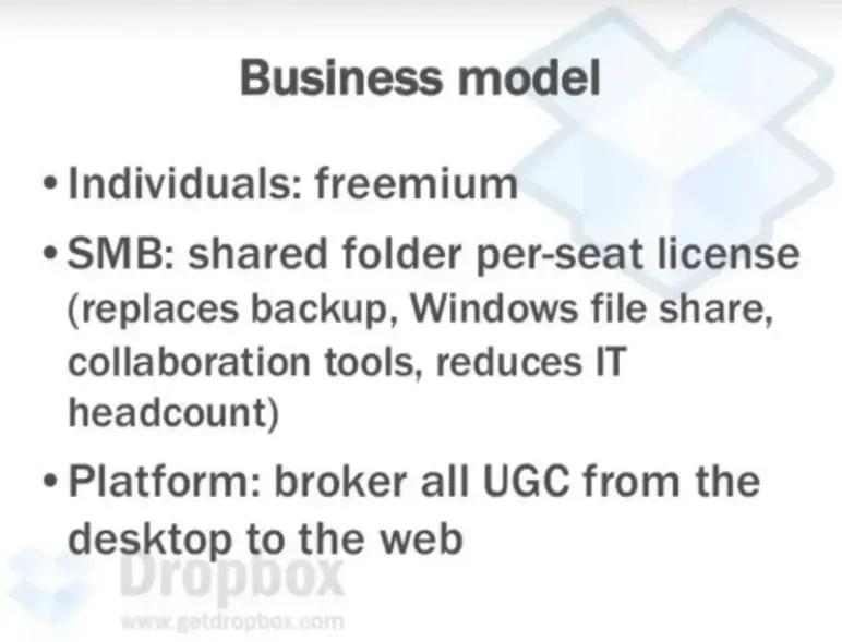
This slide broke it down neatly: freemium for individuals, per-seat licensing for SMBs, and a long-term platform play.
What stands out is that they didn’t just say “freemium” and move on; they actually explained how each layer makes money. The SMB pitch, replacing multiple tools and cutting IT overhead, was especially sharp.
Takeaway: Break down your model clearly to show real revenue potential.
15) Platform Vision
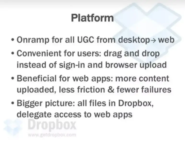
This slide no. 15 shows that Dropbox isn’t just about storing files, it is a bridge between the desktop to the web. For users, it made things easy: drag and drop instead of complicated sign-ins and uploads.
For web apps, it meant getting more content with fewer errors and less friction.
The big idea was to keep all files in Dropbox and let other apps access them smoothly, which then turned Dropbox into essential online infrastructure.
Takeaway: Show how your product can solve today’s problems while building a foundation for bigger, long-term use.
16) Customer Acquisition
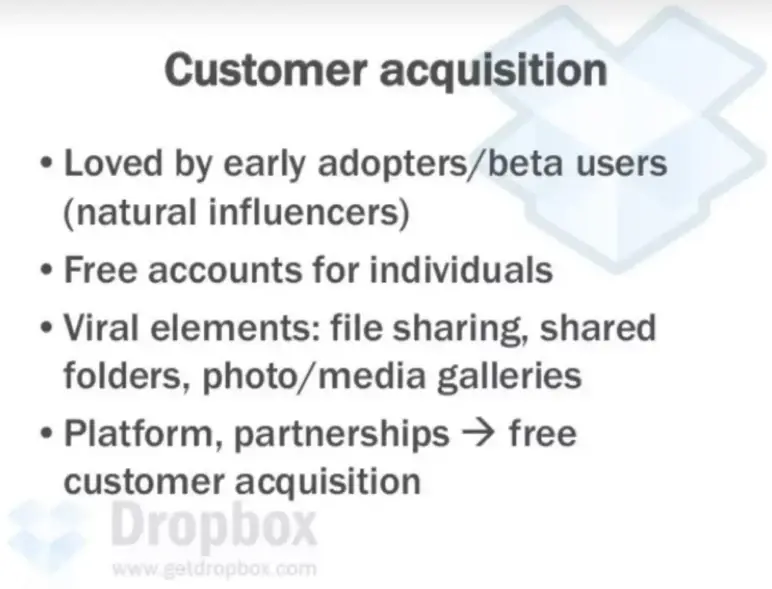
This deck slide shows how Dropbox planned to grow without big marketing costs. They focused on early adopters and beta users who would naturally spread the word. Free accounts made it easy for anyone to try.
They also built in viral features like file sharing and shared folders to encourage organic growth. By partnering with other platforms, they aimed to keep acquiring customers at little to no cost.
Takeaway: Distribution doesn’t need to be expensive if your product speaks for itself.
17) Social Proof & Closing
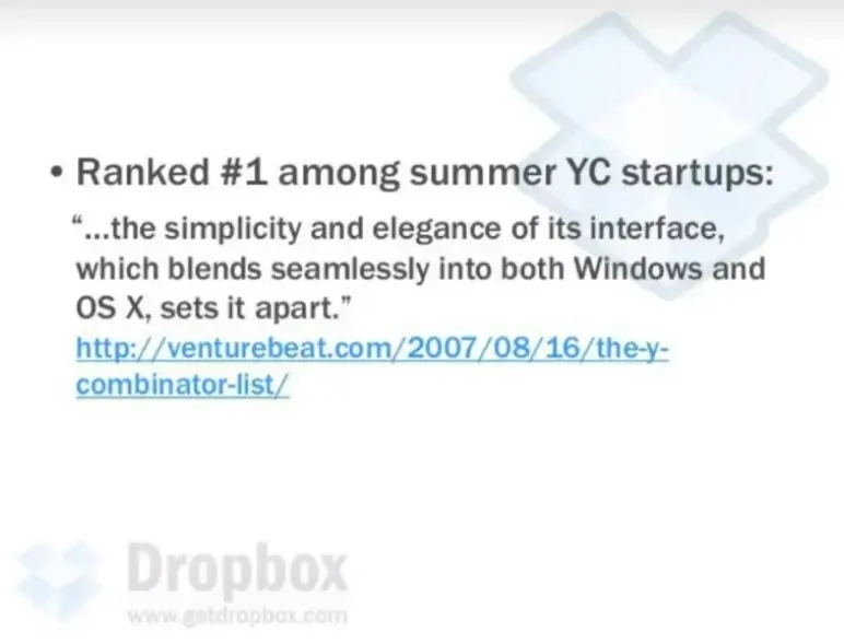
The Dropbox pitch ends with a quote from VentureBeat and a note on being ranked #1 among YC’s summer batch.
Subtle, but effective. The quote highlights simplicity and good user experience, reinforcing their entire pitch. Instead of bragging themselves, they used credible third-party validation.
Takeaway: Use social proof to strengthen your story. Let trusted users highlight what makes the company stand out.
Ditch your old-school pitch deck creation methods
Make compelling pitch decks in minutes with AI
Plans starting from $14/month
What did I like the most about this deck?
This pitch deck was made back in 2007, may be some 15 years back , yet it still feels relevant. Not because it looks modern, but because the thinking and purpose behind it is solid and timeless.
Here’s what stood out the most for me:
- It defines the problem in one line, with a simple, relatable image.
- The pain points are clear and familiar—no need for overexplaining.
- It explains why the timing was right (“Why Now”) using real trends.
- The competitive landscape is honest and sharp, showing real gaps in the market.
- The business model isn’t just “freemium” on a slide—it breaks down real revenue paths.
- The whole pitch feels honest, focused, and confident without trying too hard.
Overall, it’s a reminder that you don’t need hype to raise money. Just a clear problem, a real solution, and the confidence to show it plainly.
Perfect your deck and pitch using Upmetrics
The Dropbox deck didn’t rely on flashy visuals or big promises. It worked because the story was clear, the problem was real, and the solution made sense. That’s the kind of pitch every founder should aim for.
If you want to create an investor-ready pitch, we (Upmetrics) can help you. Whether you’re outlining ideas, building slides, or preparing to pitch investors, we’re here to make the process easier.
Our AI-powered pitch deck builder helps you quickly turn your ideas into clear, compelling slides. And if you need expert help, choose our pitch deck design services and create a polished, investor-ready presentation with ease.
Frequently Asked Questions
How many slides should my pitch deck include?
How do I talk about competition without sounding negative or defensive?
What should I include in my pitch deck?
How do I know if my pitch deck tells a good story?

Vinay Kevadia
Vinay Kevadiya is the founder and CEO of Upmetrics, the #1 business planning software. His ultimate goal with Upmetrics is to revolutionize how entrepreneurs create, manage, and execute their business plans. He enjoys sharing his insights on business planning and other relevant topics through his articles and blog posts. Read more