You’ve probably used Canva. Or at least seen someone create a resume, flyer, or social media post with it in minutes.
But it didn’t start as everyone’s favorite design tool. Back in 2013, Canva was just an early-stage idea. No product. No users. Just a team with one small win (a student yearbook tool) and a big pitch to sell.
Actually, the deck they used wasn’t a masterpiece. But it worked. It helped them raise $3 million before launch.
Here, I’m analyzing that original Canva pitch deck, slide by slide, to see what worked, what stood out, and what other early-stage founders can learn from it.
About Canva (then vs. now)
Back in 2012, Canva was just an idea. A small team in Australia, led by Melanie Perkins, Cliff Obrecht, and Cameron Adams, had the vision to make design accessible to everyone. They were building something from scratch—a web-based platform to simplify design for the masses.
Before Canva launched, the team ran a niche business called Fusion Books, which captured 10% of the Australian yearbook market.
But Canva itself? It had no users, no revenue, and no product yet. What they did have was a compelling vision. Despite no finished product, their pitch was strong enough to attract influential advisors and investors.
By the time Canva launched, the platform had 750,000 users within its first year, and famous Silicon Valley venture capitalist Guy Kawasaki as its chief evangelist.
Fast forward to 2025, Canva is one of the most successful graphic design companies globally. With over 220 million active users across 190 countries, Canva has evolved into a full suite of creative tools. The company’s revenue hit $2.7 billion in 2024, with a $40 billion valuation.
This pitch deck marks the start of something huge, showing that a solid vision and the right people can lead to massive success.
Detailed Canva pitch deck analysis (slide-by-slide)
Here’s a complete breakdown of the Canva pitch deck—slide by slide. I’ll keep it simple and to the point: What each slide covers, what works well, what could be improved, and key takeaways you can apply to your own pitch deck.
Let’s jump in!
1) Cover slide
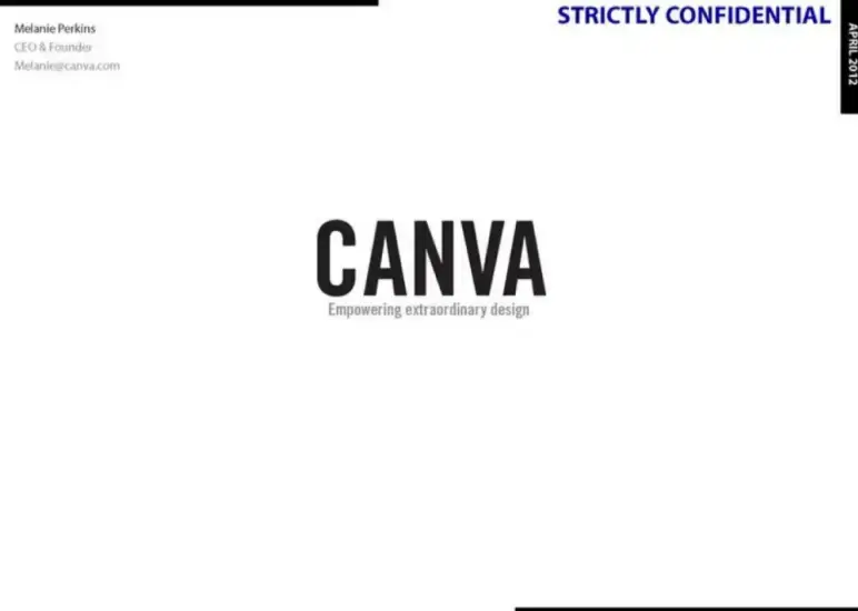
Canva’s cover slide is simple and minimal. features the company name “Canva” on a plain background with a bold logo, and a simple tagline: “Empowering extraordinary design.”
It even mentions Melanie Perkins as CEO & Founder in the corner, along with her email address. This makes it feel personal and approachable right from the start.
Takeaway: First impressions count—a clean cover with your startup name creates a focused, professional start to your pitch.
2) Why
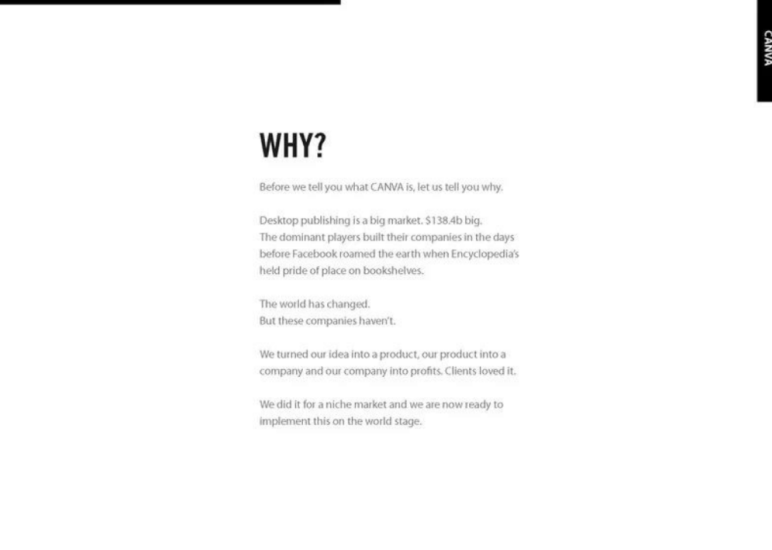
This slide answers the question, “Why are we building Canva?” It points out that design software is part of a huge market, but many of the tools are outdated and hard to use.
I think that’s a fair point—most people just want design tools that work without the hassle.
The founders saw this gap and built something better. They turned a small idea into a working product, tested it with real users, and got strong results. Now they’re ready to take it further.
Takeaway: Show why your idea matters. Point out what’s broken, prove people already want your solution, and explain why now is the right time.
Ditch your old-school pitch deck creation methods
Make compelling pitch decks in minutes with AI
Plans starting from $14/month

3) Problem
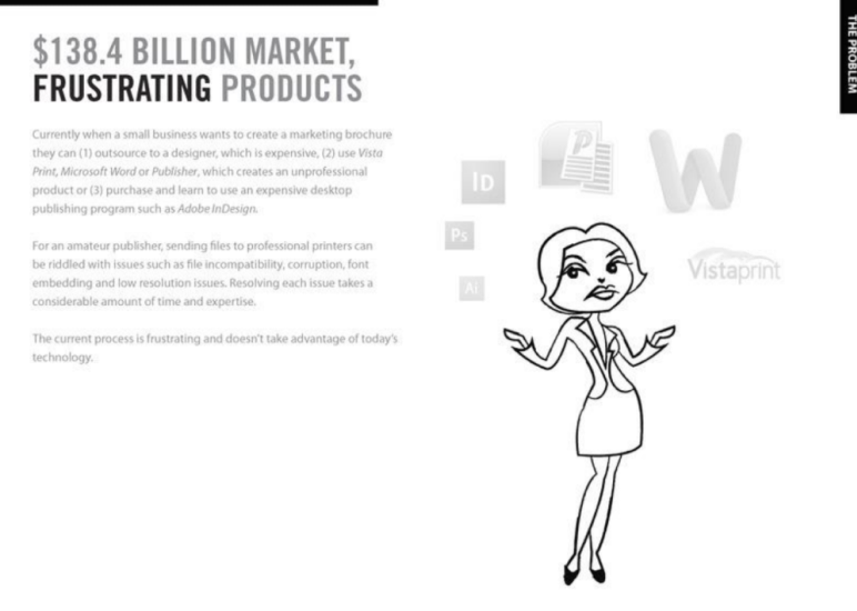
This Canva slide shows what makes design hard for most people. When small businesses want to create a brochure or flyer, they don’t have good options.
They can pay a designer (which costs a lot), use tools like Word or Publisher (which look basic), or try design software like InDesign (which is hard to learn and not cheap).
Even after that, printing causes problems—missing fonts, blurry images, or broken files. It wastes time and causes stress.
Takeaway: Explain the problem in real-world terms that people instantly recognize.
4) Solution
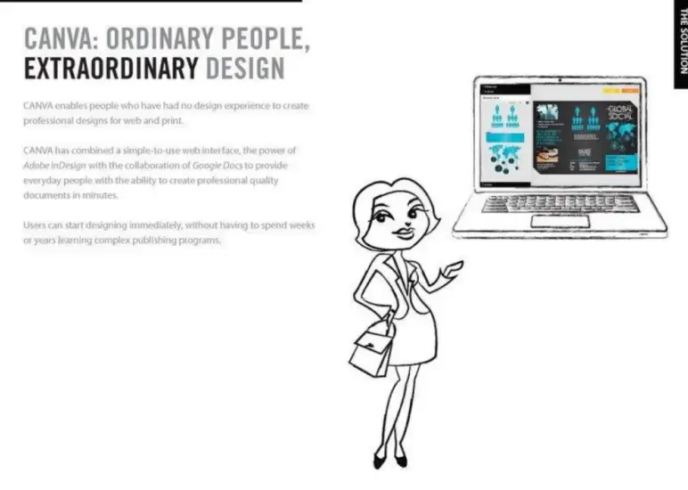
Canva introduces its core idea on this slide—what the product actually does. It helps people with no design background create high-quality designs for web or print.
It’s as easy to use as a simple web app, but it offers the powerful features of tools like Adobe InDesign and lets people work together like in Google Docs. The idea is to let anyone design something great in just a few minutes.
Takeaway: Make your solution sound useful, fast, and easy to start using.
5) Product overview
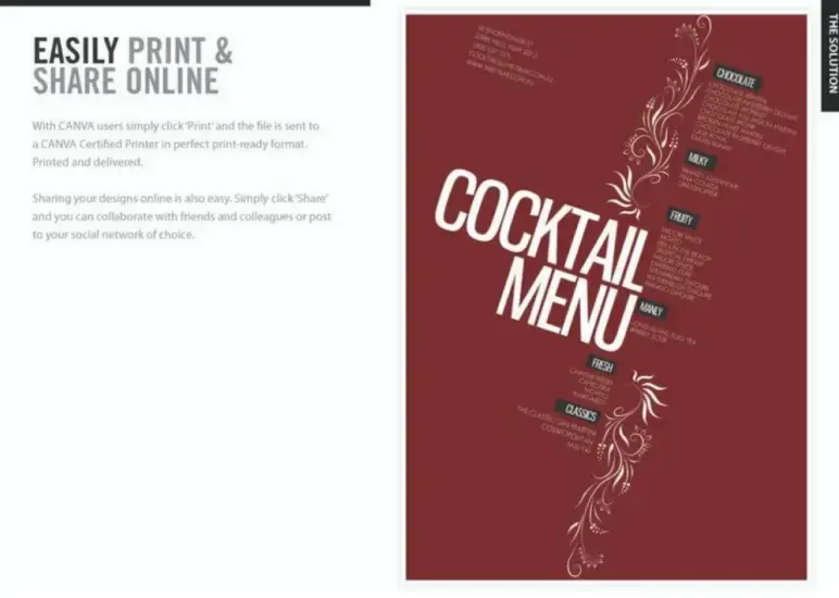
This slide describes how Canva works and the outputs it enables. How to print and share your designs? You just click “Print,” and it gets sent to a certified printer in the right format—ready to be delivered.
You can also click “Share” to send your design to friends and coworkers or post it online. It’s all built-in; no extra tools are needed.
I think this slide makes it clear how smooth and simple the user flow is from design to delivery, all in one place.
Takeaway: A single click makes printing and sharing feel easy—no extra tools, no extra time.
6) Community
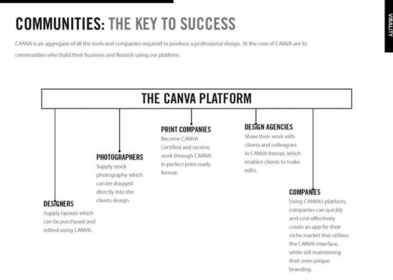
Canva shows here how its platform brings together different types of users to keep growing. Designers, photographers, print companies, design agencies, and businesses—all in one place.
Each group adds something useful, like photos, layouts, printing, editing, or branding tools. Canva brings them all together in one place, which makes the platform more useful as more people join.
Takeaway: If your platform grows stronger with more users, make that clear and central.
7) Virality
No modern startup pitch would be complete without explaining user acquisition, and Canva did this with a slide on viral growth loops. It presented the user flow as “Search → Play → Share”.
The slide also mentions “tentacles” into search engines and social networks, plus introductions into workplaces, indicating Canva’s strategy to embed itself everywhere people might discover it.
Takeaway: Demonstrate a clear growth engine. Whether it’s virality, targeted marketing, or partnerships, investors want to know how you’ll acquire users at scale.
Ditch your old-school pitch deck creation methods
Make compelling pitch decks in minutes with AI
Plans starting from $14/month
8) Monetizing plan
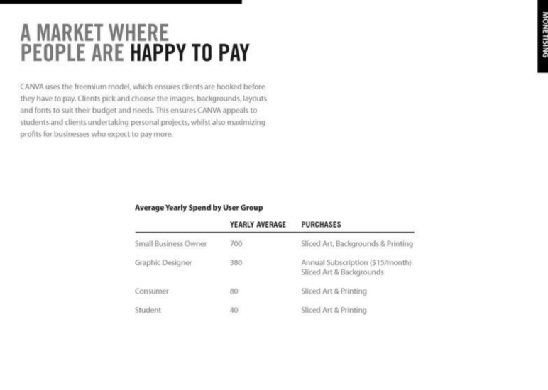
Canva explains how it makes money by using a freemium model. Users start for free but pay for things like premium art, backgrounds, and printing as they need them.
The table shows the average yearly spending by user group. Small business owners spend around $700 on sliced art, backgrounds, and printing.
Graphic designers spend about $380, often through a $15/month subscription. Consumers and students spend less—$80 and $40 per year, mainly on sliced art and printing.
Takeaway: The freemium model works because users pay for what they need, and the numbers prove there’s real demand across different user types.
9) History
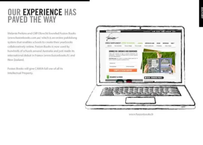
This slide shares the background of Canva’s founders. Before Canva, Melanie Perkins and Cliff Obrecht built Fusion Books, an online tool that helped schools design their own yearbooks.
Fusion Books became popular and were used by schools in Australia, France, and New Zealand. Now, Canva is using the same technology and content from Fusion Books to build something even bigger.
I think this part of the deck makes it clear—they’re not just starting with an idea, they’ve already built and scaled something similar before.
Takeaway: Team slides should prove domain expertise or relevant traction, not just general business experience.
10) Team (founder) slide
This slide introduces the core team behind Canva. Melanie and Cliff built a successful product before, so they know how to turn an idea into a real company.
Olivier brings deep tech experience and helps lead product development. Lars, who helped build Google Maps, advises them on tech and growth.
Each person brings strong skills—design, marketing, engineering, and strategy—that cover all key parts of the business.
Takeaway: Even if your team is small, showcase the key players and their strengths. Investors want to see a balanced team and any heavyweight advisors backing you.
11) Milestone
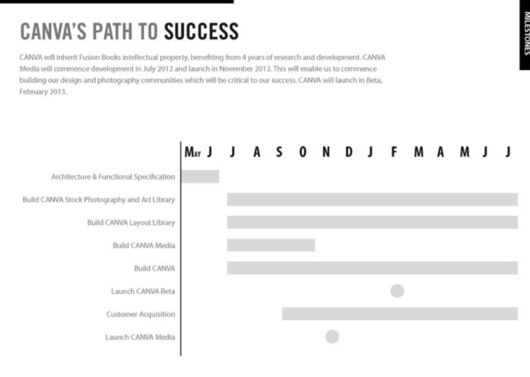
On this slide, Canva laid out its roadmap of upcoming milestones. It likely features a timeline spanning the next 12–18 months, with markers for key events: product beta launch, public launch, user growth targets, and revenue milestones.
This gave investors a sense of the company’s strategic plan and how the requested funding would be used to hit those milestones. I must say that it shows that the team had an execution plan.
Takeaway: Include a timeline of your next steps – it demonstrates forethought. A clear roadmap answers that in a concrete way.
12) Canva’s market
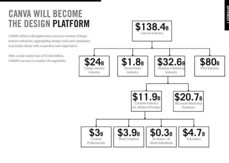
This slide shows the size of the market Canva is entering. It adds up major industries like design services, stock photos, publishing, and printing, all together worth over $130 billion.
I think that says a lot—they weren’t trying to create a new space, just enter one that’s already massive and active.
It also breaks down who the customers are, from professionals and creatives to students and everyday users.
Takeaway: Show the scope of your opportunity. If your business touches several markets or revenue streams, spelling that out can help investors grasp the full scale of what you’re going after.
Ditch your old-school pitch deck creation methods
Make compelling pitch decks in minutes with AI
Plans starting from $14/month
What did I like the most about this deck?
What impressed me wasn’t big claims or bold visuals—it was how clearly and confidently Canva explained their idea.
Here’s what stood out:
- Canva’s slides were basic. No slick design, no animations. And that actually worked in their favor. It made the pitch feel more honest and focused.
- Instead of jumping straight into the product or market size, they took a moment to explain the motivation behind Canva. That gave the whole pitch more weight.
- The deck clearly laid out what wasn’t working in the design world and how Canva fixed it. No overexplaining, just a clear before-and-after.
- There were no extra slides, no vague statements. Each one added something important to the story—whether it was the problem, the solution, or how the product spreads.
- The pitch tone is steady and confident. It feels like a team that knows where they’re going and how to get there.
Overall, they weren’t trying to impress. They were trying to communicate, and that’s what worked.
Perfect your deck and pitch using Upmetrics
After reviewing Canva’s pitch deck, one thing is clear—your slides need to be simple. No clutter, no jargon. Just a clear problem, a strong solution, and a plan that made sense. That’s exactly the kind of pitch investors want to see.
If you’re working on your own deck, Upmetrics can help. Use our AI pitch deck generator to create a clean, investor-ready deck in minutes, without needing design skills.
Need expert help with your pitch? Choose our pitch deck design services to fine-tune your final draft and prepare for fundraising with confidence.
Frequently Asked Questions
How many slides should my startup pitch deck have?
What’s one thing that made Canva’s pitch deck stand out?
How did the Canva team convince investors they could take on giants like Adobe?
What can I learn from Canva’s pitch when creating my own?

Vinay Kevadia
Vinay Kevadiya is the founder and CEO of Upmetrics, the #1 business planning software. His ultimate goal with Upmetrics is to revolutionize how entrepreneurs create, manage, and execute their business plans. He enjoys sharing his insights on business planning and other relevant topics through his articles and blog posts. Read more