Buffer’s pitch deck is a masterclass in keeping things simple—and raising serious money because of it. With just 13 slides, they raised $500,000 in seed funding and later secured $3.5 million in Series A.
No fluff, no hype—just focused storytelling that gave investors exactly what they needed to believe.
As someone who’s reviewed countless decks, I can say this one hits different. It’s not trying to impress with design tricks or big words. It impresses by showing real traction, a sharp vision, and a team that delivers.
In this breakdown, we’ll walk through what Buffer’s pitch deck nailed slide-by-slide—and why it worked. Whether you’re building your first deck or refining your tenth, there’s a lot you can borrow from Buffer’s approach to earn attention—and investment.
Let’s dive in.
About Buffer (then vs. now)
Buffer was founded in 2010 by Joel Gascoigne and Leo Widrich, born from a simple need: To schedule tweets more efficiently. Joel built a landing page to validate demand before writing a single line of code. Once he saw interest, Buffer launched as a Twitter scheduling tool—and quickly gained traction.
By the time they created their pitch deck in 2011, Buffer had:
- Just crossed $50,000 in annual revenue
- ~55,000 users
- A lean remote team
Their goal: Raise a small seed round of $500K to grow what was already working.
Fast forward to today, Buffer is a leading social media management platform for small businesses. Millions of users use it, generate multi-million dollar revenue, and are known for its radical transparency. (They even publicly share salaries and revenue numbers).
But here’s why the original deck still matters today:
It’s a masterclass in clarity, traction-first storytelling, and knowing your numbers. If you’re building your pitch deck right now, there’s a lot to learn from how Buffer laid out its slides—and how you can apply the same principles to your own.
Detailed Buffer pitch deck analysis (slide-by-slide)
Now let’s break down Buffer’s pitch deck slide-by-slide. I’ll walk you through what each slide does, why it works (or doesn’t). And how you can apply the same logic to your own pitch.
Slide 1: Title—Buffer
This first slide is simple—and that’s exactly why I like it.
As a cover slide, it does what it should: Introduces the brand without distraction. The logo is centered, the background is clean, and there’s no extra clutter, such as taglines, contact information, or unnecessary decoration.
If you’re making your deck, start with something similar: your logo, clean design, and confidence in simplicity. You don’t need to overexplain before you’ve even begun.
Takeaway: Start your pitch deck with a clean, confident logo slide. It sets the tone, shows you’re polished, and signals that you’re already thinking like a real business.
Slide 2: Social
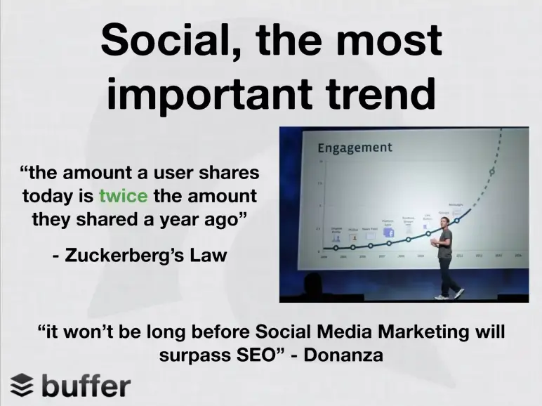
Right after introducing the brand, Buffer jumps straight into why now—why this product matters today. Smart!
Why? Because it sets the context. Before asking for money or explaining what Buffer does, they show the bigger shift: Social media is exploding. And investors need to see that your startup is riding a wave, not swimming upstream.
The use of external validation (quotes, graph, Zuckerberg image) makes the message credible and urgent without saying much themselves. That’s smart framing.
Takeaway: Always show why your startup exists now. Use data, quotes, or trends early to prove your timing is right. Investors back waves, not puddles.
Slide 3: Problem

This is where Buffer makes a subtle but powerful move—they present the problem as a question.
Instead of listing pain points, they ask: “How do you use social to drive traffic?” It forces the audience to think—and likely realize that it’s harder than it should be. That internal realization is much stronger than just telling someone a problem exists.
I liked the slide placement, right after the trend. This was they first demonstrate that social media is experiencing significant growth. Then, they zoom in on a challenge users face within that boom.
Why it works:
- Frames the problem without over-explaining
- Gets investors thinking, not skimming
- Creates a smooth setup for the solution
Takeaway: Pose your problem as a relatable question. It invites investors into the story and makes the problem feel personal, without needing extra slides.
Slide 4: Solution
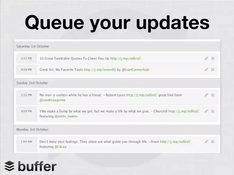
Here, Buffer introduces the solution simply and visually.
They don’t explain what Buffer is in a long paragraph. Instead, they show the product in action. One screenshot, showing their platform, lets users schedule social media posts in advance, so they can consistently share content without being online 24/7.
This is a great follow-up to the problem slide. Just after asking, “How do you use social to drive traffic?”, they answer it with a feature that solves the issue—automated scheduling.
Takeaway: Don’t describe your product—show it solving the exact problem you raised. A simple screenshot can do more than paragraphs of explanation.
Slide 5: Traction
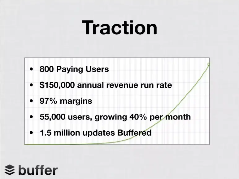
This is one of the most important slides in any deck—and Buffer nails it.
By this point, they’ve already shown the problem, the solution, and now they’re proving it works. They back it up with real metrics: Revenue, growth, engagement, and user numbers. It’s concise, data-driven, and speaks directly to what investors care about—momentum.
What I really like is the mix of qualitative scale (user growth) and quantitative strength (revenue, margins). It shows Buffer isn’t just gaining users—it’s converting them and doing it efficiently.
Takeaway: Always include a traction slide early. Let your numbers do the talking and prove that your product isn’t just an idea—it’s a growing business.
Slide 6: Milestones
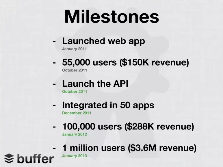
By now, Buffer has shown the problem, the solution, and proof that it’s working. This is the perfect time to shift gears and answer a key investor question: “How fast can this team move?”
Placing the milestone slide here makes sense—it builds on traction but adds a timeline. We see not just numbers, but momentum.
I like the clean, vertical format. Each milestone is tied to a specific date, mixing product launches, user growth, integrations, and revenue. It’s quick to scan and tells a story of consistent execution without fluff.
For the audience, this adds credibility. It shows Buffer isn’t just gaining users—it’s hitting real business goals at speed.
Takeaway: Use milestone slides to build trust. Combine product, user, and revenue wins in a simple, date-driven format that shows fast execution.
Slide 7: Business model
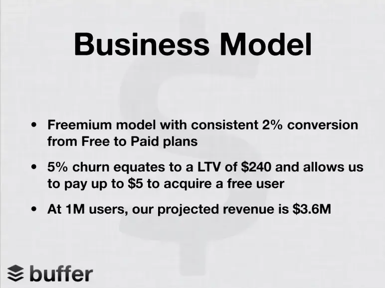
This is where Buffer answers a critical investor question: How will this make money?
Placing this slide after milestones is intentional. First, they show traction—then they explain how that traction translates into revenue. It’s all about timing: they’ve earned the right to talk about revenue because they’ve already proven growth.
The format is clean: Bullet points, plain language, and direct unit economics. It highlights conversion rates, lifetime value, CAC limits, and revenue projections—all at a glance.
For investors, this is a confidence booster. The model is simple (freemium), the math is clear, and the assumptions are tied to real usage.
Takeaway: Keep your business model slide short, direct, and data-backed. Show you understand how users turn into dollars—and how the model scales.
Slide 8: Social media landscape
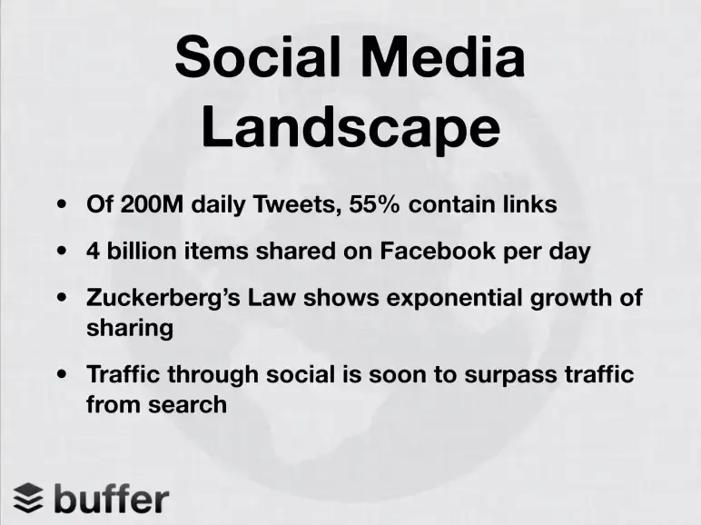
Before asking for investment, Buffer does something smart—they prove the wave they’re riding is only getting bigger.
By now, they’ve shown product, traction, and business model. But here’s where they zoom out and let macro trends do the talking. Instead of boring market size charts, they drop hard-hitting stats.
Those stats reframe that Buffer is not just a tool, but a gateway into the future of how the internet works.
One small thing they could’ve added? A direct link back to Buffer. Something like: “And that’s exactly what we help businesses do—ride the social sharing wave.” Just a single line to turn data into direct relevance.
Takeaway: Show investors the trend behind the trend. Use sharp stats to prove that you’re not just solving a problem—you’re solving the right problem at the right time.
Slide 9: Social proof
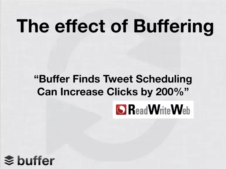
I love it when a startup lets its results speak. After showing the growing social trend, Buffer inserts a power move—a third-party quote saying tweet scheduling increases clicks by 200%.
This slide isn’t just a stat. It’s validation from ReadWriteWeb, not from Buffer’s blog or internal data. And its timing is sharp, right after the market size argument. First, they show why social matters; now, they show how well Buffer performs in it.
It’s short, bold, and earns instant credibility. No charts. No feature lists. Just one powerful number and a source that backs it.
Takeaway: Use third-party proof to break skepticism. A well-placed quote can do more than a dozen bullet points ever could.
Slide 10: Integration strategy
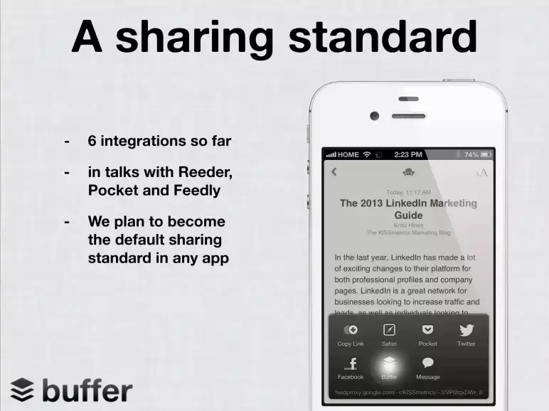
Once Buffer built trust through traction and social proof, they took a bold leap: We’re not just an app—we want to become infrastructure.
This vision slide, placed toward the end of the deck, plants a bigger idea in the investor’s mind. Buffer isn’t stopping at helping users schedule tweets—they’re aiming to be the default sharing option inside every content app.
The format is subtle but effective. One headline, three lines of text, and a phone mockup that shows Buffer baked into a sharing flow. That simplicity makes the vision stick.
Takeaway: Vision isn’t about fluff—it’s about showing where you’re headed and how you’re getting there. If you want to win investor imagination, anchor your big ideas with current traction.
Slide 11: Competition
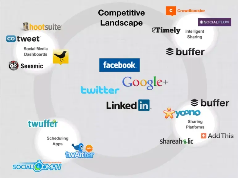
I like how this slide doesn’t just say Buffer is different—it shows it. Positioned right after the “vision” slide, it grounds their ambition in reality by tackling the competition head-on.
The slide groups competitors by function in a quadrant-style layout. It’s not labeled like a typical 2×2, but the visual clustering works—it intuitively separates dashboards, publishers, scheduling tools, and intelligent sharing. Logos replace text, making it easy to scan, while Buffer appears in more than one group, subtly reinforcing its range.
Visually, though, it’s a bit dense. A subtle highlight on Buffer’s logo or a guiding label could’ve added clarity. Still, as a mid-deck slide, it works well to answer the classic investor question: How are you different?
Takeaway: Show you understand your space. Don’t just name competitors—map them, and spotlight how you’re different.
Slide 12: Team
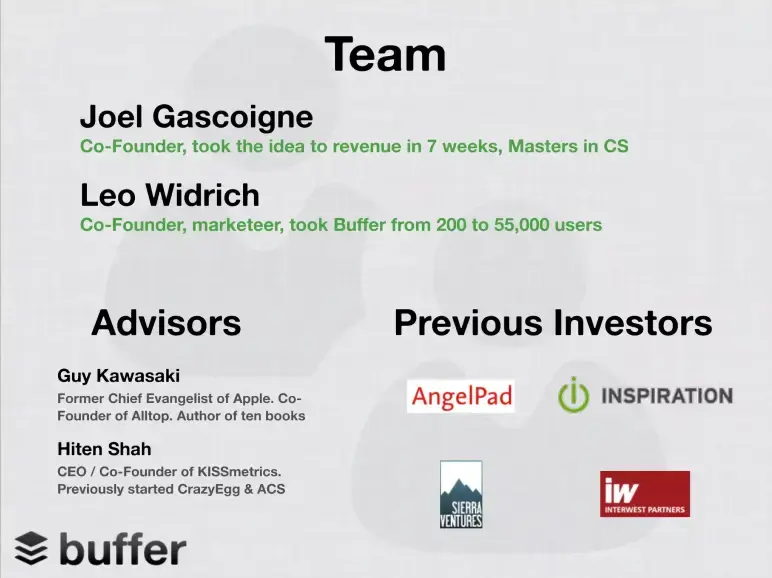
Well-placed near the end, this slide builds confidence in the people behind the product. Joel’s speed (revenue in 7 weeks) and Leo’s growth skills (200 to 55K users) speak directly to execution. No fluff—just results.
Big-name advisors like Guy Kawasaki and Hiten Shah add credibility, while AngelPad and early investors signal early validation.
I think it’s a lot on one slide, and could be cleaner with headshots or clearer investor labels—but it still delivers the key message: this team can build, grow, and attract the right people.
Takeaway: Highlight traction-backed achievements, not just titles. Show investors your team doesn’t just have experience—they get results.
Slide 13: Contact

Buffer ends with exactly what’s needed—nothing more, nothing less. A simple contact email, [email protected], on a clean background. No clutter, no “thank you,” just an open line to both founders.
The shared email feels intentional—it reinforces accessibility and the team’s transparent brand. Plus, it’s easy to remember and perfect for follow-ups after the pitch.
Could they have added a URL or Twitter handle? Maybe. But honestly, the simplicity works.
Takeaway: Always end with clear, simple contact info. Make it effortless for investors to reach you and keep the final impression crisp.
What did I like the most about this deck?
Here’s what stood out to me the most in Buffer’s pitch deck—clear signals investors care about, presented with focus and intent:
- Showed traction upfront with real numbers, not vague promises
- Framed the problem through a relatable question, making the solution obvious
- Used smart data instead of inflated TAM to validate market demand
- Demonstrated clear execution before talking about future potential
- Addressed competition directly with a thoughtful visual layout
- Built trust by showcasing founder’s results and credible advisors
Perfect your deck and pitch using Upmetrics
I’ve seen a lot of pitch decks, but Buffer’s stands out for one key reason—it’s all signal, no noise. No flashy visuals, no filler slides—just clean, direct storytelling that gets to the point. Every slide earns its place.
That’s something I always advise: Keep it lean, focused, and intentional. Investors don’t want a tour—they want clarity and confidence.
However, if you’re working on your own deck, a platform like Upmetrics can help structure your thoughts in an investor-ready pitch deck using AI. Moreover, if you’re still shaping your business model, Upmetrics also helps you craft a solid business plan to back your pitch with strategy and numbers.
Hope you enjoyed studying the pitch slides! Good luck on turning your vision into something fundable—start smart, stay focused, and let your deck do the talking.
Frequently Asked Questions
What if I don’t have traction like Buffer yet?
How did Buffer address a crowded market?
How to highlight your team like Buffer?

Vinay Kevadia
Vinay Kevadiya is the founder and CEO of Upmetrics, the #1 business planning software. His ultimate goal with Upmetrics is to revolutionize how entrepreneurs create, manage, and execute their business plans. He enjoys sharing his insights on business planning and other relevant topics through his articles and blog posts. Read more