I’ve reviewed over 50 iconic pitch decks, and Facebook’s still stands out. Why? Because in just 26 slides, it helped raise $500K in seed funding and turned a dorm-room idea into an investor magnet.
No flashy design, no buzzwords—just raw traction, user obsession, and bold ambition.
If you’ve ever wondered how much traction is enough, how early is too early to monetize, or whether you need a problem slide, this deck answers all of it.
In this teardown, I’ll break down what Facebook’s pitch deck nailed, what could’ve been tighter, and what you can borrow for your own pitch. Whether you’re pre-revenue or scaling, there’s something here for every founder serious about raising money or refining their story.
Let’s dig in.
About Facebook (then vs. now)
In 2004, Facebook was a scrappy college network called TheFacebook.com, built by Harvard students Mark Zuckerberg, Eduardo Saverin, Dustin Moskovitz, and Chris Hughes.
It had no revenue, no real business model—just a rapidly growing user base across Ivy League campuses. Their pitch? Expand to 200+ colleges and figure out monetization later.
Fast forward to 2025, and that dorm project is now Meta—a global tech giant connecting 3 billion+ users through Facebook, Instagram, WhatsApp, and more.
What started as a college directory evolved into one of the world’s most powerful advertising platforms, generating tens of billions of dollars in revenue.
This makes revisiting Facebook’s original pitch deck all the more fascinating. It’s a front-row seat to how one of the world’s most influential companies told its story at the very beginning.
Let’s dive in.
Detailed Facebook pitch deck analysis (slide-by-slide)
Let’s rewind to 2004 and break down Facebook’s original pitch deck, one slide at a time. Each slide offers a glimpse into how a dorm-room idea began its journey to global dominance.
Slide 1: Cover slide
This isn’t just a title slide—it quietly signals Facebook’s early intent. By calling it a Media Kit, Facebook positions itself not just as a social tool, but as a platform ready for advertisers.
Instead of pitching to VCs in typical startup fashion, they’re targeting brands early. That’s bold. It shows confidence that their college audience is worth advertising to, even with no revenue yet.
Takeaway: Your cover slide isn’t just design—it’s messaging. Use it to plant your positioning early, especially if you’re pitching something unconventional.
Slide 2: Table of contents
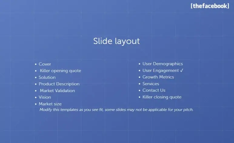
A table of contents in a pitch deck? Unusual, but Facebook includes one right up front. It lists all the sections—from “Opening Quote” to “Contact Info”—giving readers a roadmap.
For a media kit or leave-behind, it’s helpful. Ad buyers could skip to the pricing or targeting slides without reading the whole deck. It also signals a structured narrative—Facebook wasn’t winging it.
However, it takes up space without adding real value. Plus, some headings don’t match actual slide titles, which may confuse readers.
Takeaway: Include a contents slide only if your deck is lengthy and intended to be browsed independently. Otherwise, get to the story—fast.
Slide 3: Killer opening quote
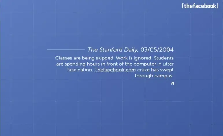
I love how Facebook starts strong here. Instead of a product blurb or founder quote, they drop a full-page headline from The Stanford Daily.
This is bold and brilliant. As a reader, I’m not being told Facebook is growing—I’m shown that people are literally addicted. That’s rare in early-stage decks. Most startups would open with “the problem” or a stats graph.
But Facebook leaned into the cultural moment they had already sparked, and it made me lean in too. That kind of buzz speaks louder than any mission statement.
Takeaway: If you’ve genuine user love or media buzz, showcase it early. Just ensure it doesn’t come at the cost of clarity.
Slide 4: What is Thefacebook.com
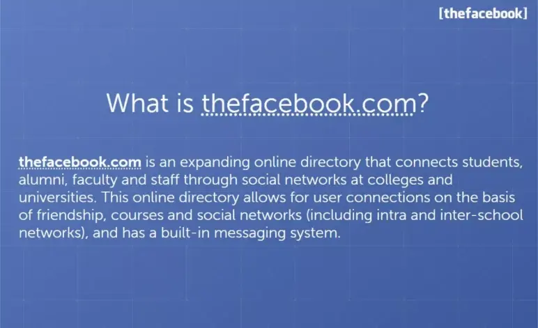
Slide 4 finally answers the big question: What is thefacebook.com? After that striking opening quote, this slide brings us back to the point with a clear, no-frills explanation.
As I read it, I could see how focused the founders were on keeping it simple—no buzzwords, just a straight explanation of how the product works.
The beauty here? Clarity—I didn’t need a demo to get what the product was about. That’s the real lesson: If you can describe your product in one paragraph and I instantly understand it, you’re already ahead.
Takeaway: If you can explain what your product does in plain English and make someone nod along thinking, “I get it,” you’re doing it right. Clarity builds confidence.
Slides 5 & 6: User profile features
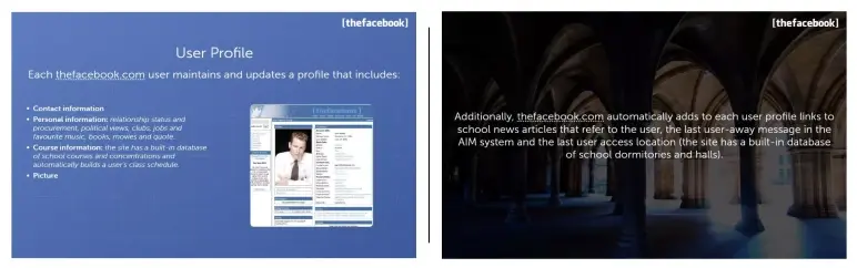
The first slide shows a screenshot of an actual Facebook profile page from 2004, giving investors a real look at the product in action. Instead of explaining features, it lets the product speak, which eliminates guesswork and makes it easy for investors to grasp the experience.
Then, slide 6 pulls in dynamic info like school news mentions, last AIM away message, and login location—quirky, student-centric touches that kept profiles fresh and engaging.
The screenshots prove the product is live and usable. The list of profile features shows early signs of engagement—students are inputting personal and academic info, suggesting real utility. It makes clear this isn’t just a concept; it’s working, and users are participating.
However, I feel the slide is a bit text-heavy. Some details (like AIM statuses) aren’t core to the pitch and could be trimmed to keep focus on what matters.
Takeaway: If your product is real, show it. Let investors see the experience, not just hear about it.
Slide 7: Social networking function
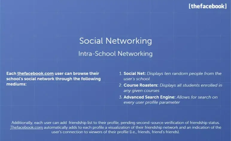
This slide focuses on how users connect on Facebook by searching names, classes, or clubs. And once users are connected, their mutual friends show up on each other’s profiles.
That’s the social loop investors want to see—users inviting others, forming connections, and spending more time on the platform.
It’s also a smart slide placement. After showing what’s on a profile (Slides 5 & 6), this one naturally answers: “Now what can users do with it?” The clear, logical flow reinforces the idea that Facebook wasn’t just a place to be seen—it was a place to connect.
Takeaway: Keep slide titles aligned with their content. Don’t just describe product features—show how they tie into user behavior and platform growth.
Slide 8: Intra-School Networking
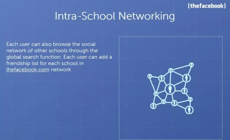
This slide is light on content—just a visual graph and a short paragraph. But from a slide design and storytelling perspective, it’s doing a bit more than it seems.
̧By showing that students could connect with other schools, they’re planting the seed for scale. They were no longer building just a Harvard network; they were building a college-wide web.
But let’s be honest: The execution is thin. This could have easily been folded into the previous slide, which already touched on network connections. Or merged with the upcoming transition slide that’s about the expansion of thefacebook.com.
Takeaway: Every slide in your pitch deck should do work. If it’s not introducing a new insight or building momentum, it might be better off merged or removed. Clean structure matters—and sometimes, one great slide beats two okay ones.
Slide 9: Our school expansion
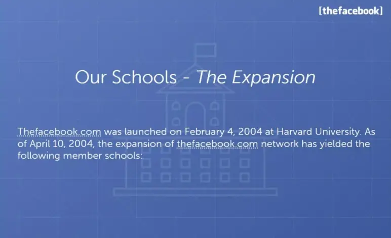
This slide acts as a clear transition point in the deck, from explaining what Facebook is to showing where it’s working. It doesn’t try to impress with features or metrics; instead, it sets the stage for the upcoming traction data.
It creates breathing room. After a string of product-focused slides, this shift to “Here’s where we’ve launched” gives investors context before diving into detailed rollout tables.
However, the title “Our Schools” could be more specific—something like “Live Campuses” or “Where We’re Active” might’ve been clearer. Otherwise, its minimalism is purposeful.
Takeaway: Use transition slides to reset the narrative and guide your reader, especially when shifting from product to traction.
Slides 10 & 11: Schools Launched
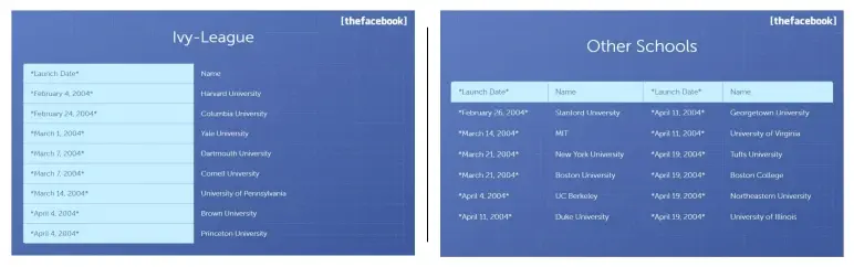
These two slides work as a unit, and they do exactly what early-stage investors want at this point in the deck: Show traction clearly and credibly.
Slide 10 opens with Ivy League schools, anchoring Facebook’s rollout in prestigious, high-demand markets. Slide 11 picks up from there, expanding the list with other top universities like Stanford and MIT.
The layout is simple: School names and launch dates in a clean table format. It’s not flashy, but that’s what makes it work. It lets the traction speak for itself.
Takeaway: When showcasing traction, be direct. Dates and names in a readable table beat vague hype every time. Keep it clean, and let your momentum shine.
Slide 12: Expansion plan
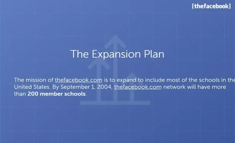
Slide 12 is one of my favorites because it shows just how powerful a single, well-crafted sentence can be. Visually, it’s clean—just one goal on the slide: “Over 200 member schools by September 1, 2004.” That’s it. But that number, paired with a date, does a lot of heavy lifting.
From a deck-structure perspective, this is the perfect moment for it. We’ve just seen where Facebook has launched—now it’s time to hear where they’re headed.
What do I like most? The specificity. It’s not a vague growth dream. It’s a concrete, time-bound milestone.
Takeaway: After showing proof of demand, don’t just say “we want to grow.” Show what growth looks like—clearly, briefly, and boldly.
Ditch your old-school pitch deck creation methods
Make compelling pitch decks in minutes with AI
Plans starting from $14/month

Slide 13: Audience
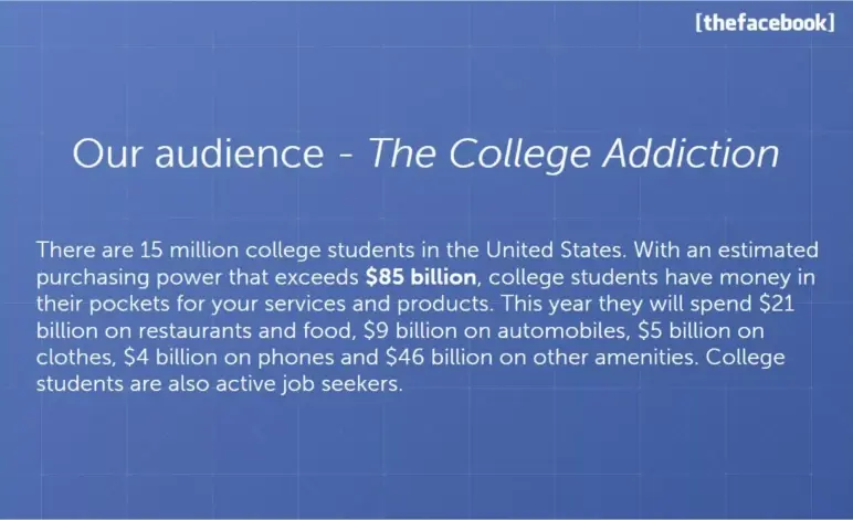
Slide 13 is where the deck zooms out and connects the dots between users and business. I liked how it shifted from “who’s using Facebook” to “why this market matters.” It’s simple, but strategic.
From a slide-design angle, it likely relied on stats and punchy text. I would’ve liked to see more visual weight—like bold callouts or a clean graphic—but the point still lands.
Takeaway: After traction, investors want to know how big this can get. Use your audience’s size and spending habits to prove there’s real business potential behind your product. This slide did exactly that, with focus and clarity.
Slide 14-16: User base demographics
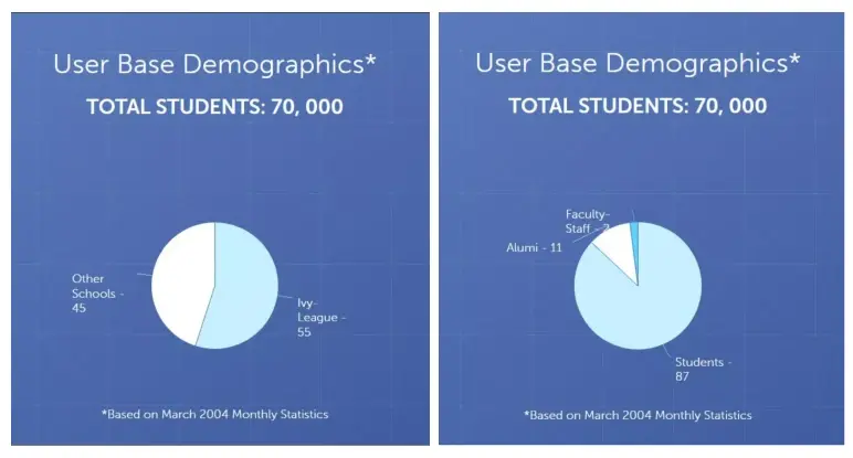
Instead of just saying “we have users,” Facebook shows exactly who those users are. Slide 14 opens with a meaningful number and a simple chart. That signals reach and relevance beyond early adopters.
Slide 15 adds depth, showing the user base includes not just students, but alumni and even faculty. That hints at retention and cross-campus stickiness—a good sign for long-term value.
Slide 16 closes the section with gender and age stats. It’s confirmation that Facebook appeals broadly, with a balanced split and strong 18–24 presence—ideal for advertisers.
The insight is strong, but the format could’ve been tighter. These three slides could’ve easily been one. The repetition slightly stalls the pitch’s pace.
Takeaway: Demographic proof builds trust, but condense where you can. One powerful visual slide often beats three that repeat the same story.
Slide 17-18: Site usage
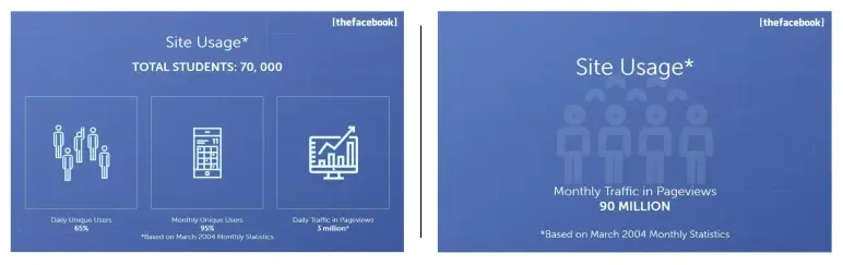
These two slides are smartly placed—they come right after all the who’s using it and how fast we’re growing sections. Now it’s time to answer the silent investor question: “Okay, but are people using it?”
Slide 17 hits daily engagement. Slide 18 zooms out to monthly. Together, they do one thing well: They validate that Facebook isn’t just spreading—it’s sticking. The charts give visual weight to the numbers already discussed earlier. And by keeping it clean and focused, these slides avoid overwhelming the viewer.
From a deck design perspective, this is textbook: Use visuals to reinforce what you’ve been saying without needing more text.
Takeaway: After showing growth and reach, give your audience usage proof—ideally with visuals. It grounds your story in real behavior, which builds trust.
Slide 19: Press Quote (Mid-Pitch) – The Daily Pennsylvanian
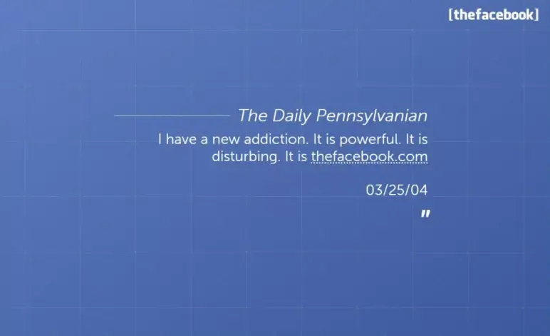
This slide comes in at just the right moment. After a stretch of charts and numbers, it acts like a sharp inhale—a breather that brings the story back to the user voice.
I like how it resets the rhythm. It reminds me that behind all the traction and stats, real people are hooked on this product. That’s the kind of social proof no spreadsheet can deliver.
Would I include a quote slide in my own deck? Maybe—but only one. If I did, I’d place it just like this: right after heavy data, to punch up emotion and keep attention alive.
Takeaway: A well-timed quote can re-engage your audience. Use it as a narrative reset, not as filler. And pick one that says a lot, fast.
Slide 20: User growth rate
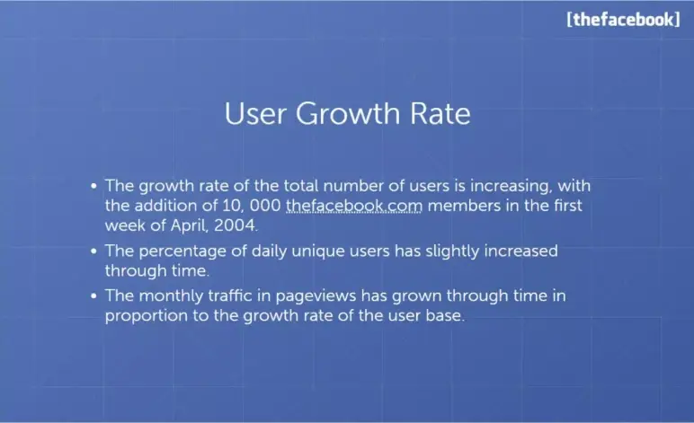
I see this slide as the punchline to all the buildup before it. After showing who’s using Facebook and how often, this one answers the key investor question: “Okay—but is it growing?”
The bullet format works well here. It’s fast to read, clean, and confident. I like that it’s not trying to be flashy—it’s just letting the numbers speak. That simplicity adds to its credibility.
The placement is smart, too. It’s timed to land right after user excitement and engagement, so it feels like momentum is accelerating.
Takeaway: Your traction slide should be a crescendo. Keep it clean, pick only strong metrics, and let them carry the weight. This is your “show, not tell” moment—so make every bullet count.
Slide 21: Online marketing services
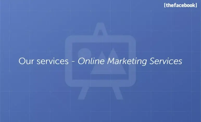
When I saw this slide, I immediately recognized it as a signal—we’re shifting gears. Up until now, it’s been all about user growth and product adoption. This simple title slide marks the start of Facebook’s business model section.
Is it minimal? Yes. But in context, it serves a purpose: It reorients the audience. For decks that double as sales tools (like Facebook’s early pitch), section breaks like this can be useful, especially if advertisers are also in the room.
Takeaway: Use section headers when clarity or audience shift demands it, but only if the pause adds value. Otherwise, keep the narrative flowing.
Slide 22-23: Advertisement
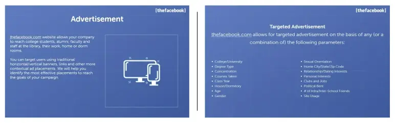
This pair of slides is all about clarity. Slide 22 lays out the basic ad model—who pays, and what they’re buying. It doesn’t try to oversell. Just enough to say, “Here’s how we plan to make money.”
Slide 23 follows up with the why it’s different—hyper-specific targeting. Not just ads, but ads filtered by school, class year, major, and even interests. That detail is what transforms this from a basic monetization idea to something investors could see scaling.
Takeaway: When you introduce your revenue model, don’t stop at “we’ll sell ads” or “we charge X.” Layer in what makes it work better than others. Sequence matters: start with the business, then show the edge.
Slide 24: Rates
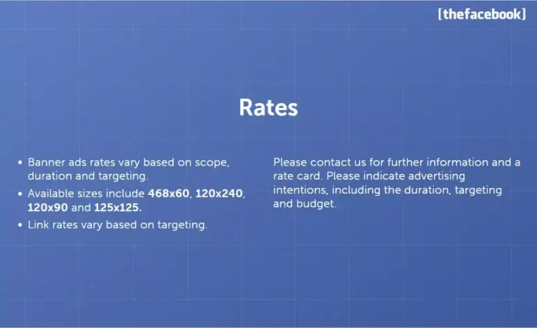
This slide outlines how Facebook will price ads based on banner size, campaign scope, duration, and targeting depth. It’s clean and strategic, giving a high-level view of the monetization model without overloading details.
I like that it shows thought behind ad value: Bigger banners or wider reach cost more. It’s early-stage, but the logic is solid.
Takeaway: Make use of pricing slides to show revenue mechanics clearly. No need for exact numbers—just enough structure to prove the model has legs.
Slide 25: Contact us
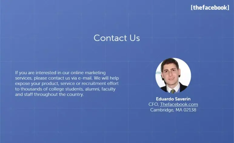
The contact info slide wraps the deck with a clear point of action—a contact for ad inquiries. I see this as a smart move if the primary audience is advertisers. It signals: “We’re ready. Reach out.”
From a layout standpoint, it gives the deck a clean endpoint. I like that it personalizes the close—one name, one channel, no confusion.
Takeaway: Always align your final slide with your audience. If you’re targeting advertisers, a direct contact works. But for investors, end with your team—people invest in founders, not just ideas.
Slide 26: Closing quote
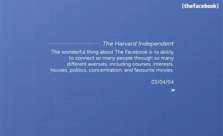
I like how this final slide brings the pitch back to emotion, closing not with data, but with a reflection on what the product means to its users. It’s not just about growth or revenue; it’s about connection. Ending on a quote helps me feel the product’s impact, not just understand it.
For investors, it quietly reinforces that users genuinely love the product. For advertisers, it reminds them of the platform’s cultural reach.
Takeaway: End your deck with emotional clarity. After all the logic and traction, remind your audience why your product matters in the real world. A thoughtful quote or a resonant final message leaves the room thinking this is more than just a startup.
What did I like the most about this deck?
Not many decks get straight to the point and still manage to be memorable—Facebook’s did. It didn’t try to impress with design tricks; it let the product and numbers do the talking.
Here’s what I liked about this deck:
- Loved how they opened with traction—instant credibility without wasting a slide on hype.
- No formal “problem” slide, yet the pain point was obvious just by how people reacted.
- Every number felt earned—user growth, school count, usage stats—it all stacked up.
- The expansion plan showed real ambition; you could see this scaling way beyond campus.
- Their ad targeting pitch felt ahead of its time, like they already knew the future of ads.
- The flow was tight—each section built naturally into the next without getting lost.
- That Stanford quote? Perfect opener. The Harvard one at the end? Smart emotional close.
- Slides were clean, focused, and didn’t waste time—everything had a reason to be there.
Perfect your deck and pitch using Upmetrics
A great pitch deck doesn’t just tell your story—it proves you’re worth betting on. Facebook’s deck showed us that traction, clarity, and confidence matter more than flashy design. It kept things simple, data-driven, and forward-looking—and that’s what made it powerful.
If you’re building your pitch, tools like Upmetrics make it 10x easier. From AI-powered pitch deck generator to guided business plan writing, we help you nail the story, structure, and numbers—all in one place.
Whether you’re raising capital or clarifying your vision, Upmetrics gives you everything you need to pitch with purpose. Curious about the cost? Upmetrics pricing starts from just $14.
Start strong, stay focused, and let your pitch do the convincing.
Frequently Asked Questions
Do I need a problem slide if Facebook didn’t have one?
Should I include quotes in my pitch deck?
Can I use one deck for investors and customers?

Vinay Kevadia
Vinay Kevadiya is the founder and CEO of Upmetrics, the #1 business planning software. His ultimate goal with Upmetrics is to revolutionize how entrepreneurs create, manage, and execute their business plans. He enjoys sharing his insights on business planning and other relevant topics through his articles and blog posts. Read more