Notion is now a go-to tool for teams, creators, as well as solo users who want to keep their notes, tasks, and docs in one clean, organized place.
But rewind a bit, it looked very different. It was still an early product, trying to get off the ground. The team had shipped a first version, but it wasn’t gaining traction, and they needed money to keep going.
So what did they do?
They pitched. A simple, clear story about the future of productivity. And it worked.
Today, I’m breaking down that early deck (which helped them raise $2M in seed funding) and what early-stage founders can learn from it.
Let’s take a look at the actual slides from Notion’s pitch deck.
About Notion (then vs. now)
Notion started in 2013 in San Francisco with a clear goal to build one simple tool that could handle notes, tasks, wikis, and databases.
The company was started by Ivan Zhao and Simon Last, with a clear focus on building a simple, all-in-one workspace. After rebuilding the product a few times, they released Notion 1.0 in 2016, followed by a more polished version—Notion 2.0—in 2018.
At the time of this pitch, Notion had a small team of fewer than 10 people. They had raised limited funding (just a ~$2 million seed round in 2013) but a passionate user base.
By 2019, they had reached 1 million users and secured another $10 million in funding at an $800 million valuation. This growth came mainly from people finding the product useful and sharing it with others.
Today, Notion is valued at over $10 billion after a Series C raise of $275 million in 2021. Its user base has grown from that early 1 million to over 100 million users worldwide as of 2024.
Notion’s all-in-one workspace has become a cornerstone productivity tool for individuals and enterprises alike, and it has come a long way from its scrappy startup days.
Going from a simple pitch to a tool used by 100M people, Notion’s rise makes their early deck especially interesting to review.
Detailed Notion pitch deck analysis (slide-by-slide)
Here’s a quick slide-by-slide breakdown of Notion’s pitch deck—what each slide covered, why it worked, and where it stood out.
No fluff. Just the key points that show how the story is structured and what makes it effective.
1) Slide 1: Cover
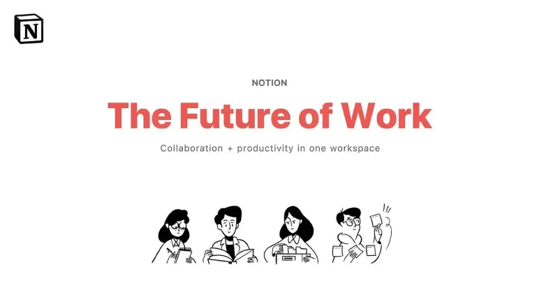
This opening slide sets the tone right away. The title is big and bold—“The Future of Work”—paired with a short line underneath that hints at the core idea: Collaboration and productivity in one place.
There’s no clutter, just a simple illustration and clean layout. It feels confident without trying too hard, which makes a solid first impression.
Takeaway: A clear, strong title and a short line is all you need to set the vision upfront.
2) Slide 2-3: Problem
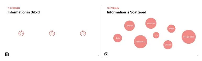
This slide show what happens when teams work in silos. Marketers store files in one place, engineers in another, and no one has the full picture.
Everyone’s busy, but not really working together. Then it zooms out to the bigger issue—tool overload. Notes in Evernote, tasks in Trello, docs in Google Drive, design in Dropbox. Instead of doing the work, everyone is jumping between tabs trying to find it.
I think that’s spot on. Most teams today feel this pain. The tools don’t talk to each other, and it slows everything down.
Takeaway: Don’t just describe the problem—make it real. Use simple, everyday examples that your audience will recognize instantly.
3) Slide 4-6: Problem impact
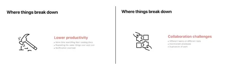
This slide explains what scattered work actually does to teams. First, it kills productivity. People waste time hunting for documents, redoing work, and getting pinged with notifications that don’t matter.
Then there’s the collaboration mess. Teams use different tools, no one’s on the same page, and things get missed or duplicated. It slows everything down.
And finally, it’s hard for an organization to have a shared understanding. Information sharing across departments or locations can be difficult, and there’s no shared space where work is clear and trackable.
Takeaway: Explain what the problem causes: missed info, slow work, and poor teamwork. Be clear and direct.
Ditch your old-school pitch deck creation methods
Make compelling pitch decks in minutes with AI
Plans starting from $14/month

4) Slide 7: Solution
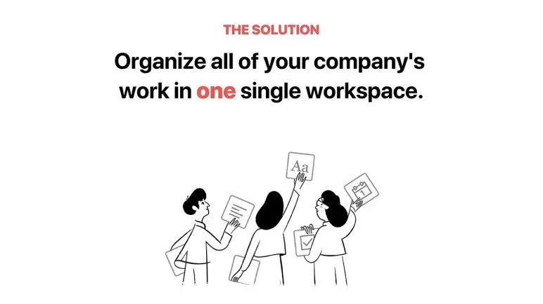
This Notion slide explains what Notion actually does. It brings docs, tasks, notes, and projects into one shared workspace—so teams don’t have to juggle five tools just to get one thing done.
Instead of switching between apps, everything lives in one place. That makes work easier to manage, faster to find, and simpler to share.
Takeaway: Keep the solution clear and practical. Show how it simplifies daily work, saves time, and cuts down on tool overload.
5) Slide 8: What Notion does
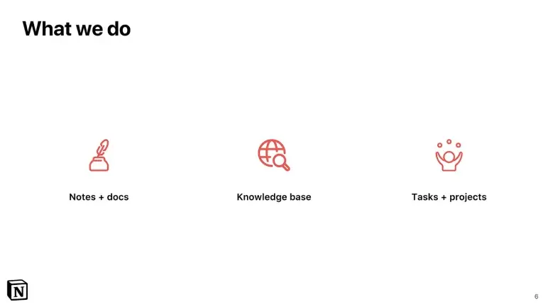
This slide 8 lays out what Notion actually looks like in action. It’s a workspace where users can write docs, track tasks, take notes, and organize all their team’s points or knowledge, together, in one place.
The point is to stop bouncing between tools. With Notion, everything’s built to work side by side—clean, fast, and fully connected.
Takeaway: Focus on core use cases, not features. Keep the language simple and user-focused so investors instantly get what the product helps people do.
6) Slide 9: Unified platform
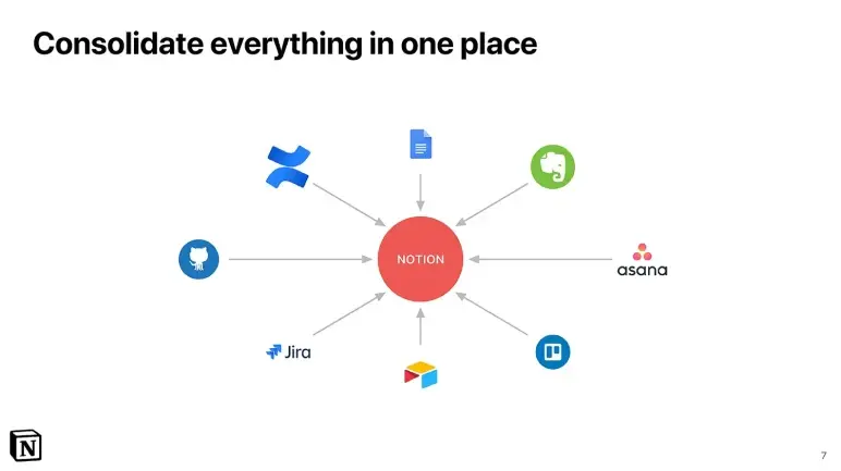
In this 9th slide, Notion founders show what they built after seeing how messy team workflows had become. People were using Trello for tasks, Confluence for docs, Jira for tracking, and switching between them all day.
This led them to make one place where everything works together—notes, tasks, docs, and projects. No more jumping between apps.
And I think this makes the product easy to get. It’s not just helpful—it replaces tools people already use, in a much simpler way.
Takeaway: Clearly show how your product brings everything into one place and makes work simpler.
Ditch your old-school pitch deck creation methods
Make compelling pitch decks in minutes with AI
Plans starting from $14/month
7) Slide 10-11: Product demo
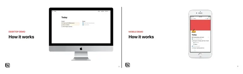
These two slides give a quick look at how Notion actually works—first on desktop, then on mobile.
On the desktop, it’s clean and distraction-free. Just open the app, write your to-dos, check things off, and drag tasks around. Fast and simple.
Then comes mobile. Same list, same layout, everything updates automatically. You get the full experience, just on a smaller screen.
This short demo does the job—it proves Notion is real, usable, and already working well across devices.
Key takeaway: Show your product working across platforms. Even a simple demo builds confidence and makes the pitch feel real.
8) Slide 12-13: Social proof
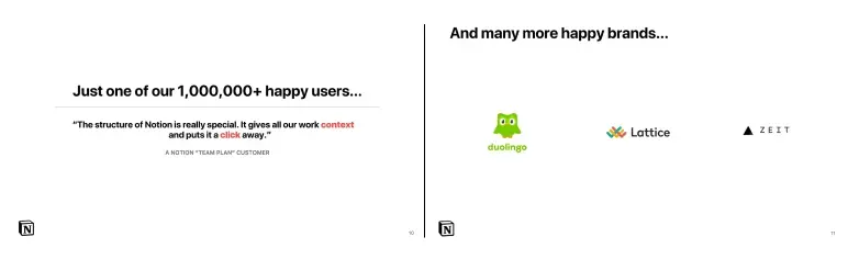
These slides show real traction. The product already has over a million users—not just individuals, but full teams using it to stay organized. A quote on the slide sums it up: it keeps everything in one place and is easy to access.
Even better, known companies like Duolingo, Lattice, and ZEIT are already using it. That kind of early trust shows this is more than just a new tool—it’s something teams actually need.
Takeaway: Show real proof. Numbers and familiar names go a long way in making your product feel legit.
9) Slide 14: Why does it matter
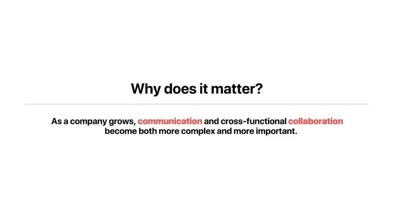
This slide sets up why this solution (I mean “Notion”) matters. As companies grow, communication gets harder, and teams start using too many different tools. Things slip through the cracks, updates get missed, and teamwork slows down.
It explains the need for a simple, shared space where teams can stay clear, connected, and work in one place.
Takeaway: Highlight why the problem is worth solving. Make it relatable, scalable, and easy to agree with.
10) Slide 15: Branding
Slide 15 focuses only on the Notion logo, no headline, no message, just the cube and the “N.” It’s simple, but it feels a bit unnecessary since the logo appears throughout the rest of the deck.
Still, many pitch decks include a separate brand slide to create a pause or set the tone.
And yes, I need to add that it could be more effective by adding a short line about what the product does would give it more meaning.
Takeaway: A logo-only slide can support pacing or branding, but if it doesn’t serve a clear purpose, it ends up wasting valuable space in a short deck.
11) Slide 16-17: Appendix transition slides
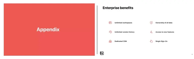
Slide 16 serves as a section divider—it signals that the next few slides are supporting material, not part of the core story. But it feels unnecessary. A simple title on the next slide could’ve done the job without adding bulk to the deck.
Slide 17 lists enterprise-focused features like SSO, unlimited workspaces, and dedicated support.
While it shows Notion is ready for large teams, the benefits would land better if connected to actual enterprise needs or examples.
Takeaway: Only add appendix slides if they bring real value. Avoid filler. And when listing benefits, don’t just name features—show why they matter to your target audience.
12) Slide 18-19: Company timeline (phases 1 to 5)
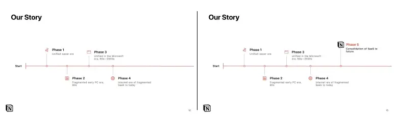
These slides show a five-phase timeline of how workplace tools evolved—from paper to PCs, then Microsoft, then the current fragmented SaaS era. Slide 18 stops at Phase 4 (today), and Slide 19 introduces Phase 5: Notion’s vision of the future, where everything gets consolidated again.
Here, I’d say that visually, it’s clean and easy to follow, but splitting it into two slides feels unnecessary. The message could’ve landed just as well on one complete timeline.
Takeaway: Use timelines to show clear shifts over time, and make your product feel like the natural next phase.
What did I like the most about this deck?
Notion’s pitch deck doesn’t rely on flashy design or big promises—it stands out because it communicates clearly, slide by slide.
Here’s what I like the most about this pitch:
- The problem was easy to understand. Just seeing those scattered app logos made the issue clear. It was a smart, visual way to show what wasn’t working.
- The deck followed a clear structure—from the problem to the solution, product, traction, and vision.
- Notion also showed early results. They highlighted over 1 million users, paying customers, and a strong user quote, enough to prove real demand.
- The pitch balanced vision with facts. “The future of work” wasn’t just a buzzword—they backed it up with a clear product and real features.
- The design was clean and matched their brand. Minimal slides, simple icons, and good spacing made the whole deck feel polished and professional.
Perfect your deck and pitch using Upmetrics
After reviewing Notion’s pitch deck, one thing is clear—your slides don’t need to be complex. A clear problem, simple visuals, strong structure, and proof of traction go a long way. That’s exactly how Notion made its case.
Working on your own pitch deck? Upmetrics can help. Use our AI pitch deck creator to build a clean, investor-ready deck without overthinking the design.
Want expert input? Choose our pitch deck design services and get the support you need to fine-tune your deck—clearer slides, stronger story, and a pitch you’ll feel ready to share.
Frequently Asked Questions
What key slides should I include in my pitch deck?
How do I highlight traction if I’m just starting out?
How many slides should my pitch deck have?
Should I include a demo or product screenshots in my pitch deck?

Vinay Kevadia
Vinay Kevadiya is the founder and CEO of Upmetrics, the #1 business planning software. His ultimate goal with Upmetrics is to revolutionize how entrepreneurs create, manage, and execute their business plans. He enjoys sharing his insights on business planning and other relevant topics through his articles and blog posts. Read more