Uber? Of course, we all know!
Tap a button, get a ride—simple, fast, and way better than waving at taxis.
Today, it’s worth over $190 billion, runs in 70+ countries, and does everything from ride-hailing to food delivery.
But what got them started?
I would say, “It was a well-thought-out idea, a detailed understanding of the market, and a perfect product-market-fit.”
Today, I’m analyzing Uber’s first-ever pitch deck (which helped them raise $200K in seed capital), trying to break it down, and take out a few takeaways.
Here we go!
About Uber (then vs. now)
Back in 2009, Uber wasn’t an app. It wasn’t a global brand. It wasn’t even called Uber—it was still “UberCab,” and it only existed as a rough test website.
The idea came out of a simple frustration: When Garrett Camp and Travis Kalanick couldn’t get a cab in Paris, it sparked the thought—what if getting a ride was as easy as pressing a button?
At the time of this deck, there was no app, no brand—just a test website, a handful of rides, and a plan to raise $200K.
But even at that stage, they had something most early-stage startups don’t: a clear vision, a real-world problem, and the plan to solve it.
Today, Uber is a public company with operations in 70+ countries, brings in over $45 billion in revenue, and went public at an $82 billion valuation. Beyond ridesharing, they’ve expanded into food delivery, freight, and even autonomous driving.
The scale is massive, but the early pitch was simple, focused, and real.
I would add here: This is exactly why the deck is still a favorite in startup circles. It shows what a solid early-stage pitch looks like before the headlines, funding rounds, or hype.
Detailed Uber pitch deck analysis (slide-by-slide)
Here’s a full breakdown of the Uber pitch deck—slide by slide. I’m keeping it straight to the point: what each slide covers, what works, what could be better, and what you can learn from it.
Think of it as a quick scan guide for building a solid pitch deck of your own. Let’s dive right in!
1) Slide 1: Title
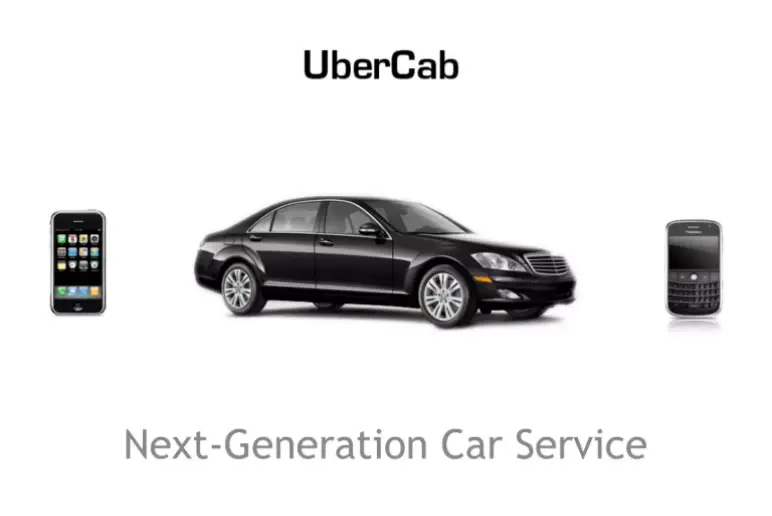
This slide introduces “UberCab” with a sleek black car between a Blackberry and an iPhone, plus the tagline “Next-Generation Car Service.”
It sets the tone for a premium, tech-driven transport experience, clearly hinting at their early target audience—urban professionals.
Takeaway: A short tagline and relevant visuals help instantly set the tone and audience focus.
2) Slide 2-3: Problem
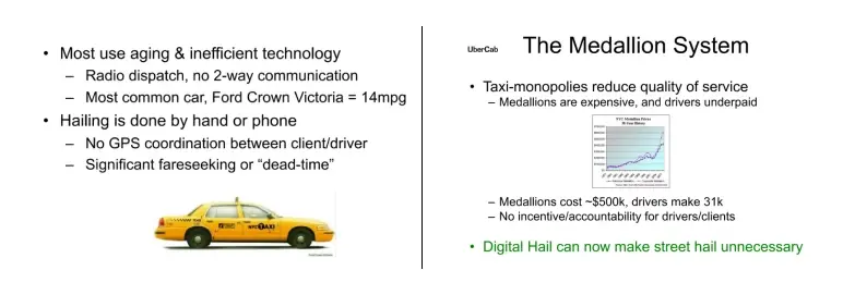
These slides show why taxis were broken in 2008: long waits, no GPS, poor driver coordination, aging fleets, and no accountability.
For drivers, barriers to entry were high, and pay was low. Riders had to flag cabs manually or call dispatch.
Here, I also note that Uber highlighted pain points on both sides of the market, showing a real need for better tech and smoother service.
Takeaway: Highlighting real frustrations from both customers and providers makes your problem worth solving.
Ditch your old-school pitch deck creation methods
Make compelling pitch decks in minutes with AI
Plans starting from $14/month

3) Slide 4-5: UberCab Concept
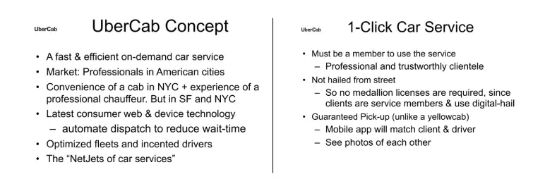
These slides lay out what Uber is and how it works!
The pitch is simple: a fast, reliable car service for busy professionals in big cities. It’s positioned as a members-only luxury alternative to taxis, with shorter wait times, cleaner rides, and better service.
Here, I need to add that the details cover both rider convenience and driver benefits, giving a clear sense of how the idea solves real-world problems from both sides.
Takeaway: When pitching, clearly show how your product works and who it’s for. Don’t assume investors will connect the dots on their own.
4) Slide 6: Key Differentiators
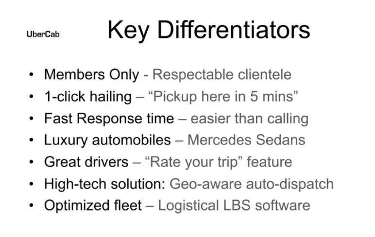
In this slide, Uber clearly lists how it stands out from regular cabs: reliable cars, better response times, trusted drivers, automatic billing, and easy bookings. These points speak to a real problem customers face.
No complex data or visuals, just clear points. This makes it easy for investors to quickly see why this isn’t “just another cab company.”
Takeaway: Use short, clear points to show how you’re different and better.
5) Slide 7: Operating Principles
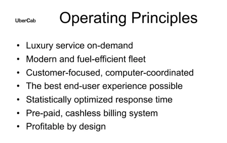
This one lists Uber’s core values: fast response, great experience, and reliability. The intent is solid, but it leans on broad statements like “best end-user experience” without concrete examples.
I also need to add that it still shows that the founders were thinking about operations early, even if they didn’t yet have data or user feedback to back it up.
Takeaway: Don’t just state goals—show how you’ll achieve them with real examples or plans.
6) Slide 8: UberCab Apps
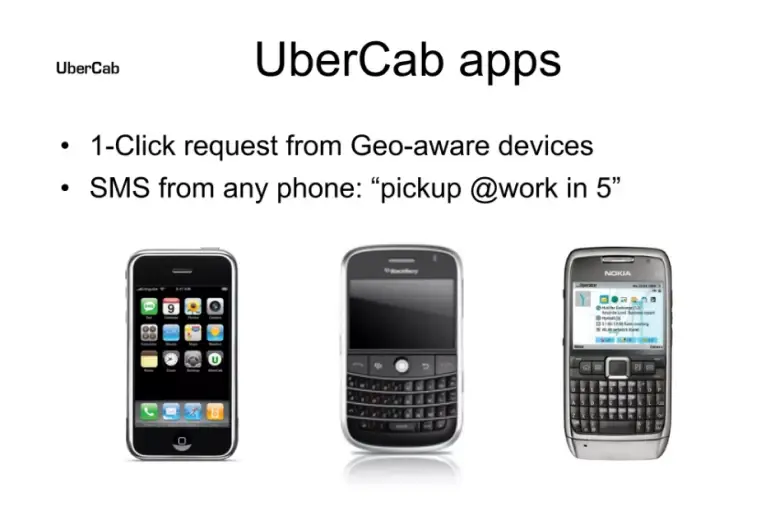
Uber introduces the tech idea—a one-click ride request using smartphones or even SMS. It’s an early version of the app vision.
The slide includes images of devices but no mockup of the app UI, and I think that makes it harder to picture the user experience. However, the core message is strong: this will be a mobile-first platform, designed for ease.
Takeaway: When selling a product, visuals help people imagine using it—show, don’t just tell.
7) Slide 9: UberCab Website
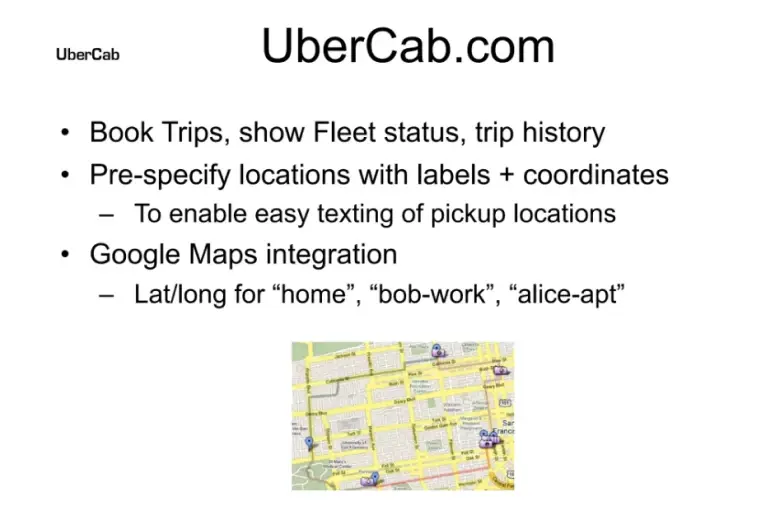
The ninth Uber pitch slide explains the desktop version of the service. It tells that users could schedule rides and save key locations like “home” or “work.”
A screenshot shows a simple map interface. At the time, these features were new and compelling, especially for busy professionals. It gave investors a glimpse into a polished, thoughtful user flow—even if the product wasn’t live yet.
Takeaway: Show how your product fits into real-world habits and makes life easier.
8) Slide 10: Use Cases
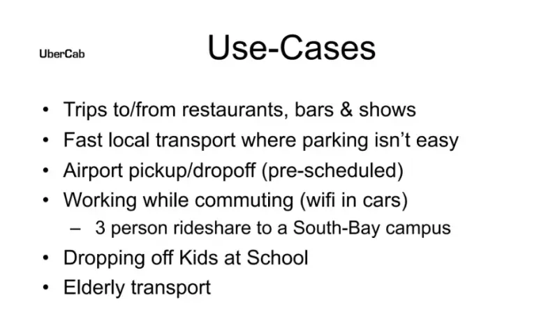
This slide lists out how people might use Uber: commuting, airport runs, business trips, or just getting around town. They also floated ideas like in-car Wi-Fi, which never really became a thing.
But overall, I think it paints a clear picture—Uber wasn’t just a taxi replacement; it was meant to be a daily-use service for busy professionals.
Takeaway: Highlight real use cases to show how your product fits into people’s daily lives.
9) Slide 11: User Benefits
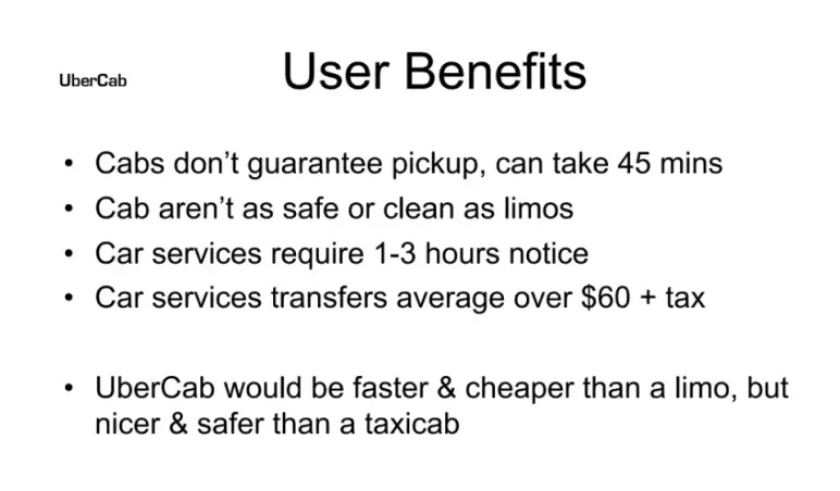
Uber positions itself as a better alternative to both taxis and limos—faster pickups, lower prices, and more reliability.
However, I also need to add that I don’t really like this slide. Some points feel off. Saying “cabs don’t guarantee pickup” is a stretch, and much of what’s mentioned has already been covered.
While the intent is clear, this slide could’ve been stronger and more focused on fresh value instead of repeating earlier claims.
Takeaway: Focus on clear, credible benefits—and avoid restating what’s already been said.
10) Slide 12: Environmental Benefits
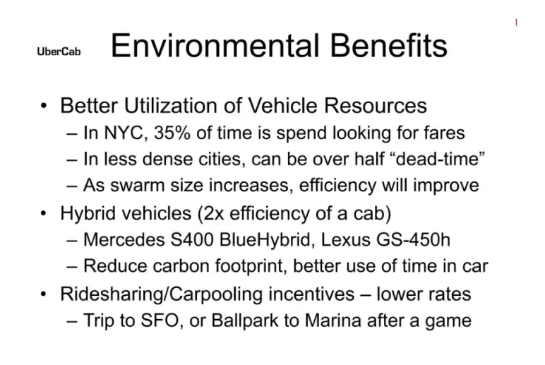
Here, in this pitch slide, the Uber founders make a case for eco-friendliness. They claim Uber helps cut wasted miles and fuel by reducing idle driving, plus hints at carpooling and hybrid vehicle use.
I note that it’s not deeply detailed, but the message is clear: this isn’t just more efficient—it’s greener too.
Back in 2009, adding an eco angle was forward-thinking. Today, it’s the kind of message investors expect to see.
Takeaway: If your idea has a positive environmental angle, don’t bury it—make it part of your pitch and strengthen investor confidence.
11) Slide 13: Fleet Info
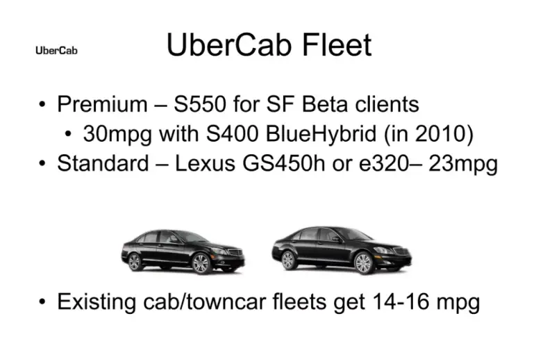
This slide outlines UberCab’s early plan to use premium, fuel-efficient vehicles for its fleet. They list specific models—like the S550 and Lexus GS450h—with clear MPG comparisons to standard town cars.
The message is simple: Uber would offer a better ride experience with better fuel efficiency. At the time, they expected to manage the fleet directly, which eventually changed.
Takeaway: Early assumptions may evolve, but detailed planning—down to vehicle types—signals that you’re serious about execution.
12) Slide 14: Initial Service Area
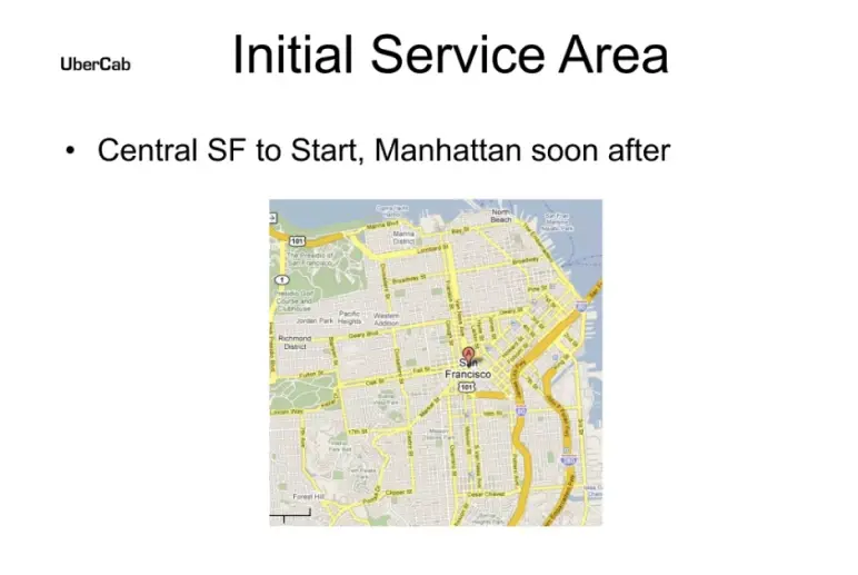
Well, there’s not a lot to take in on slide 14. It simply shows where Uber plans to start: San Francisco first, then New York. These are dense cities with lots of traffic and potential riders, so they’re good testing grounds.
I must say that starting in business-heavy metros also gave Uber access to early adopters who’d pay for convenience.
Takeaway: Start where demand is high and logistics make sense—don’t try to scale everywhere at once.
13) Slide 15: Technology
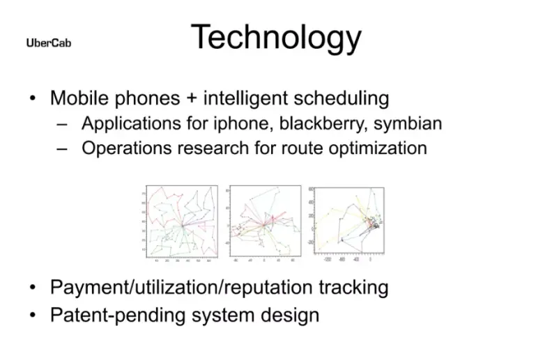
On slide 15, Uber lays out its early tech plans: mobile apps for major platforms, route optimization, and backend systems for tracking payments and reputation. There’s also mention of a patent-pending design.
Here, the slide hints at strong tech thinking, but it’s vague without supporting visuals or context—something investors might find unclear when viewing it alone.
Takeaway: Make your tech slide clear and self-explanatory—don’t rely on the pitch to fill in the gaps.
14) Slide 16: Demand Forecasting
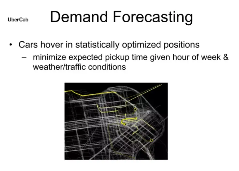
This slide explains how Uber planned to use data to reduce pickup times. The idea was to position cars in high-demand areas based on factors like time of day, traffic, weather, and local events.
While Uber didn’t stick with centralized driver control, this early vision showed they were thinking beyond what taxis offered.
Takeaway: Smart, data-backed ideas—especially around logistics—can help you stand out, even if the final product looks different.
15) Slide 17-18: Market Info
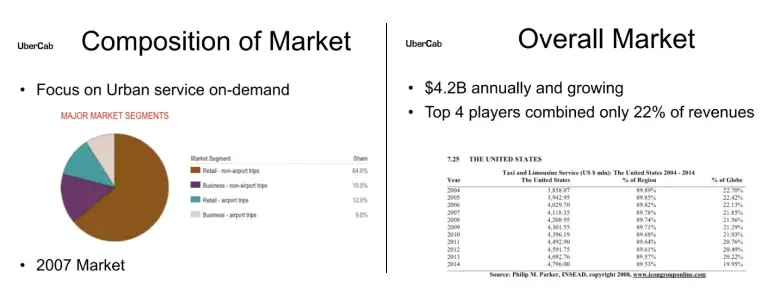
These two slides highlight a $4.2B U.S. taxi and limo market, with the top four players holding just 22%—a sign of fragmentation and opportunity. Then, they show how the market splits by ride type (retail vs. business, airport vs. non-airport).
Here, I would say, the data’s light on insights, but it proves they weren’t guessing—they understood who the riders were and where demand came from.
Takeaway: Show a big market, but also break it down. It helps investors see where your real growth lies.
16) Slide 19: Target Cities
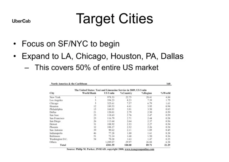
This slide expands on Uber’s market rollout plan. It starts with SF and NYC, then outlines a clear path to other top U.S. metro areas like LA, Chicago, Houston, and Dallas—markets that together represent 50% of national taxi revenue.
However, I noticed that it overlaps slightly with the earlier service area slide, but it does reinforce how deliberate their expansion strategy was.
Takeaway: Show that you’re not guessing—target growth areas with data-backed intent and clear next steps.
17) Slide 20: Potential Outcomes
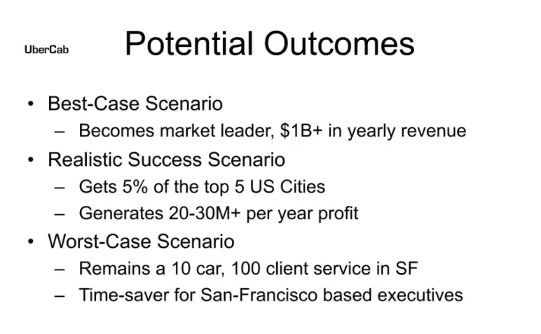
On slide 20, Uber detailed three possible scenarios: a best case where it becomes a $1B+ market leader, a realistic case with strong profits from limited city share, and a worst case where it stays a niche SF service.
Actually, I appreciate this slide. It’s a thoughtful way to set expectations while still aiming high. This helps investors weigh both risk and upside, which is essential in early-stage decisions.
Takeaway: Laying out clear, honest outcomes—good or bad—makes your pitch more credible and investor-ready.
Ditch your old-school pitch deck creation methods
Make compelling pitch decks in minutes with AI
Plans starting from $14/month
18) Slide 21: Smartphone Info
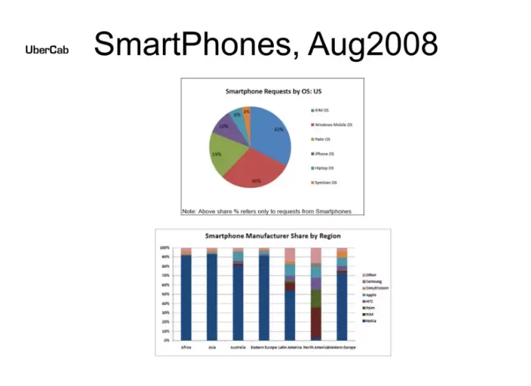
Back in 2008, not everyone had a smartphone. This slide includes data to support Uber’s tech-first approach by highlighting the rise in smartphone usage.
The logic was clear: more smartphones meant more people who could access the app. While that seems obvious now, it was a sharp insight at the time—proof that Uber was aligned with an emerging trend.
Takeaway: If your idea relies on an emerging trend, show that the trend is real and growing fast.
19) Slide 22: Future Optimizations
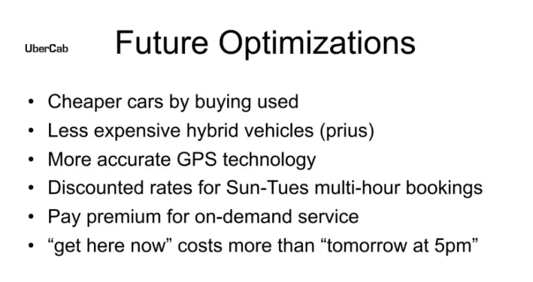
Slide 22 outlines ideas Uber had for future improvements—like cheaper vehicles, better GPS, and flexible pricing models.
These aren’t must-haves for a first pitch deck, but they show that the team was already thinking ahead and planning for scale and experience improvements.
While it could’ve been saved for a later round, this kind of forward-thinking may have helped convince early investors that the product had room to grow.
Takeaway: Go beyond just the launch. Show investors you’re already thinking about future improvements.
20) Slide 23: Marketing Ideas
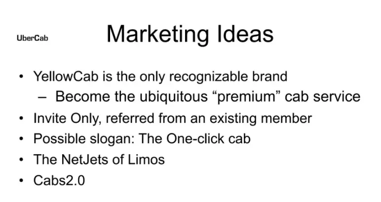
The Uber pitch slide 23 shares a few early marketing concepts—positioning Uber as a premium brand, using invite-only access, and playing with slogans like “The One-click Cab.”
While the ideas are interesting, the slide reads more like a casual brainstorm than a launch-ready strategy.
I also need to say that, for a pitch deck, investors expect clarity on how you’ll attract your first users. A structured go-to-market plan would have made this section stronger.
Takeaway: Creative ideas are a good start, but investors look for focus. Show how you plan to get traction, not just what you might try.
21) Slide 24: Location-Based Service
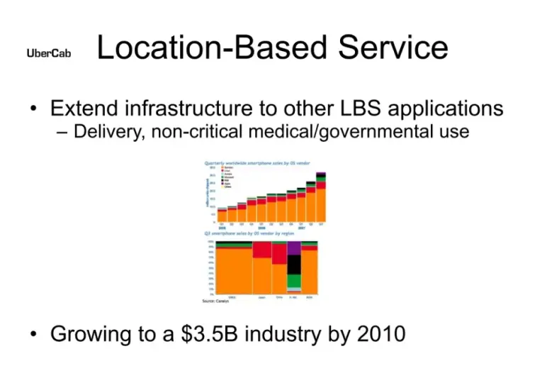
This slide broadens the vision beyond rides. Uber hints at using its infrastructure for other location-based services, like deliveries or non-critical medical transport. It’s an early sign of what eventually became Uber Eats and similar spin-offs.
I must say, it’s a smart way to close the pitch. Instead of just focusing on rides, it hints at a platform with multiple growth paths.
Takeaway: If you’ve got long-term platform potential, show it. Even a simple nod to future verticals can strengthen your vision.
22) Slide 25: Progress to Date
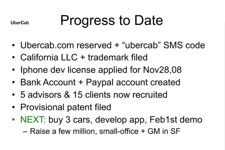
The final slide lists everything Uber had done so far: reserving the domain, setting up the business entity, applying for licenses, recruiting advisors, and preparing for a demo. It proves they weren’t just pitching an idea. They were taking steps to launch.
For early-stage startups, this kind of traction (even if small) helps investors take you seriously.
Takeaway: Show real progress, even if it’s early. Execution matters more than a perfect plan.
What did I like the most about this deck?
It’s been over 15 years since this deck first came out, and it still holds up. Not because it’s perfect (it’s not), but because it gets the core things right.
Here’s what I liked the most:
- Right from the start, they clearly defined the problem and the proposed solution without unnecessary filler.
- The market size was solid, believable, and just big enough. No inflated TAM claims—just real numbers to show the opportunity was legit.
- They had a prototype, some rides completed, and actual testing with drivers. That early traction added serious weight to the pitch.
- Including best- and worst-case outcomes was smart. It made the deck feel grounded and made the upside look even better.
- The slides were simple but effective. You could go through the entire deck and clearly understand the idea without needing extra verbal explanation.
Though I need to add that Uber’s pitch deck stretched to 25 slides in total, it mostly stayed focused. And while most early-stage decks today stick to 12–14 slides, Uber proved that if your story is strong and well-structured, a few extra pages won’t hurt.
Perfect your deck and pitch using Upmetrics
After reviewing Uber’s pitch deck, one thing is clear—your slides don’t need to be flashy. They just need to tell the right story, clearly and confidently. Uber got that part right. They focused on a real problem and presented a believable plan.
Working on your very own pitch deck? We (Upmetrics) can help. Upmetrics is a planning platform for entrepreneurs and business owners, providing business planning and presentation tools and services.
Check out our AI pitch deck creator to get started with your pitch deck. Considering outsourcing the entire pitch deck creation? Choose our pitch deck design services, and let us take care of it for you.
Hope you enjoyed the read.
Frequently Asked Questions
How much did Uber raise with this pitch deck?
What can startups learn from Uber’s pitch deck?
Should I include market size and forecasts in my deck?
Do I need a complete product before pitching?

Vinay Kevadia
Vinay Kevadiya is the founder and CEO of Upmetrics, the #1 business planning software. His ultimate goal with Upmetrics is to revolutionize how entrepreneurs create, manage, and execute their business plans. He enjoys sharing his insights on business planning and other relevant topics through his articles and blog posts. Read more