


If you’re raising money again after your seed round, you already know your old deck won’t cut it here. At seed, investors mostly bet on you and your idea. But now they want real numbers: proof that your growth is efficient and worth backing.
That’s exactly what Mixpanel had to prove with its Series B deck, the 12 slides the founders actually used to raise $65M at an $865M valuation.
A few of these slides (the ones about revenue and sales) do most of the work. They don’t just show the company growing; they show it paying for itself. That’s the same case you’ll have to make.
In this post, I’ll break down all 12 slides so you can see how they built that proof, what worked, what fell short, and what you can apply to your own deck.
About Mixpanel (then and now)
Suhail Doshi and Tim Trefren founded Mixpanel in 2009. It wasn’t an easy start; they pitched ten investors and got ten nos before anyone said yes.
What they were building was product analytics software that helped companies track what people actually do inside an app or website, such as clicks, signups, and purchases, instead of just counting page views. That kind of analysis is normal today. Back in 2009, it wasn’t.
By 2012, the company had gained enough traction to raise a $10.25 million Series A led by Andreessen Horowitz.
Two years later, that same firm invested another $65 million in Mixpanel, valuing the company at $865 million. That’s the pitch deck we’re breaking down in this article.
Later, Doshi open-sourced all 12 slides on Mixpanel’s blog shortly after the round closed, so other founders could see exactly what worked. Worth noting: it’s a Series B deck, not Series C, which a lot of sites get wrong.
Most importantly, that $865M valuation looked like a big bet back in 2014 for an analytics company. But it paid off. By 2021, Mixpanel raised a $200 million Series C from Bain Capital at a $1.05B valuation and became a unicorn.
And here’s one thing I’d add: the company also changed significantly along the way. Doshi stepped down as CEO in 2018, and Jen Taylor became CEO in September 2025.
Today, Mixpanel has expanded beyond the product shown in this deck into a broader behavioral and digital analytics platform. It has helped over 29,000 companies grow, including names like Pinterest, Xero, and Monday.com.
Now, let’s get into its Series B pitch deck analysis.
Slide-by-slide Mixpanel pitch deck breakdown
The deck has 12 slides. There are no design flourishes anywhere, just white text on a gradient background. That’s worth noticing before you start: nothing here is trying to look impressive; the slides are doing all the work.
Here’s the full slide-by-slide breakdown. For each one, I’ll show what works, where it’s thin, and what you can learn from it.
Slide 1: Cover

The cover is just the Mixpanel logo on a gradient. No tagline, no date, no “Series B pitch” label. Nothing.
Here I’d say: by the time you’re raising a round this size, the people in the room already know who you are and why they’re there. A busy cover would only get in the way. The confidence to leave it almost empty is a signal in itself.
Takeaway: Your cover doesn’t need to sell. A clean logo and nothing else is often the strongest way to start.
Slide 2 and 3: The problem (in two steps)
Mixpanel spends two slides on the problem, and the order matters.

The first slide is broad. “Most of the world makes decisions by guessing or going with their gut, and they end up either lucky or wrong.” That’s not an analytics point. That’s a human point, and anyone in the room feels it.
The second slide narrows in. It says: Companies on mobile and web are measuring “bullshit metrics like page views and installs,” and it’s hard to be sophisticated about data. Yes, that word is on the slide. It’s blunt on purpose.
What works is the build. Slide one gets you nodding at a truth everyone accepts. Slide two turns that truth into Mixpanel’s specific fight, so by the time you reach the solution, the need is obvious. The blunt language helps too: it tells an investor you know exactly who you’re for and who you’re not, and that reads as focus.
Takeaway: Don’t rush to your solution. Set up a problem your audience already believes, then narrow it to the exact gap you fill.
Slide 4 and 5: Solution and mission
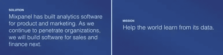
The solution slide is one sentence. Mixpanel builds analytics for product and marketing, and as it goes deeper into companies, it will expand into sales and finance next.
That’s a land-and-expand story in a single line. Investors hear the wedge today and the bigger platform tomorrow, without a cluttered roadmap to wade through.
The mission slide is even shorter: “help the world learn from its data.” One line, easy to remember, and it gives all the metrics that follow a reason to matter.
If I’m nitpicking, the solution slide is thin. At Series B that’s mostly fine, since the room already knows the product. But it’s a reminder never to assume people remember what you do. A weak solution slide is a risk if even one person in the room is new to you.
Takeaway: Say what you do in one clear line, then give it a bigger purpose. Just don’t let “they already know us” make the slide lazy.
Ditch your old-school pitch deck creation methods
Make compelling pitch decks in minutes with AI
Plans starting from $14/month

Slide 6: Competitive advantage
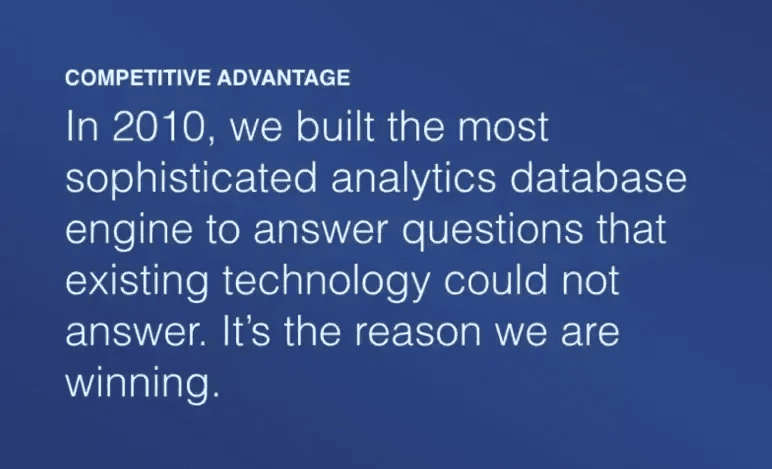
Here Mixpanel states its edge plainly. Back in 2010, it built the most sophisticated analytics database engine it could, one that answered questions the existing tools couldn’t. That, the slide says, is the reason they’re winning.
No architecture diagram, no deep technical detail. Just the claim, stated with confidence. It positions Mixpanel as real infrastructure rather than another dashboard sitting on top of someone else’s data.
The risk is that it’s an assertion. There’s no proof on this slide. But that’s what the next two slides are for.
Takeaway: You can highlight your edge in one confident line. Just make sure the slides around it back it up with evidence.
Slide 7 and 8: The numbers that sold the round
This is the heart of the deck, and where I’d spend the most time if I were you.
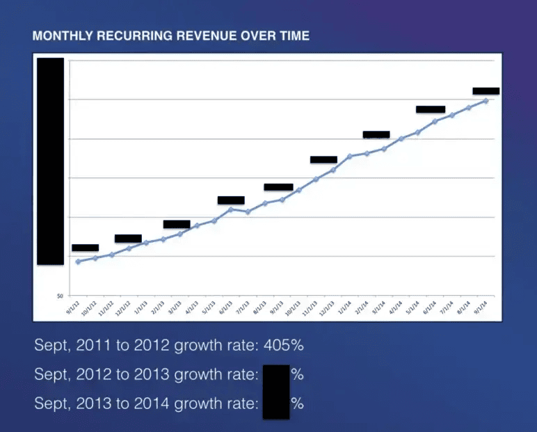
Slide 7 is a monthly recurring revenue chart from late 2012 to late 2014. The line climbs the whole way steadily. But the actual dollar figures are blacked out. That’s on purpose.
Once you publish a deck for the world to see, competitors and press read it too, so Mixpanel shows the shape of its growth without handing anyone its real revenue.
The one number they did leave visible is the growth rate from 2011 to 2012, which was 405%, enough to prove the story without exposing the underlying figures.
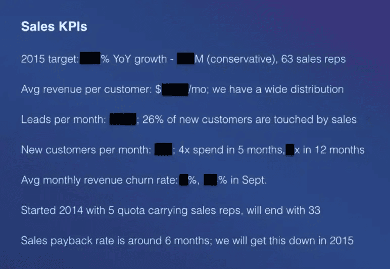
Slide 8 is the sales KPIs, and it carries the single most important metric in the deck: a sales payback period of about six months. Plenty of figures here are redacted too, but the ones they left in tell a tight story.
The sales team grew from 5 reps to 33 during 2014. The 2015 plan calls for 63 reps. And 26% of new customers get touched by sales.
Why does the payback period matter so much? Because it answers the question every investor is really asking: if we give you this money, does it come back, and how fast? A six-month payback says the growth isn’t just fast; it’s efficient.
Takeaway: Growth charts show that you’re growing. Efficiency metrics like payback period show that you’re growing in a way that’s worth funding. And if you ever publish your own deck widely, this is the model: show the shape, hide the absolutes.
Slide 9: Marketing
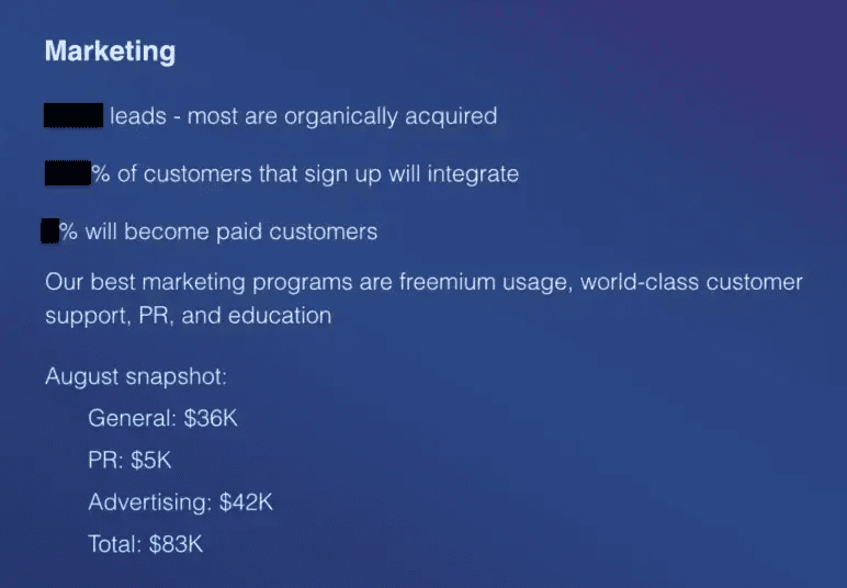
The marketing slide keeps the efficiency story going. Most of Mixpanel’s leads come in organically. Its best programs are freemium usage, strong customer support, PR, and education.
The exact lead numbers and conversion rates are redacted again, but there’s one figure they left in. Total marketing spend for August was $83K ($42K advertising, $36K general, $5K PR).
For a company about to raise $65M, $83K a month on marketing is tiny. That’s the whole point. It tells investors the growth isn’t bought; it’s earned. Every dollar of the raise lands on top of an engine that already works cheaply.
Takeaway: If your growth is efficient, show it with a real, itemized number. A small, specific spend next to strong growth beats any adjective.
Slide 10: The 2015 and 2016 expansion plan
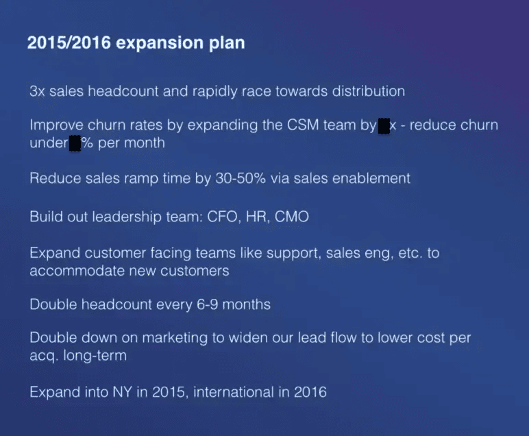
This is the use-of-funds slide, though it never calls itself that.
It lays out where the company is headed: triple the sales team, build out customer success to cut churn, reduce sales ramp time, hire a CFO, head of HR, and CMO, and double headcount every six to nine months. Geographically, New York in 2015 and international in 2016.
What I like is that it’s specific, and it reads as a real plan rather than a wish list. An investor can see exactly what the money buys.
Takeaway: You don’t need a slide that shouts “the ask.” A clear, specific plan for the next 18 months tells investors where their money goes, which is what they actually want to know.
Slide 11: Competition
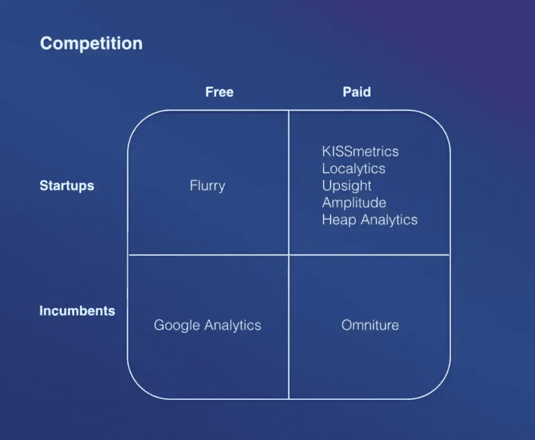
Competition shows up as a simple 2×2. One axis is free versus paid, the other is startups versus incumbents.
- Flurry sits in free startups.
- Google Analytics is the free incumbent.
- Omniture is the paid incumbent.
- And the paid-startup box is crowded: KISSmetrics, Localytics, Upsight, Amplitude, and Heap.
The clever move is what’s not there. Mixpanel doesn’t put itself on the grid. It shows the shape of the market and lets you notice the gap. It also quietly argues that the real fight has moved away from the old incumbents toward this newer group.
The one thing I’d want is a clearer sense of where exactly Mixpanel wins inside that crowded paid-startup box. The grid shows awareness but stops short of a sharp “here’s why us.”
Takeaway: A 2×2 is a clean way to show you understand your market without a messy feature-by-feature table. Just make sure it’s obvious where you fit and why you win.
Slide 12: Financing history
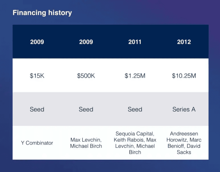
The deck closes on a financing history table: the $15K from Y Combinator in 2009, a $500K round the same year, $1.25M with Sequoia in 2011, and a $10.25M Series A led by Andreessen Horowitz in 2012, with angels like Marc Benioff and David Sacks along the way.
Notice this isn’t an “ask” slide. There’s no “we’re raising $X.” It’s a list of everyone who’s already backed the company, including some big names.
The message underneath is quiet but strong: serious people keep betting on us, and there’s room for one more column. It turns the close into proof instead of a request.
Takeaway: Ending on who already believes in you can be stronger than ending on the ask. Let your past rounds make the case that the next one is the obvious next step.
That’s all 12 slides explained. But it’s worth knowing what this deck leaves out. There’s no team slide, no product screenshots, and no explicit “we’re raising $X” ask anywhere. That worked here at Series B because investors already knew Mixpanel, the founders, and the number going in.
But if you’re pitching earlier, or pitching people who don’t know you yet, you won’t have that same head start, so include those details.
One more thing worth knowing: since most of the real numbers are redacted, this deck can’t give you dollar benchmarks, only ratios like the payback period. Use those, not the missing figures.
With that said, here’s what’s actually worth copying from it.
What did I like the most about this deck?
A lot of decks try to do everything. This one does a few things well, and here’s what it actually gets right:
- It builds the problem in two steps before selling the solution, so the need feels obvious.
- It makes one efficiency metric, the six-month payback, the hero. That’s what tells investors their money is safe, worth finding your own version of.
- It shows the shape of growth while hiding the raw revenue numbers, proving the story without giving competitors ammunition.
- It maps competition with a simple 2×2 instead of a cluttered feature war.
- It closes on who’s already invested. Ending that way is quieter and stronger than asking outright.
And the thing that ties it all together: the deck never relies on design. It’s short, plain, and confident. Just 12 slides, no clutter, telling one clear story: this company grows fast, and it grows efficiently. That’s what actually convinced investors.
Conclusion
Mixpanel’s 12 slides worked because they matched exactly the stage of the business: Series B, with real revenue, a working sales team, and a clear plan to scale. That’s why the deck leaned heavily on traction, sales economics, and what additional funding could unlock.
Your own deck should also match where you actually are.
- Proving the idea? Lean on the problem, solution, and team.
- Proving traction? Focus on the numbers, the way Mixpanel did here.
- Raising to scale? Plan for what the funding will help you grow.
If you’re building your own deck and don’t want to start from a blank page, Upmetrics’ AI pitch deck generator gives you that proven slide-by-slide structure to build on. That way, you can put your energy into your story and your numbers.
Hope this breakdown helps you build a stronger deck.
Turn Your Story Into a Powerful Pitch
Create an investor-ready pitch deck that brings your business vision to life.

Frequently Asked Questions
How many slides should my pitch deck have?
Do I need to show revenue numbers in my pitch deck?
Can an early-stage startup use Mixpanel's pitch deck structure?
Do investors expect a pitch deck to look professionally designed?
More pitch decks, broken down
See all 26





Vinay Kevadia
Vinay Kevadiya is the founder and CEO of Upmetrics, the #1 business planning software. His ultimate goal with Upmetrics is to revolutionize how entrepreneurs create, manage, and execute their business plans. He enjoys sharing his insights on business planning and other relevant topics through his articles and blog posts. Read more