


What do you get when a guy two weeks into a new job builds a dating app in 48 hours and pitches it on ten slides? You get the app that became Tinder — back then it was called Match Box, and it had no team slide, no market size, no competition, and no ask.
By every checklist you’ve read, this deck should have failed.
It didn’t. It won a hackathon at Hatch Labs, got the green light, and the app launched a few months later.
So what did this deck get right that the checklists miss? And what should you copy?
In this breakdown, I’ll walk you through all ten slides — what worked, what didn’t, and the one I’d have pushed back on.
About Tinder (then vs. now)
Tinder works on one rule: you only match if you both swipe right. That way you never find out who passed on you, so there’s no rejection to sting. This “both people have to say yes” idea was the whole point, and Tinder later patented it. Back in 2012, there wasn’t even a swipe yet, just a thumbs-up “Like” and a thumbs-down “Not.”
It didn’t start as Tinder, either. As Match Box grew into a real product, Jonathan Badeen built the iPhone app (and later added the swipe), while Justin Mateen ran the marketing on college campuses.
That August, the team renamed it Tinder, since Match Box was too close to Match.com, owned by the same parent company. It launched on iPhone in September 2012 and was spread by hand at USC (University of Southern California), where it hit a couple of thousand users in the first week. It went on to win TechCrunch’s Best New Startup of 2013.
Today Tinder is the biggest dating app in the world, with over 75 million monthly active users in 2026, and it’s still the main revenue engine inside Match Group. It brought in $1.8 billion in 2025, and its momentum is picking back up: Tinder’s direct revenue rose to $457.5 million in the second quarter of 2026.
Detailed Tinder pitch deck analysis (slide-by-slide)
Ten slides, and you can read the whole thing in under two minutes.
1) Slide 1: Cover
A hand-drawn orange logo, a cream background, and one line: “the flirting game…”
That line does more than it looks. Not “dating app.” Not “social platform.” Flirting game. Three words that set the mood and the whole idea. Calling a dating app a game wasn’t obvious in 2012, and that’s exactly what the app turned out to be.
No date. No presenter name. Nothing extra. When you’re pitching your own bosses, everyone already knows who you are.
Takeaway: Put your one-line pitch in the subtitle, not the logo.
2) Slide 2: Meet Matt
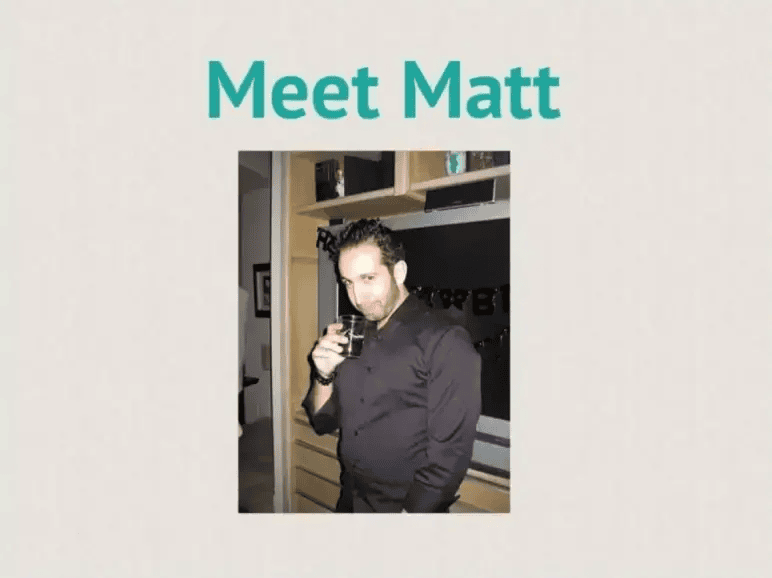
One line of text and a photo of a guy holding a drink at what looks like a house party.
This is what makes Tinder’s deck different, and it’s the part I like most. Instead of opening with a stat about the dating market, they opened with a person. Not a polished model, but a real, slightly awkward guy.
Put a face on the screen, and the room stops judging a business and starts following a story. That gets you about thirty seconds of real attention, and I think Tinder used it well.
Takeaway: Open with one specific person, not a market. Rooms remember people and forget percentages.
3) Slide 3: The setup
Two sentences, and the second one is the key. “Like most of us” quietly turns Matt’s story into a claim about everyone, with no numbers, and nothing anyone in that room could argue with.
I’d call it the cheapest market slide ever made, and it works because everyone listening had been Matt at some point.
Takeaway: When the behavior you’re describing is universal, one honest sentence does more than a TAM chart. Save the numbers for claims people might doubt.
Ditch your old-school pitch deck creation methods
Make compelling pitch decks in minutes with AI
Plans starting from $14/month

4) Slide 4: The problem: fear of rejection
Here’s the part I think is genuinely clever, and it’s easy to miss. Every dating product before Tinder framed the problem as supply — not enough people to meet, not enough good matches, bad algorithms. Match.com and eHarmony were both built on that assumption, and IAC owned one of them.
Tinder said the real problem is in your head. It’s not finding someone. It’s the two seconds of nerve it takes to walk across the room. Believe that, and every other dating app is fixing the wrong thing. Tinder never has to say it beats Match.com. It’s just aiming somewhere else.
To me, that’s a competitor slide hiding inside a problem slide, pitched inside the company that owned the competitor.
Takeaway: Frame the problem so the big players look like they’re solving something else.
5) Slide 5: The solution (Meet the Cure)
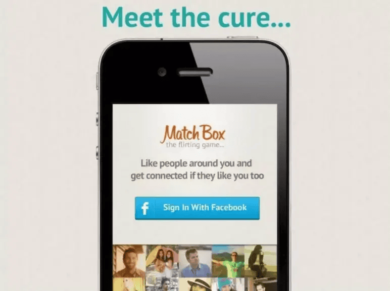
“Meet the cure…” over an iPhone 4 showing the login screen: “Like people around you and get connected if they like you too,” plus a Sign In With Facebook button.
Read that line again, because it’s the whole company: get connected if they like you too. You never find out if someone said no. So there’s no rejection to fear. Slide 4’s problem, fixed by one simple rule, in seven words, on a login screen.
I’d say the Facebook button mattered too. In 2012 it did three things at once: real names instead of fake profiles, instant photos, and shared friends and interests to work with.
Takeaway: Say what your app does in one plain sentence. If it needs a diagram, it’s not simple enough yet.
6) Slides 6, 7 & 8: The product walkthrough
Three slides in a row. No titles, no notes, just screenshots of the app working.
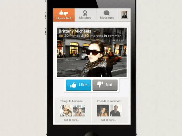
Slide 6 shows a profile card for “Brittany Michaels” with a thumbs-up (Like) and thumbs-down (Not), plus two boxes below: 20 friends and 50 interests in common.
That’s Facebook doing the work, turning a stranger into someone you have things in common with. Notice what’s missing: the swipe.
Tinder’s most famous move came later, from co-founder Jonathan Badeen, who says it started as an afterthought he added without telling the team. The best idea in the whole app isn’t in the pitch at all, which still surprises me.
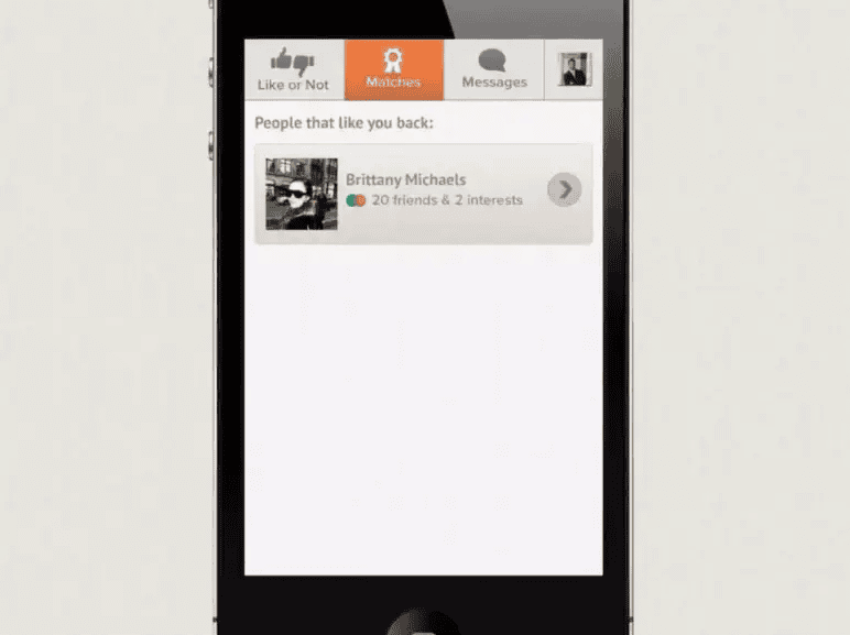
Slide 7 is the payoff: a Matches tab called “People that like you back.” One line, and the whole idea stops being a promise and becomes a real screen.
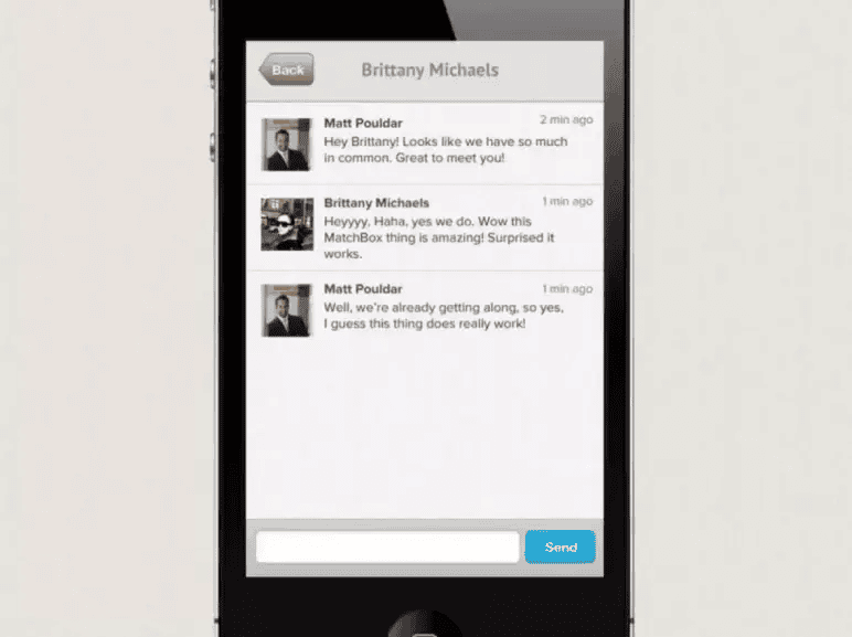
Slide 8 is a chat that only happens because both people said yes. The messages are cheesy (“Wow this MatchBox thing is amazing! Surprised it works”), but they show the result instead of describing it.
Three of ten slides just on the app is a lot. But for an app whose whole value is a feeling, I think it’s the right call.
Takeaway: If your product is the argument, spend the slides on it. Screenshots of a real flow beat a features list every time.
7) Slide 9: Why it works (Under the hood)
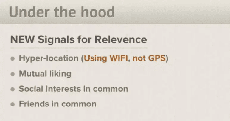
The first slide with a real title. It lists four things the app uses to rank people.
This is the “why can’t someone copy us” slide, and I think it aged the worst. Three of those held up fine. The fourth, WiFi instead of GPS, was just a battery-saving trick dressed up as a big deal, and it’s not how Tinder works now.
I’d have pushed back on that in the room. A small tech choice isn’t protection. Anyone can copy it next month. The real edge on that slide was “you both have to like each other,” a rule about people, and those are much harder to copy than code.
Also, the typo: “Relevence.” Nobody cared. It looked like a rough work file, not a sales pitch.
Takeaway: If a rival can copy it in a week, it’s not your edge.
8) Slide 10: Revenue opportunity
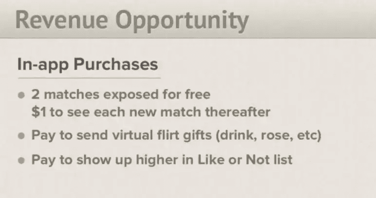
The last slide suggests three ways to charge people.
None of that is how Tinder makes money now, and I think charging per match would probably have killed it. An app like this needs lots of people first. Put a paywall on the main action, and you starve the thing you’re trying to grow. This is the slide I’d have argued with.
But look at the gut feeling behind it. The bet was that people will pay to see who likes them. That bet was dead right. It just needed the right shape, and that took five and a half years. Tinder Gold launched in August 2017 with “See Who Likes You” for $4.99 a month. Days later, Tinder hit number one on the App Store’s top-grossing chart for the first time.
Slide 7 showed the feature. Slide 10 priced it wrong.
Takeaway: Investors care about why people want your product, not your price list.
And notice what’s missing
Read back through those ten slides, and you’ll spot the gaps. No market size, no competition, no team, no traction, no projections, no go-to-market, no ask. Against a normal investor deck, this one is missing more than it has.
I don’t think that’s lazy, though. It’s reading the room. The Hatch Labs bosses had hired the team, owned the company, and ran Match.com, so they already knew everything those slides would cover, and the app was four days old, so there was no traction to show anyway. This deck isn’t answering “should we invest?” It’s answering “is this worth three more weeks and a little money?”
That’s why copying it is risky. Pitch strangers for real money and you’ll get asked about all of it. Tinder never had to.
Takeaway: Build the deck for the decision in the room. Cut what your audience already knows; never cut what they’ll ask.
What I liked most
What stayed with me is the discipline. Ten slides, roughly forty words of body copy across the entire deck, and not one sentence explaining the concept twice.
A few things it does especially well:
- It commits to a story structure. Character, obstacle, cure, proof. Slides 2 through 8 are a screenplay, and you can follow them with the sound off.
- It picks one emotion and stays there. Fear of rejection is named on slide 4, and everything after it is an answer to that one feeling.
- It doesn’t hedge. No “potentially disruptive,” no “we believe.” Just: here’s Matt, here’s his problem, here’s the cure.
- It let the product carry the weight. Three raw screenshots did the job a features grid would have failed at.
That discipline is the part I’d actually steal. It works, though, because the room wasn’t asking the harder questions yet. Yours probably will.
Conclusion
The real lesson from Match Box isn’t “keep it to ten slides.” It’s that Tinder got to skip six slides because everyone in the room already knew the team, the market, and the company. Almost no one else has that.
If you’re pitching people who don’t already know you, you need the full picture: your team, your market, your competition, your numbers, and a plan for your first users — told with the same clarity Tinder used on Matt’s story.
That’s where Upmetrics AI pitch deck generator helps. It lets you build an investor-ready pitch deck fast, so you get Tinder’s storytelling without dropping the six slides your investors will actually ask about.
Turn Your Story Into a Winning Pitch
Build a complete investor-ready deck with the numbers and insights investors expect.

Frequently Asked Questions
How much did Tinder raise with this pitch deck?
What's the biggest lesson from Tinder's pitch deck?
How many slides should my pitch deck have?
Who is a pitch deck like this for?
Is Tinder's deck a good template to copy?
More pitch decks, broken down
See all 26



Vinay Kevadia
Vinay Kevadiya is the founder and CEO of Upmetrics, the #1 business planning software. His ultimate goal with Upmetrics is to revolutionize how entrepreneurs create, manage, and execute their business plans. He enjoys sharing his insights on business planning and other relevant topics through his articles and blog posts. Read more