Creating a pitch deck that’s clear, concise, and compelling is harder than it looks, especially when every slide counts. That’s exactly why I’m breaking down Guy Kawasaki’s famous 10-slide pitch deck format.
It’s not just a theory; it’s a practical, battle-tested structure that helps founders get straight to the point and win investor attention fast. In a world where 90% startups fail, attention spans are short, and meetings are shorter, this format forces clarity—no filler, no fluff.
Each slide has a purpose: To guide the story, build credibility, and show exactly how the business works. Whether you’re pitching live or sending a cold deck, understanding why these slides are placed the way they are gives you a huge edge.
So, in this post, I’ll walk you through Guy Kawasaki’s pitch deck slide—why it matters, what to include, and how to make it work for your startup.
Let’s dive in.
What is Guy Kawasaki’s pitch deck?
Let me first introduce Guy Kawasaki. He’s a Silicon Valley legend—former Apple evangelist, bestselling author, and a big voice when it comes to pitching and early-stage investing.
And one of the most practical tools he’s given to founders? His famous 10-slide pitch deck framework.
Now, to be clear, this isn’t an actual startup deck he used to raise funds—it’s more of a template or blueprint he recommends to entrepreneurs.
Kawasaki’s philosophy is simple: Cut the fluff, keep the clarity. So his deck trims the fat and keeps only what matters—just 10 slides, ideally delivered in 20 minutes, with a 30-point font minimum (yes, that’s the 10/20/30 rule he swears by).
Over the years, I’ve seen dozens of founders lean on it to structure their early pitches. It’s simple, clean, and forces you to get to the point. No fluff, no jargon overload.
How Does the 10/20/30 Pitch Deck Rule Work—Slide by Slide
Before we dive into each slide, let me quickly walk you through what the 10/20/30 rule actually means, because this rule is the backbone of the entire framework.
Here’s the breakdown:
- 10 Slides: You only need 10 slides to communicate your business effectively. Not 20. Not 50. Just 10. These should cover everything from the problem you’re solving to your team. The idea is to say more by showing less.
- 20 Minutes: Even if you’re given a 1-hour slot, assume tech issues or investor interruptions will cut your time in half. So your core message should be deliverable in 20 minutes, clean and crisp.
- 30-Point Font: Use a minimum font size of 30 points. This keeps your slides clean and readable, prevents text overload, and forces you to focus only on key messages.
Alright then. Let’s break down each of the 10 slides suggested by Guy Kawasaki. I’ll walk you through what goes where, why it matters, and how to make every slide count.
Slide 1: Title slide
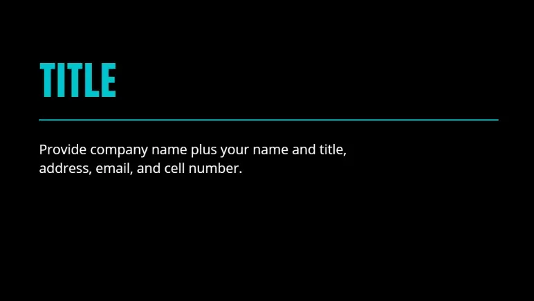
According to Guy Kawasaki, the first slide should be simple and to the point—no flashy taglines or buzzwords. While it might seem basic, it sets the tone for everything that follows.
Here’s what I always make sure to include, just like Guy Kawasaki recommends:
- The name of the company
- Your name and title
- Contact information (usually email and phone number)
- And if relevant, the date or location of the presentation
I like to treat this slide as a digital handshake. It informs investors about who I am, what I represent, and how to contact me. This is your opening moment—keep it clean, professional, and easy to read.
Slide 2: Problem/Opportunity slide
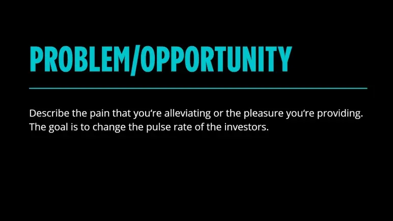
Right after the title slide, Guy Kawasaki suggests jumping straight to the problem or opportunity, and it makes perfect sense. Investors want to know, right away, why your startup exists.
I’ve found that starting with a clear, relatable problem helps anchor the rest of the pitch. It gives everything that follows a reason to matter.
Here’s what Guy Kawasaki’s problem slide includes:
- A clear description of the problem you’re solving or the opportunity you’re capturing
- The pain point your target users are experiencing
- Why this problem matters now—timing and urgency
- A goal to spark emotion or urgency
- A simple explanation that’s easy to grasp
The goal of your problem slide shouldn’t just be about making them understand the problem. Rather, it should make them feel it.
Slide 3: Value proposition

Guy Kawasaki puts the value proposition slide right after the problem for a reason—if I just highlighted the pain, now I need to explain how I solve it. This is where I define the core value my product brings.
Here’s what a value proposition slide should include:
- A clear statement of how I’m solving the problem
- The benefit or outcome the user gets
- Why is my solution better or different from what’s out there
Remember, don’t overexplain, just make it obvious why the solution matters. It should directly connect to the problem that was just introduced.
Slide 4: Underlying magic
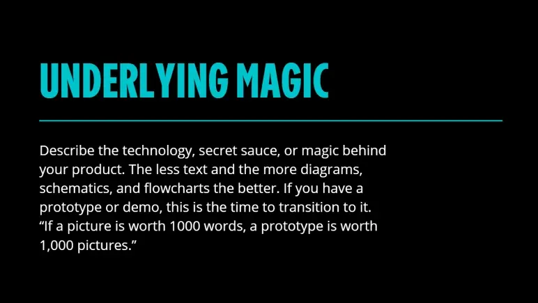
I view this slide as the technical backbone of the deck because, after explaining the solution, Guy Kawasaki uses it to demonstrate how it works and why it’s unique. It’s where the “secret sauce” comes in—whether that’s a proprietary algorithm, a clever process, or a standout design.
The focus is on visuals over text. Kawasaki recommends using diagrams, flowcharts, or even a demo instead of long explanations.
The less you say in words, the more you show in action. His logic is clear: If you have something real and impressive behind the product, now’s the time to prove it—visually, simply, and confidently.
Slide 5: Business model
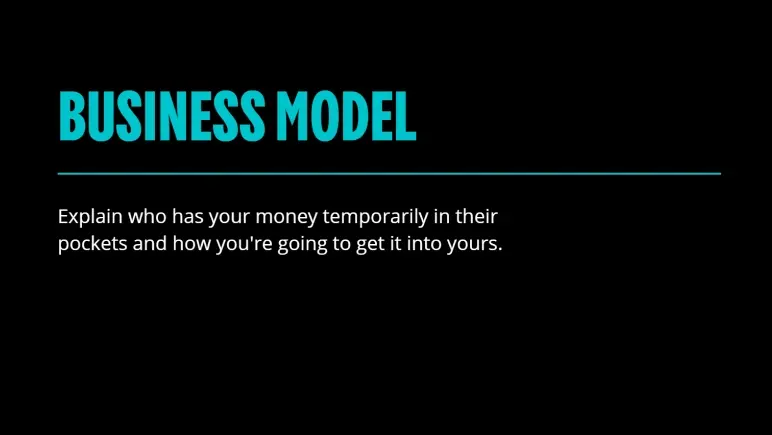
Placed right after the “Underlying Magic,” this slide transitions the conversation from how the product works to how it makes money. The placement is intentional—once credibility is established through the tech or solution, the next natural question from investors is: “How does this become a business?”
This slide exists to answer that. It’s not enough to have a great product; it has to be financially viable. That’s why Guy Kawasaki includes this slide to show the revenue engine behind the idea. Without this clarity, even the most impressive solution can feel incomplete.
A solid business model slide typically includes:
- Who pays
- What they pay for
- How much and how often
- How it scales
When I look at this slide in Kawasaki’s deck, it’s clear that simplicity is the goal. The takeaway here is straightforward: If the business can’t explain in one or two lines how it earns revenue, it’s not ready to pitch.
Confused about what investors expect in a pitch deck?
Try Upmetrics to create investor-ready decks in minutes.
Plans starting from $14/month

Slide 6: Go-to-market plan

This slide comes right after the business model, which makes sense—once investors understand how the startup plans to make money, they want to know how it will attract paying customers. Kawasaki places this here to keep the momentum on revenue-focused thinking.
The need for this slide is simple: A product without a practical way to reach users is just an idea. Investors don’t want vague promises—they want a real plan that shows traction is possible without burning through cash.
| What to Cover | Why It Matters |
|---|---|
| Target customer | Who exactly are you trying to reach |
| Acquisition channels | How do you plan to get their attention (paid, organic, partnerships, etc) |
| Tactics, not fluff | Actual strategies—no “go viral” claims |
| Cost awareness | Budget-friendly, scalable approach |
Kawasaki makes it clear: Saying you’ll “go viral” is a red flag. The takeaway here is to be specific, realistic, and cost-conscious. I noticed in his slide, there’s no space for buzzwords—just a direct call for smart execution.
Slide 7: Competitive analysis
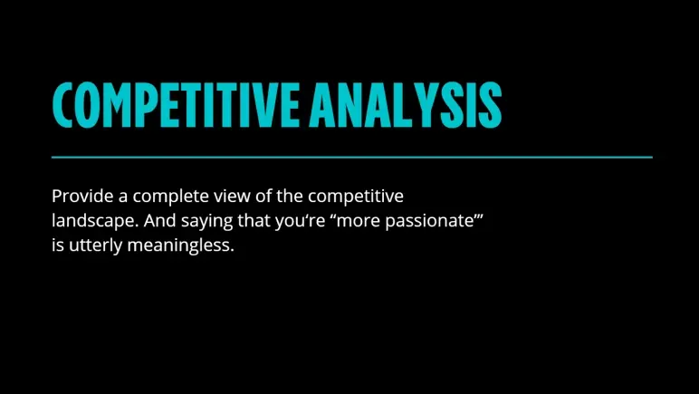
This slide shifts the focus from your strategy to your surroundings. After laying out how you’ll get customers, it’s time to show you’ve done your homework—who else is in the game, and why you won’t get crushed?
You need this slide because no investor wants surprises. They want to see that you understand the landscape and aren’t blindly charging into a red ocean.
Simply saying you’re more passionate or “better” won’t cut it. Kawasaki cuts through that fluff fast.
Here’s what this slide should include:
| What to Cover | Why It Matters |
|---|---|
| Top competitors | Names that investors will recognize |
| Feature comparison | How you’re different—visually, not emotionally |
| Market positioning | Where you sit (price, target, UX, etc.) |
| Your edge | Something they can’t easily replicate |
I see this slide as your credibility test. If you can’t name your competitors—or worse, say “we don’t have any”—you lose the room.
Slide 8: Management team
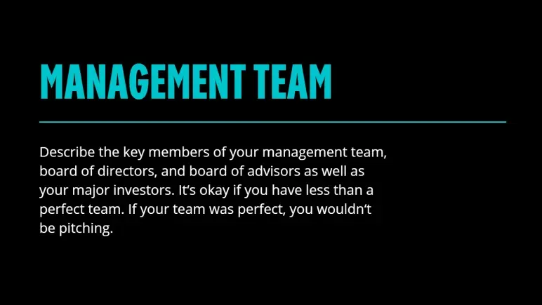
This slide lands near the end—and for good reason. By now, you’ve pitched the idea, proven the need, and shown the market. Now it’s time to answer the real question: can this team pull it off?
You need this slide because no investor backs a product—they back the people building it. Kawasaki doesn’t expect perfection here, and I like that. What matters is honesty and capability. Hiding gaps won’t help. Naming strengths and showing who’s filling what role will.
What to include:
- Core team members’ names
- Positions
- Team members’ relevant experience
- Qualification
- Notable advisors
- Investors on board.
Don’t flood it with bios—just enough to build trust and momentum.
Bottom line: Investors back people first. Show them this is the team to make it happen.
Slide 9: Financial projections and key metrics
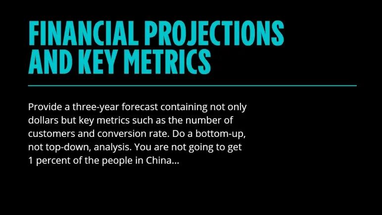
This slide is important because it demonstrates your understanding of your own business engine—what drives growth, what costs money, and how these two factors balance over time.
I’ve found that the smartest investors don’t just look at the revenue line—they zero in on assumptions: How many users, what conversion rate, what retention.
If you’re showing ARR growth from $200K to $1M in 18 months, they’ll want to know exactly what’s fueling that—whether it’s a higher average contract value, lower churn, or faster onboarding.
A good slide here doesn’t just project income. It paints a path—realistic, data-backed, and defendable. Avoid broad claims like “we’ll get 1% of a giant market.” Instead, map how you’ll earn every dollar. This is where your credibility gets tested. Pass it, and you’re one step closer to a yes.
Slide 10: Current status
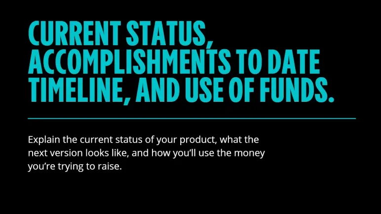
I see this slide as your chance to prove you’re not just dreaming—you’re building. Placed at the end, it wraps the pitch with proof and clarity: Where you stand today, what you’ve achieved, what’s next, and exactly how the money will be used.
It matters because investors want to see traction and a plan. Not just numbers, but progress.
Include:
- Product status (MVP, beta, launched)
- Key milestones hit
- What the next 6–12 months look like
- Breakdown of fund usage (team, product, growth)
The takeaway? End strong with confidence and show you know how to turn funding into outcomes.
When to use the Guy Kawasaki pitch deck format?
If you’re an early-stage founder trying to raise your first round or get an investor’s attention in under five minutes, Guy Kawasaki’s pitch deck format is one of the smartest tools you can use.
I like it because it strips away the fluff and forces you to focus on what really matters: Problem, solution, market, business model, and financial projections. It’s ideal when you’re pitching live, sending a deck cold, or just don’t have the luxury of a long meeting.
That said, this format isn’t a one-size-fits-all solution. If you’re raising a Series A or beyond, investors will expect deeper insights—more detailed traction, financials, maybe even a product roadmap.
So, while this deck gives you the perfect starting structure, know when to expand. It’s one of the cleanest formats out there for early-stage pitching, but if you want to explore how other startups structured their decks, check out these pitch deck examples.
It’ll give you a broader sense of what works across industries and stages.
Use Upmetrics to build your pitch faster
Struggling to structure your pitch deck or not sure where to start? That’s exactly where most early-stage founders get stuck—and it’s where a tool like Upmetrics can save you serious time and frustration.
With an AI pitch deck generator, you can create an investor-ready pitch deck in minutes. Moreover, pre-built pitch deck templates—including one based on Guy Kawasaki’s proven 10-slide format can help you organize your content clearly and focus on what truly matters to investors.
Additionally, customize slides and collaborate with your team in real time. Export a polished deck that helps you pitch clearly and confidently, without wasting weeks on design.
Try Upmetrics’ pitch deck generator today.
Conclusion
If you want a pitch deck that gets to the point and actually gets read, Guy Kawasaki’s 10-slide format is a smart place to start.
We’ve just broken down why each slide matters and how it helps you tell a clear, convincing story, especially when time is limited or you’re pitching an early-stage.
Tools like Upmetrics can help you move even faster. You get ready-to-use templates (including Guy’s format), AI assistance, and easy editing—all in one place. And it’s not just pitch decks—Upmetrics also helps founders craft solid business plans, so you’re ready for both investors and long-term growth.
If you’re building something great, I hope this guide gave you the clarity to pitch it better. Good luck—and go make it happen.
Frequently Asked Questions
Why only 10 slides?
Can I combine or skip some slides?
Do investors still use this format?
What if I’m pre-revenue, do I need projections?
What tools can I use to design my deck?

Vinay Kevadia
Vinay Kevadiya is the founder and CEO of Upmetrics, the #1 business planning software. His ultimate goal with Upmetrics is to revolutionize how entrepreneurs create, manage, and execute their business plans. He enjoys sharing his insights on business planning and other relevant topics through his articles and blog posts. Read more