You build a forecast at the start of the year and feel good about it. But after a few months, that confidence starts to wear off as the real numbers come in.
Revenue’s up one month, down the next month. Expenses creep past plan. Cash runs lower than expected. By month three, your forecast and your actuals are telling different stories.
I’ve watched this happen with most of the founders I worked with. And honestly, the hard part isn’t noticing those gaps. It’s knowing what they mean and what to do about them.
That’s where a plan vs. actual analysis helps. In this guide, I’ll walk you through how to conduct one, step by step. But first, let’s understand the basics.
What is plan vs. actual analysis?
Plan vs. actual analysis is the monthly exercise of comparing your forecast (sales, expenses, cash flow) to your actual results over the same period and measuring the gap between them. That gap is called variance, and it shows up as a dollar amount, a percentage, or both.
Variance is what makes the analysis useful. It’s the number that tells you whether to act or not.
A small variance tells you your forecast held up, and you can move on. A bigger one tells you something in your business is working differently than you assumed, and you need to look at it before it shows up again next month.
In accounting, this same thing is called “variance analysis”. Finance and bookkeeping teams sometimes call it “forecast vs. actuals” too. Different names, same idea. We’ll use plan vs. actual throughout this guide because that’s what most founders really call it.
Plan vs. actual variance formula (3 steps)
So how do you calculate variance? It’s simpler than it sounds.
The formula behind every plan vs. actual analysis is the same, no matter how big or small your business is. Three steps, two simple equations.
Step 1: Pull the planned figure
Start with the number from your forecast: Whatever you projected for the metric and period you’re measuring. Say your March sales forecast for lattes was $4,950.
Step 2: Pull the actual figure
Now pull the same metric from your accounting tool for the same period. Your actual March latte sales came in at $4,290.
Step 3: Calculate variance and variance %
Once you have both numbers, the math is straightforward:
- Variance = Actual − Plan
- Variance % = (Actual − Plan) / Plan × 100
Apply that to the latte example:
- Variance = $4,290 − $4,950 = −$660
- Variance % = (−$660 / $4,950) × 100 = −13%
A positive variance means you came in above plan. A negative one means you came in below it. From there, here’s a quick rule of thumb for what to do with the number:
| Variance | What it means | What to do |
| ±5% | Normal fluctuation | Note it, no action needed |
| ±10% | Something’s worth investigating | Dig into the numbers before next month |
| ±20% | Real problem | Take clear action to fix it, not just a note |
Once the formula clicks, the rest is just choosing how you want to run it month after month. That’s what the next section is about.
How to conduct a plan vs. actual analysis (Example)?
There are two common ways to run a plan vs. actual analysis: Using a spreadsheet or using financial planning software like Upmetrics that connects directly to your accounting tool.
I’ll walk you through both so you can decide where you are in that arc.
Plan vs. actual analysis using spreadsheets
If you’re running a plan vs. actual analysis for the first time, a spreadsheet is the easiest place to do it. Excel and Google Sheets are free, you already know how to use them, and the math is simple enough to handle.
Here’s the 3-step process.
1. Start with the plan (spreadsheet method)
Since you’re planning to conduct a plan vs. actual analysis, we’re assuming you already have your forecasts with you. However, if you don’t have forecasts yet, here is the process for creating them:
First, start a new spreadsheet to forecast your data. Consider all the metrics you want to compare with the actual data, such as sales forecasts, revenue, expenses, profit, etc.
Take the sales forecast as an example. List all the products or items you sell in the vertical column, along with the units and average price per unit. In the horizontal column, add the months or years you’re predicting. This setup helps you clearly organize and project your sales data.
Here’s an example of a sales forecast done for a cafe business:
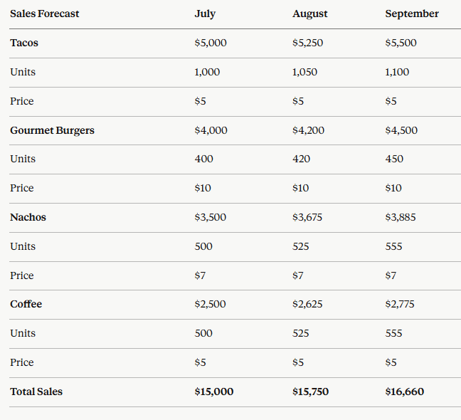
Take coffee, for example. The cafe expects to sell 500 units at $5 per cup in July ($2,500 in sales), 525 units in August ($2,625), and 555 units in September ($2,775). The same units × price math applies to tacos, gourmet burgers, and nachos, repeated month by month.
This is just an example. You can run the same setup quarterly, monthly, or yearly; the math doesn’t change
2. Put the actual results into your spreadsheet
Once a month closes, it’s time to gather your actual sales data. Most accounting or bookkeeping software can export results directly into a spreadsheet format, so you can copy them straight into your forecast sheet.
Here’s the actual sales data for the same cafe business as the above example:
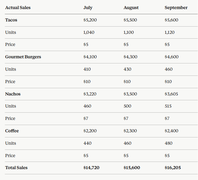
Take coffee again. Against the planned 500 units in July, actual sales came in at 440 units ($2,200). August: 460 units sold ($2,300), against the planned 525. September: 480 units sold ($2,400), against the planned 555. The same line-by-line comparison runs across tacos, gourmet burgers, and nachos.
This step is where most spreadsheet errors creep in, so double-check every number before you move on. A typo here will throw off every variance number that follows.
3. Compare both the data
Once you’ve gathered both your forecasted and actual sales data, the next step is to compare them. Side-by-side columns (planned vs. actual) make the gaps obvious without any extra formatting.
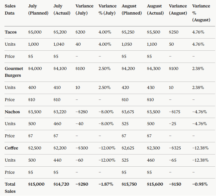
Here’s how the cafe’s plan and actual numbers look side by side:
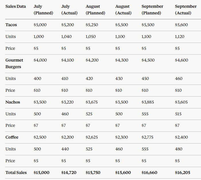
Now apply the variance formula from earlier (Variance = Actual − Plan) line by line.
Take coffee in July: Actual sales of 440 units came in against the planned 500, a variance of −60 units. In dollars, that’s $2,200 actual against $2,500 planned, or −$300 (a −12% variance). Run the same math down every row, every month.
Once you’ve calculated variance across the table, you’ll see two patterns: lines that hit the plan and lines that didn’t. The lines that didn’t are where the next conversation starts.
Plan vs. actual analysis using Upmetrics
Let’s move ahead with our other method for conducting plan vs. actual analysis through Upmetrics.
Upmetrics is an AI-powered business and financial planning tool that helps entrepreneurs and teams plan, forecast, and track their plans from a single platform.
Let’s see how to use Upmetrics for plan vs. actual analysis:
1. Start with the plan
First, log in to Upmetrics and create a workspace. Answer some of your business-related questions to input data into the software. If you already have forecasts, you’ll need to add them manually.
But if you don’t, create them using the AI financial forecasting tool. For that, you’ll need to go to the finance forecasting option as shown below:

Then, within the financial forecasting module, under all financial streams (revenue, expenses, etc.), you will get the option to create a financial stream using AI.
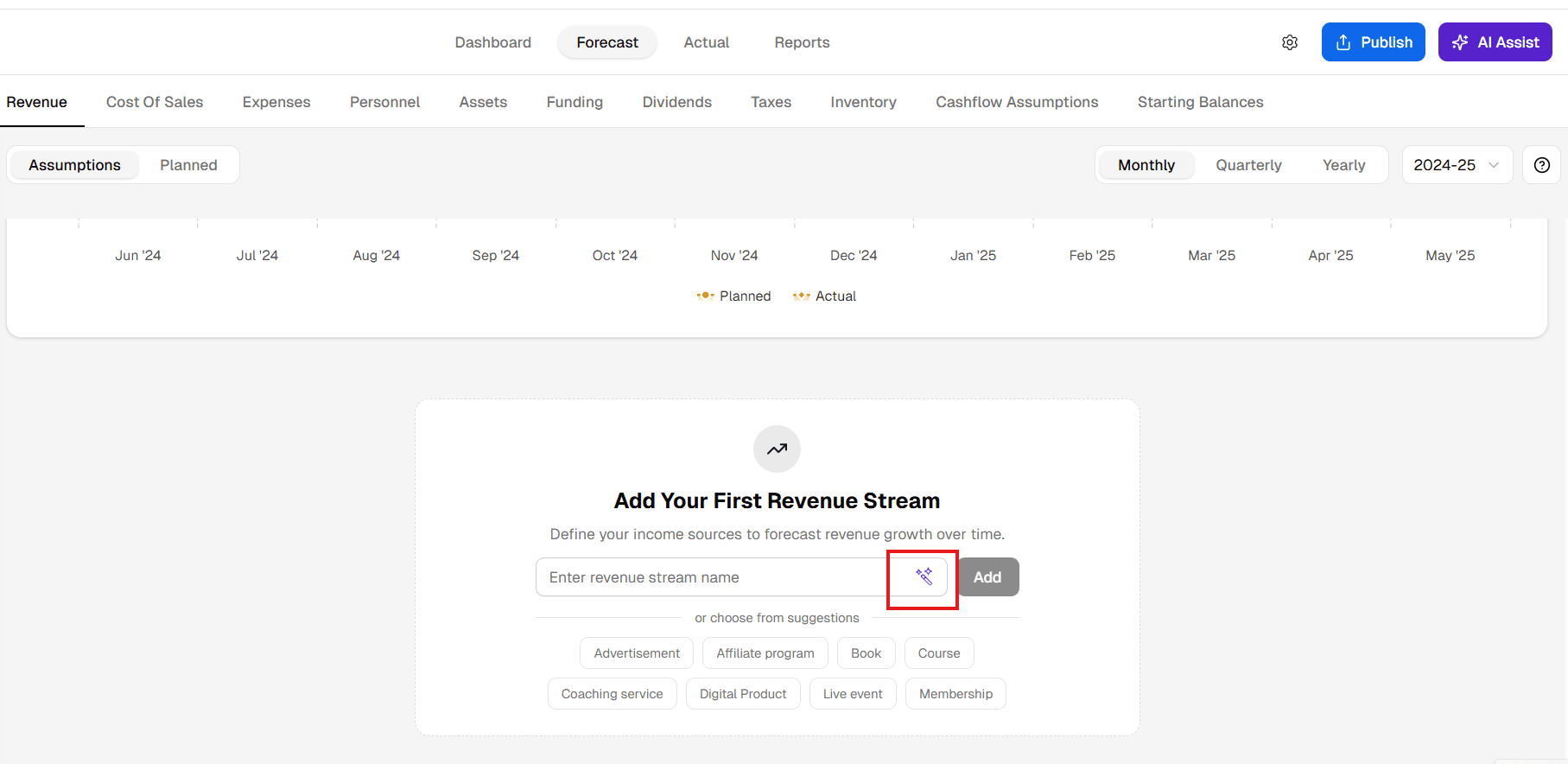
Select the AI suggestions icon, and you will have a few options to generate streams that AI thinks are best, considering your business type.
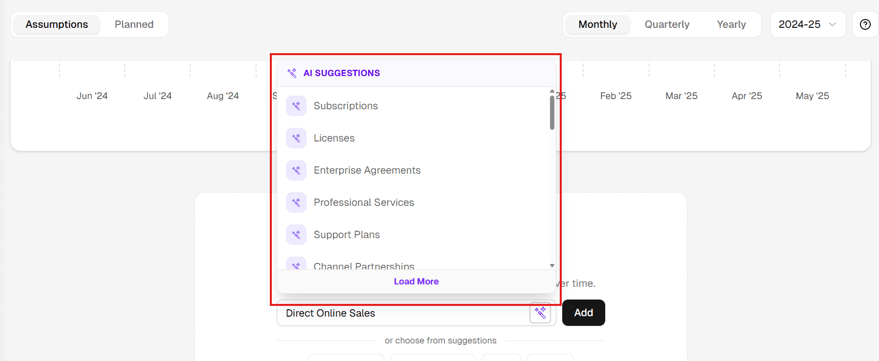
Select the streams that are useful for you. Under each stream, add line items for what you’re actually selling (like coffee, tacos, or burgers). Then, click into each one to set up its forecast.
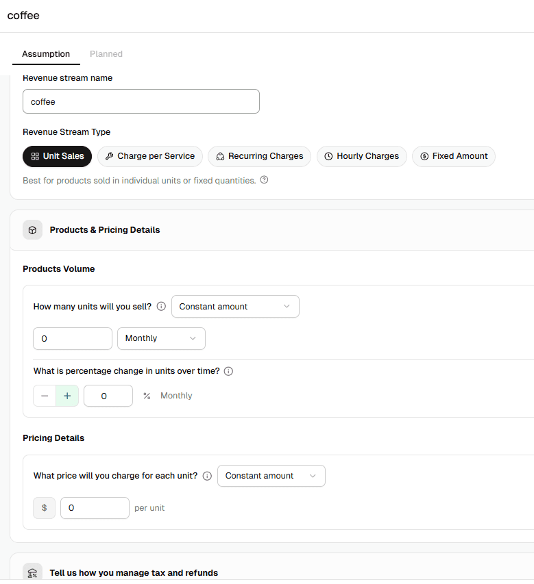
You’ll choose how the revenue is earned (unit sales, charge per service, recurring, hourly, or fixed amount), then plug in your volume (how many units, how often, growth rate) and your pricing (cost per unit).
The form also asks how you want to handle tax and refunds.
Once you fill in all the details, a forecasted sheet will appear, which you can further edit and modify.
Finally! Your forecasts are ready. You can save and alter it at any time.
2. Put the actual data and compare both
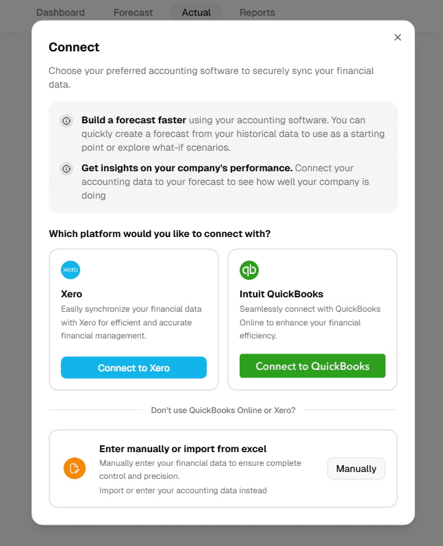
Now that forecasts are ready, go to the actual tab from the top-middle menu to get the actual data.

For importing the actual data, you will get 3 options:
- Connect to XERO
- Connect to QuickBooks
- Enter the actual financial data manually
Though there are three methods, the process works similarly for both the integrations of Xero and QuickBooks. Let’s see how:
Integration with Xero or QuickBooks
Integrating Xero or QuickBooks with Upmetrics enables automatic financial data transfer, allowing for immediate comparison with your forecasts to achieve a clear view of your financial performance. Let’s connect to Xero and see how it works.
(We’re using “XERO” to explain the process here. It’s the same for QuickBooks as well.)
Go to the Xero website and create an account if you don’t already have one. After signing up, input your business details, set your accounting preferences, and link Upmetrics to Xero for automatic data synchronization.
Further, for comparison, you need to log in to Xero from Upmetrics by clicking on “Connect to Xero”.
This will take you to the login page of Xero. Once you add the credentials, allow access to Upmetrics to import the actual data directly.
Once you’re logged in with Xero, you’ll get all the finance streams from Xero that appear in the left-hand sidebar, grouped into Revenue, Cost of Sales, Expense, Asset, Liability, and Equity, as shown in the picture below:
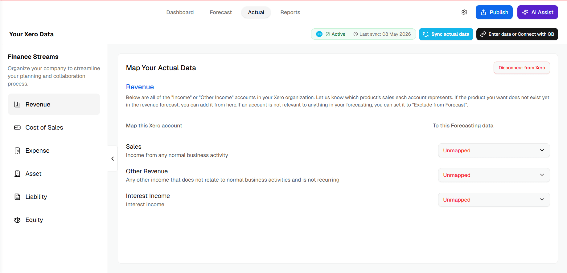
Then, click into the category you want to map. We’ll use Revenue as the example.
Each row shows an Xero account on the left (“Map this Xero account”) and the Upmetrics forecast category it should connect to on the right (“To this Forecasting data”). Any account that hasn’t been mapped yet shows up in red as “Unmapped.”
Click the dropdown next to any unmapped account to see your forecast categories. Pick the one that matches.
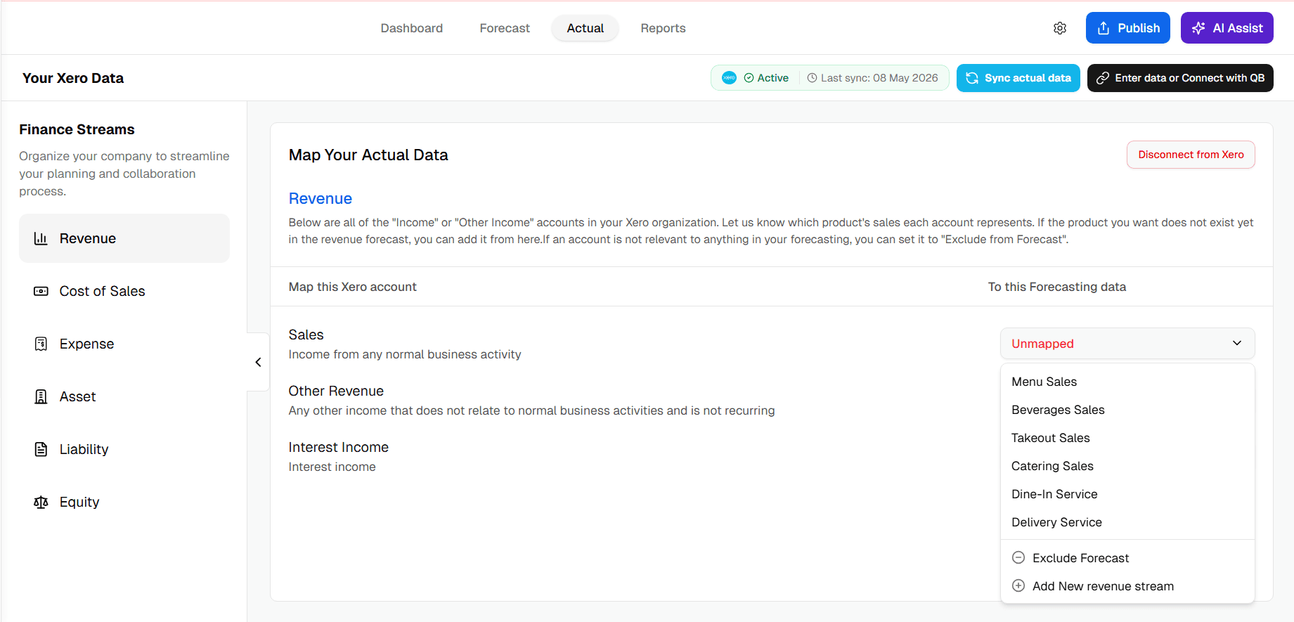
You can also add a new revenue stream right from the dropdown if you don’t have a matching category yet. Or choose “Exclude Forecast” if the account isn’t relevant to your forecast (a tax refund, an insurance payout, anything one-off you don’t want skewing your variance).
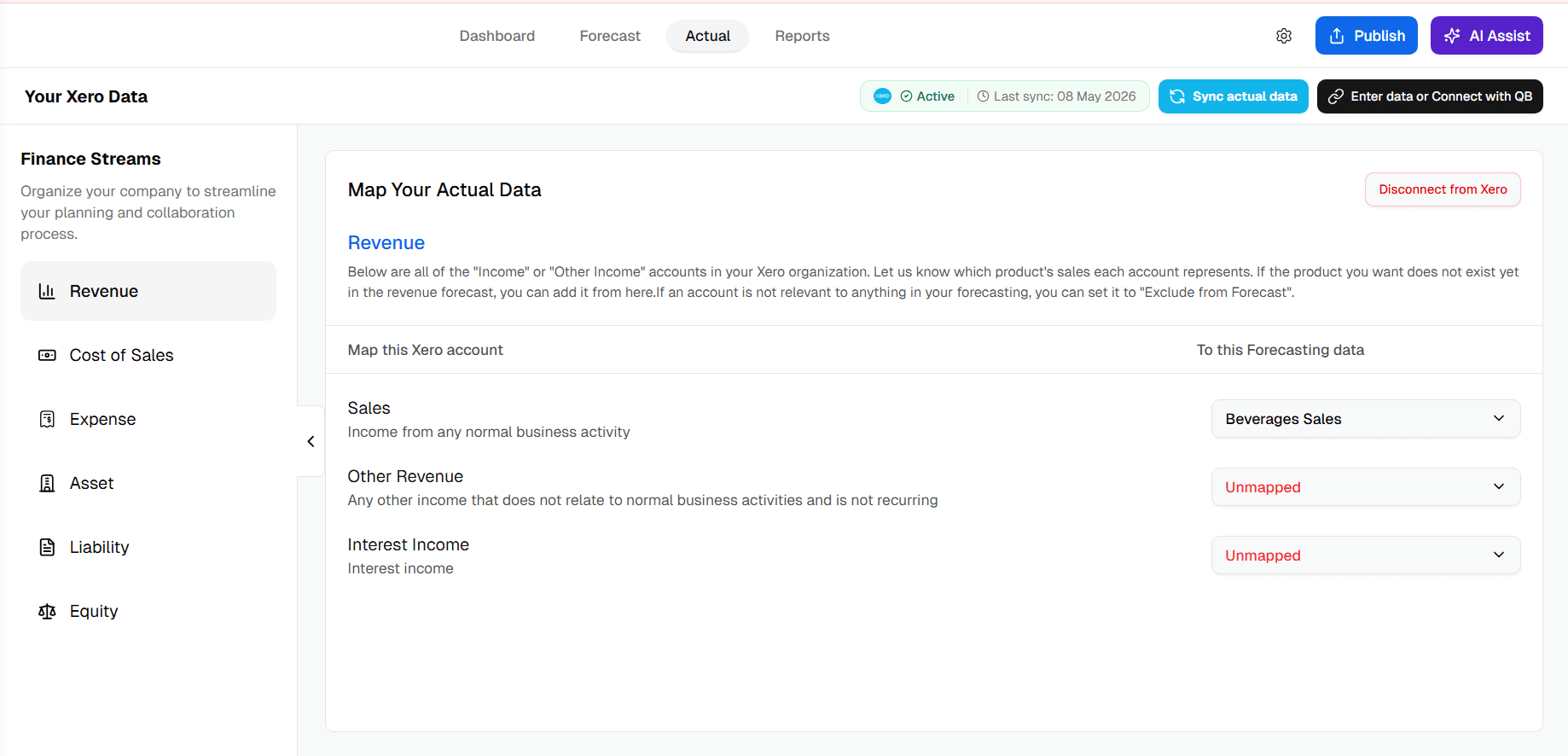
Once your categories are mapped, you’ll see them update from “Unmapped” to the chosen forecast category:
To view the full comparison of actuals against your forecast, head to the Reports section in the top navigation. The comparison table will look like the picture below:
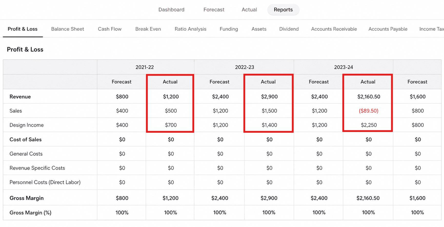
Negative actuals appear in red parentheses, so anything that came in below plan jumps out instantly. That’s how you spot underperforming areas of your business without having to calculate the variance yourself.
Repeat the same process for the rest of your finance streams (Cost of Sales, Expense, Asset, Liability, and Equity) so every account in Xero is connected to the right forecast category.
You only need to do this once. After that, every monthly sync brings your actuals straight into Upmetrics, ready to compare against the plan.
3. Visualize the data with the Upmetrics dashboard
While your plan vs. analysis report should be ready following the above steps, charts show you the shape of your financial performance, whether a one-month dip is noise or a trend.
Upmetrics’ visual dashboard helps you turn complex financial reports into easy-to-understand visuals, allowing you to track and compare critical financial metrics easily.
Here’s how you can visualize the data through our dashboard:
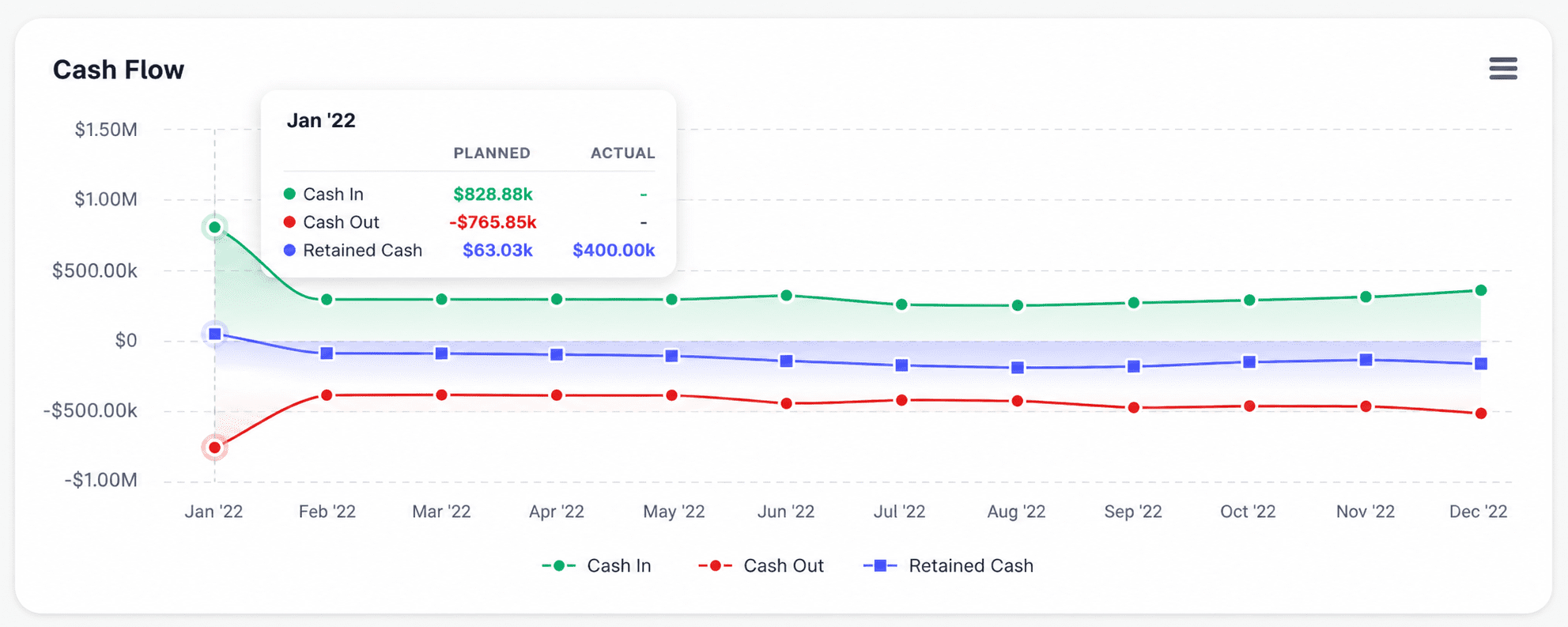
Cash flow is shown with a green line for income, a red line for expenses, and a blue line for retained cash, highlighting surplus or deficit months.
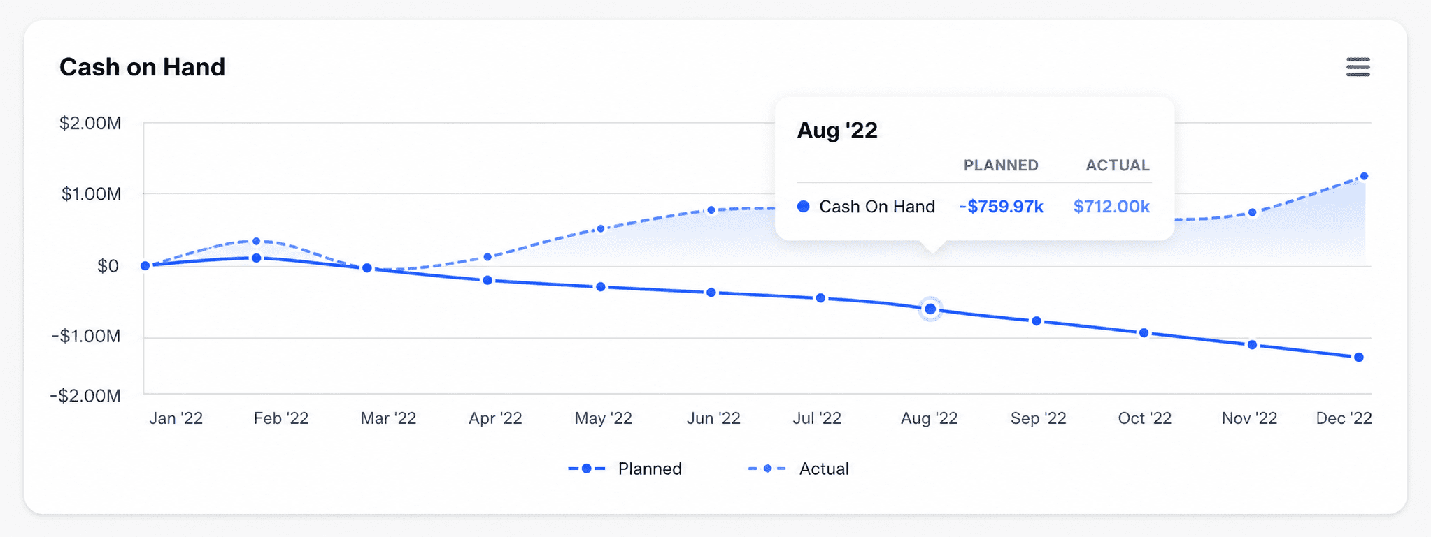
Cash on hand offers insight into long-term profitability and liquidity, letting you compare actual vs. forecasted data at a glance.
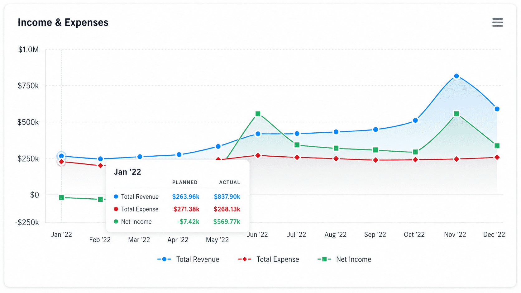
The income & expenses chart uses colors to display revenue, expenses, and net income, making it easy to track profits or losses.
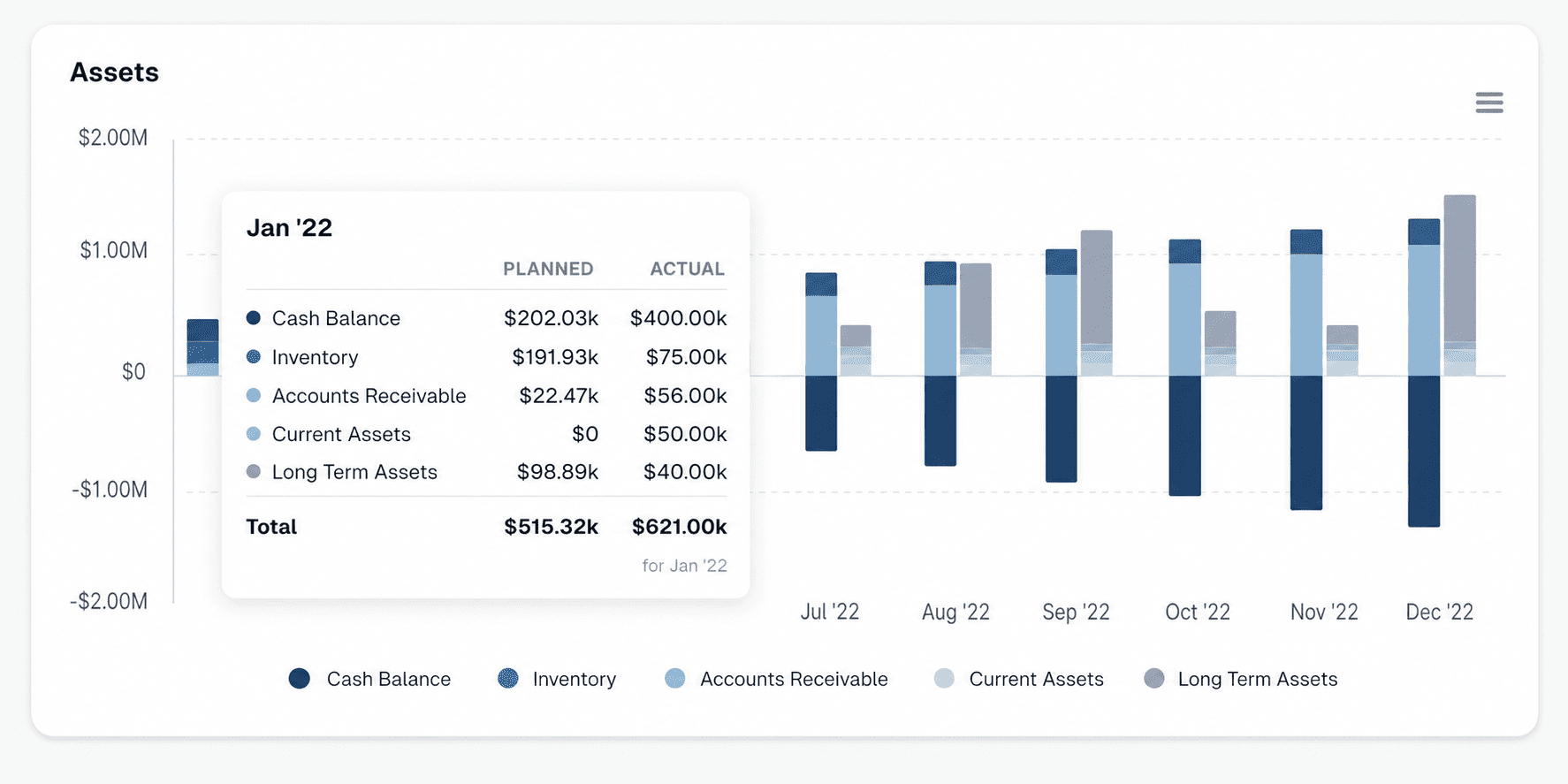
Asset charts present the value and distribution of your business’s assets over time, helping you track growth or depreciation by comparing actual and forecasted data.
Variances
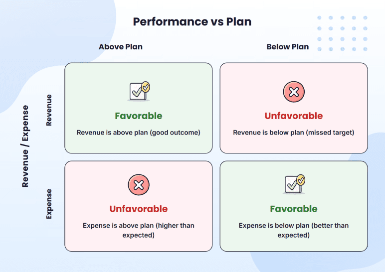
Calculating variance is the easy part. Reading it correctly takes a little more care, because a positive number isn’t always good news, and a negative number isn’t always bad. It depends on which line you’re looking at.
If your revenue comes in $500 above plan, that’s good (you sold more than expected), but if your expenses come in $500 above plan, that’s bad (you spent more than expected). Both numbers are positive. But they don’t mean the same thing.
Here’s how that looks in the cafe’s variance report:
You can see it clearly: Tacos and gourmet burgers ran above plan, and on a revenue line, that’s good news. Coffee and nachos came in under plan, and on a revenue line, that’s bad.
Now look at your coffee supply costs on the expense side. The same logic flips. Under plan is good because you spent less than expected. Above plan is a problem. The sign on the number doesn’t decide that. The line item does.
That’s the basic split every variance report rests on. Finance teams have a name for the two outcomes:
Favorable vs. unfavorable variance
A favorable variance is one that moves your business in a good direction. That can mean either revenue above plan (you sold more) or expenses below plan (you spent less). Both put more money in your pocket.
An unfavorable variance is the opposite. Either revenue below plan (you sold less) or expenses above plan (you spent more). Both take money out.
Here’s the simple matrix:
Once you know whether a variance is favorable or unfavorable, the next question is why it happened.
4 Common causes behind a variance
Variance usually traces back to one of four sources. Each one points to a different kind of problem:
1. Price variance
You charged a different amount per unit than you planned. For example, you forecasted coffee at $5 a cup, but ran a promo and sold it at $4.50.
Check whether the change was deliberate. If it wasn’t, find out why your price drifted and decide whether to update your forecast assumption next month.
2. Volume variance
You sold more or fewer units than you planned, at the planned price. For example, you forecasted 500 cups of coffee, but only sold 440.
The fix is to dig into demand (traffic, marketing, competition), because volume variance is rarely a numbers problem. It’s usually a real-world thing happening to your business.
3. Mix variance
Customers bought a different mix of products than you forecasted. For example, you sold the same total dollars in coffee, but customers bought more drip coffee (lower margin) and fewer lattes (higher margin).
So, recalculate the margin using the actual mix you sold, not the forecasted one. Your top-line revenue might look fine, while your profit has quietly dropped.
4. Timing variance
A sale or expense landed in a different month than planned. For example, your June marketing invoice hit in July. The number isn’t wrong, the calendar is.
Don’t change the forecast. Just note it in the variance log so it doesn’t get flagged again next month, and move on.
In practice, you’ll rarely see one type cleanly. Most variances are mixed, and figuring out the mix is half the job.
Why conduct a plan vs. actual analysis?
In my experience, plan vs. actual isn’t just a variance-catching exercise. It’s what gives you a real, honest view of what’s working in the business and what isn’t. Here are the five benefits I see founders get out of doing it every month.
Identify variances early
The earlier you find a problem, the cheaper it is to fix. A 10% revenue miss in March feels small in the moment, but if nobody flags it, by June it’s not a 10% problem anymore. It’s a real cash flow squeeze, the kind where you start doing math on whether payroll lands.
That’s why I push founders to run this monthly. Not to chase every tiny variance, but to catch the real problems while you’ve still got time to do something about them.
Improve next month’s forecast
Your first forecast is mostly guesses, built from benchmarks, gut, and some optimism. After six months of running plan vs. actual, those guesses get replaced by real numbers from your business.
I’ve watched founders go from wildly off in month one to within a few percent by month six. Not because they got smarter at forecasting, but because they finally had their own data to work with.
That’s what makes the difference between running the business on hope and running it on evidence. Better forecasts mean smarter hiring calls, fewer cash surprises, and real planning more than 30 days ahead.
Make data-driven decisions
Without a plan vs. actual analysis, “How are we doing?” is a question you answer by feel. With one, you can answer it with real numbers: revenue is 8% above plan, but expenses are 14% over. So you’re actually making less than you thought.
That’s something you can act on. Instinct gets you far, but at some point, you need numbers behind your decisions.
Tighten cash flow management
Whatever’s happening on your revenue and expense lines is what eventually shows up in your cash flow. If revenue’s been below plan and expenses above plan for two months in a row, your runway is shorter than your forecast says it is.
The SBA recommends looking closely at money in and money out to keep your business cash flow positive. Plan vs. actual catches that early, before payroll becomes the problem you’re trying to solve.
Once you see it, you can act before it becomes urgent: Slow down hiring, delay a big purchase, or talk to investors with real numbers in hand. Founders who catch this in month two have options. Catch it in month five, and you’re usually in survival mode.
Build team accountability
This one matters more as your team grows. Once the variance report starts going to the person responsible for each line every month, people pay closer attention to their own numbers.
Your marketing lead is going to notice when customer acquisition cost runs 22% over plan, because it’s sitting right there in the report.
I think the discipline it creates across a small team is often worth more than the analysis itself. People plan more carefully when they know the variance is coming back to them.
So that’s the case for doing it. But I’ll be upfront: Many founders run plan vs. actual every month and don’t get much out of it, usually because they’re making the same few mistakes without realizing it.
5 Common mistakes when running a plan vs. actual analysis
Here are the five mistakes that come up over and over. If you’ve been running plan vs. actual for any length of time, at least one of them is probably already happening in your process.
| The mistake | How it shows up | How to fix it |
| Mixed-up timelines | Your forecast is monthly, but your actuals only come in every quarter | Ask your bookkeeper for monthly numbers, or pull them straight from QuickBooks or Xero |
| Changing the plan to match reality | You update the planned numbers when actuals come in low, so variance always looks fine | Don’t change the plan. If your thinking has shifted, save your new thinking as a separate forecast |
| Only looking at revenue | You watch sales every month, but never check what’s happening with expenses | Run the same variance check on every big expense line, not just total expenses |
| Numbers with no reason | The report shows variances, but no one explains why they happened | Add a one-sentence reason next to every variance over ±10%, while the month is fresh |
| Reviewing without deciding | The team looks at the report, talks about it, and then moves on without changing anything | End every review with at least one written decision, even if it’s “no action this month.” |
The bottom line
If you’ve made it this far, you’ve got everything you need to start running plan vs. actual on your own.
The math is the easy part. The harder part is doing it every month and acting on what you find. That’s the real difference between a plan that just sits in a folder and one that helps you run the business.
If you’d rather not handle the manual work every month, Upmetrics is built for this. It connects to QuickBooks and Xero, runs the variance for you, and keeps your dashboard updated as your actuals come in. Same process we walked through, just without the spreadsheet work.
Either way, the next step is simple. Pull up last month’s forecast, line it up against what actually happened, and see what the numbers tell you.
The Quickest Way to turn a Business Idea into a Business Plan
Fill-in-the-blanks and automatic financials make it easy.
Frequently Asked Questions
What is the difference between a plan and an actual?
How do you calculate plan vs. actual variance?
What tools are best for plan vs. actual analysis?
How often should you conduct a plan vs. actual analysis?
What's considered a good variance percentage?

Vinay Kevadia
Vinay Kevadiya is the founder and CEO of Upmetrics, the #1 business planning software. His ultimate goal with Upmetrics is to revolutionize how entrepreneurs create, manage, and execute their business plans. He enjoys sharing his insights on business planning and other relevant topics through his articles and blog posts. Read more