You only get one shot at a first impression with investors, and your business plan cover page makes it for you. If it looks rushed or incomplete, that’s the impression that sticks, no matter how strong the plan inside is.
In this blog, we’ll show you what a well-structured cover page includes and how to format it so it feels credible and investor-ready.
What is a business plan cover page?
A business plan cover page is the first page of your plan. It includes your company name, logo, address, and key details that identify the document.
A clean, professional cover helps investors or bankers quickly understand what the document is and who it’s from. Whether you’re writing a business plan, marketing plan, or business proposal, the cover page is an essential part of all.
Do you really need one for your plan?
Technically, no. Your business plan can exist without a cover page.
But should it? Not.
The cover page is the first cue investors or lenders get about your professionalism. Before they read a word, they judge how seriously you take presentation, organization, and detail.
The real value of a cover page is psychological: It makes your plan feel finished. When you’re sending it to investors, partners, or banks, it shows you’ve taken the time to package your thinking properly. And that small detail shows effort often, which earns your document a closer read.
Sending your plan to investors or a bank?
Walk in with a plan they can’t put down

What goes on your business plan cover page (w/ order & placement)
We’ve broken this down so you know exactly what belongs on your cover page, why, and where exactly.
1) Company logo
![]()
Your logo is the first thing that puts your reader into context, so its placement sets the tone for the entire page. Position your logo at the very top of the cover page, ideally centered or aligned to the top-left corner.
This is the primary visual anchor of your cover, demonstrating professionalism and instantly connecting the document to your brand identity. So always:
- Use a high-resolution file to prevent it from appearing blurry when printed.
- Leave enough white space around the logo to prevent it from looking cluttered.
- Ensure the background color or pattern doesn’t interfere with legibility.
- Use the same logo version (colors, proportions) as in your other official materials to maintain consistency.
2) Business name
Your company name should be the most prominent text on the page, and it naturally comes right below the logo, close enough to feel connected but separated by enough white space to avoid visual clutter. This placement keeps the reader’s attention flowing from brand mark to brand name in one clean motion.
Make it bold, clear, and readable from a distance. Use a clean, professional font that aligns with your overall brand identity. For consistency, the name should look exactly as it appears in your other official documents.
If your logo already contains the company name, don’t repeat it—one strong placement is enough to make it memorable and maintain visual balance.
Reminder: Always do a quick black-and-white print test—your company name should remain clearly visible even without color.
3) Value proposition or tagline
This line sits directly below your company name (or logo, if the name is already included there). Its placement bridges your brand identity and the content of the document, giving the reader an instant sense of what your business does and why it matters.
If you already use a tagline in your marketing, keep it consistent here to reinforce brand recall. Keep the text concise—one line, centered or left-aligned depending on your overall layout.
The message itself should be specific and grounded: “Payroll software for 10-person teams” tells a clear story; “Innovating the future of work” does not. And if you don’t regularly use a tagline, skip it. A forced line placed here weakens the professional tone of the cover.
4) Business plan title
Place the document title in the middle section of your cover page, centered and clearly separated from the logo, company name, and tagline above it. This is the visual midpoint of the page (where a reader’s eyes naturally pause), so it should immediately confirm what the document is.
Keep the title simple and direct: “Business Plan – [Company Name]” is sufficient. Use a slightly smaller font than your company name but larger than your tagline, maintaining a clean hierarchy.
Avoid getting creative with titles like “Vision Book” or “Strategic Growth Playbook.” Investors and lenders expect clarity, not branding experiments. Your goal here is zero ambiguity—let the reader know at a glance that they’re holding a formal business plan.
5) Completion and/or update date
Place the date just below the document title, in a smaller font size and lighter weight. This position keeps it visible without distracting from the main heading.
The date indicates how current your business plan is, signaling reliability to investors or lenders. Use it to show when the plan was finalized or last updated. If you make regular revisions, include both the update date and version number—for example:
Updated: 3 Oct 2025 | v1.3
Always use a clear, global-friendly date format like day–month–year to avoid regional confusion. A format such as “10/03/25” can be read differently across markets, so write it out to prevent misinterpretation.
6) Prepared by
This section goes near the bottom of the cover page, typically above the contact information. Keep it in a smaller, professional font so it’s easy to locate but doesn’t compete with the main visual elements above.
Use this area to specify who prepared or is presenting the document—usually the company’s CEO, Founder, President, Owner, or another key decision-maker. Listing this name signals accountability and shows that leadership stands behind the plan.
If multiple people contributed, you may include a team or department name, but avoid clutter. One clear point of contact is generally best.
7) Contact information
Place the contact information at the very bottom of the cover page, directly beneath the “Prepared By” section. Align it neatly—either centered or bottom-right—to maintain balance and keep it visible without drawing attention away from the main logo or title above.
This block should include:
- Company’s physical address
- Phone number
- Official company email address
- Company website
Ensure all details are accurate, current, and professional. Avoid personal email addresses and inactive numbers.
This section gives readers a clear way to reach the right person for questions or follow-ups, completing the visual and informational flow of the cover page.
8) Confidentiality statement
A confidentiality statement is optional but recommended when sharing your plan externally. Place this section directly below the contact information as the final footer line on your cover page. It should sit at the very bottom margin, in the smallest font size used anywhere on the page.
This placement keeps it visible yet discreet, clearly separated from the main content above. You can keep it simple by writing “Confidential” or include a short statement such as:
Example of Confidentiality Statement
If you include this section, place it at the bottom of the cover page in a smaller font. Keep it short and professional. Long disclaimers are unnecessary for most cases. For extra formality, you can also add “© [Year] [Company Name]. All rights reserved.” beneath it.
Need a captivating cover page for your business plan?
Make compelling business plans in minutes with Upmetrics

How to create your business plan cover page (w/ apt. formatting)
We’ve simplified this into clear steps so you can create a cover page that looks professional without hiring a designer.
1) Gather all the essential details
The foundation of a strong cover page is accuracy and completeness. Start here.
List your essentials first
Include the must-haves: your company name, logo, tagline (only if it’s already in use), your name and role, contact details, date, and a clear “Confidential Business Plan” label.
Add small but powerful details.
Go one step further by mentioning your registration details (LLC, Inc., GST, etc.). It gives your plan a more official edge.
Track your versions.
If you’re sharing drafts with multiple reviewers, add a version number in the footer—something like v1.2 – Oct 2025. It shows organization and prevents confusion later.
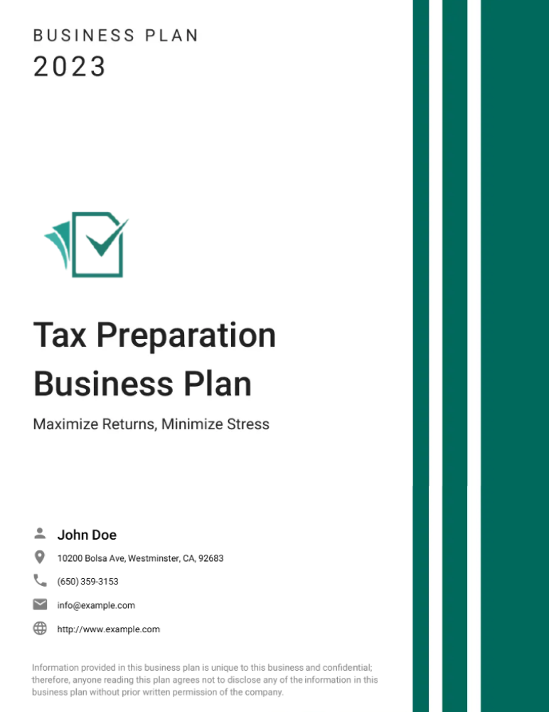
Here’s a simple, well-structured cover page that includes all the essentials.
2) Lay out content (consider order/placement)
Picture the cover like a slide, each section guiding the eye down naturally.
Start with the logo and company name at the top. This creates instant recognition and sets the professional tone. Keep them aligned—either centered or top-left—and give enough white space around them.
In the middle section, place your document title (“Business Plan – [Company Name]”). This is the focal point, so ensure it stands alone with breathing room. If you have a short tagline or value statement, put it directly below in a smaller font.
The bottom section ties everything together: Include the prepared by/for line, date, contact block, and finally the confidentiality statement as the footer.
The order shows accountability, accessibility, and ownership—all in one clean sequence.
3) Choose readable fonts and sizes
Typography sets the tone for your cover page. Keep it clean and consistent.
Use one main font, or two if you need light variation. Serif fonts like Cambria or Times New Roman feel formal and traditional. Sans-serif fonts like Helvetica, Calibri, or Lato look modern and simple.
Set a clear hierarchy:
- Company name: 26–28 pt
- Subheadings: 14–16 pt
- Body text: no smaller than 11 pt
Avoid shrinking text to make space—it shows poor layout planning. Leave breathing room so everything reads comfortably.
4) Apply brand colors sparingly
Start with your logo as the visual anchor. It gives instant identity, so let it lead. Avoid decorative icons, borders, or patterns that don’t add meaning.
Add a single accent to create structure—maybe your company name in brand colors or a fine dividing line that separates sections. Two colors total (logo + one accent) are enough to create hierarchy without clutter.
Think of whitespace as part of the design. It gives breathing room, helps the eye focus on what matters, and communicates quiet confidence.
If you want to check your balance, print a sample in grayscale. A well-designed cover should still look clear and legible without color. If contrast or hierarchy disappears, simplify again.
Always test your design in grayscale. Many investors print in black-and-white to save costs, and messy contrast or weak text can make your page unreadable.
5) Proofread
Read the page word by word, not just through spellcheck. Confirm the spelling of your company name, tagline, and email address—these are where mistakes most often slip through.
Match the date and version number to the file name. Inconsistent versions cause confusion when multiple drafts circulate.
Print one copy to review alignment, margins, and spacing; PDF exports often shift layout slightly.
Use a short verification list:
- Company name accurate
- Date and version consistent
- Footer and confidentiality line in place
- Contact information correct and functional
A few things to keep in mind:
- If English isn’t your first language, have someone else read it aloud to you, and you’ll catch errors you missed on screen.
- Use the verification list we mentioned above.
- If you’re sharing with multiple investors, personalize the “Prepared for” line. It avoids confusion and makes the document feel tailored
Business plan cover page examples


Design your business plan cover page using Upmetrics
While a great cover page won’t guarantee you funding, it definitely sets the tone for what’s coming next.
First impressions matter, and a clean, well-organized layout signals professionalism before anyone reads a single word.
Upmetrics makes that easy. You’ll find ready-to-use templates built around what investors and lenders expect: simple, clear, and polished. You’ll find ready-to-use templates designed around standard investor and lender expectations—simple, clear, and professional.
Customize fonts, colors, and layouts to match your brand, or upload your own design. It’s the easiest way to make your business plan look complete and credible from the very first page.
Frequently Asked Questions
Does a business proposal have a cover page?
What three aspects must be included in the cover page?
What is the best format for a cover page?

Vinay Kevadia
Vinay Kevadiya is the founder and CEO of Upmetrics, the #1 business planning software. His ultimate goal with Upmetrics is to revolutionize how entrepreneurs create, manage, and execute their business plans. He enjoys sharing his insights on business planning and other relevant topics through his articles and blog posts. Read more